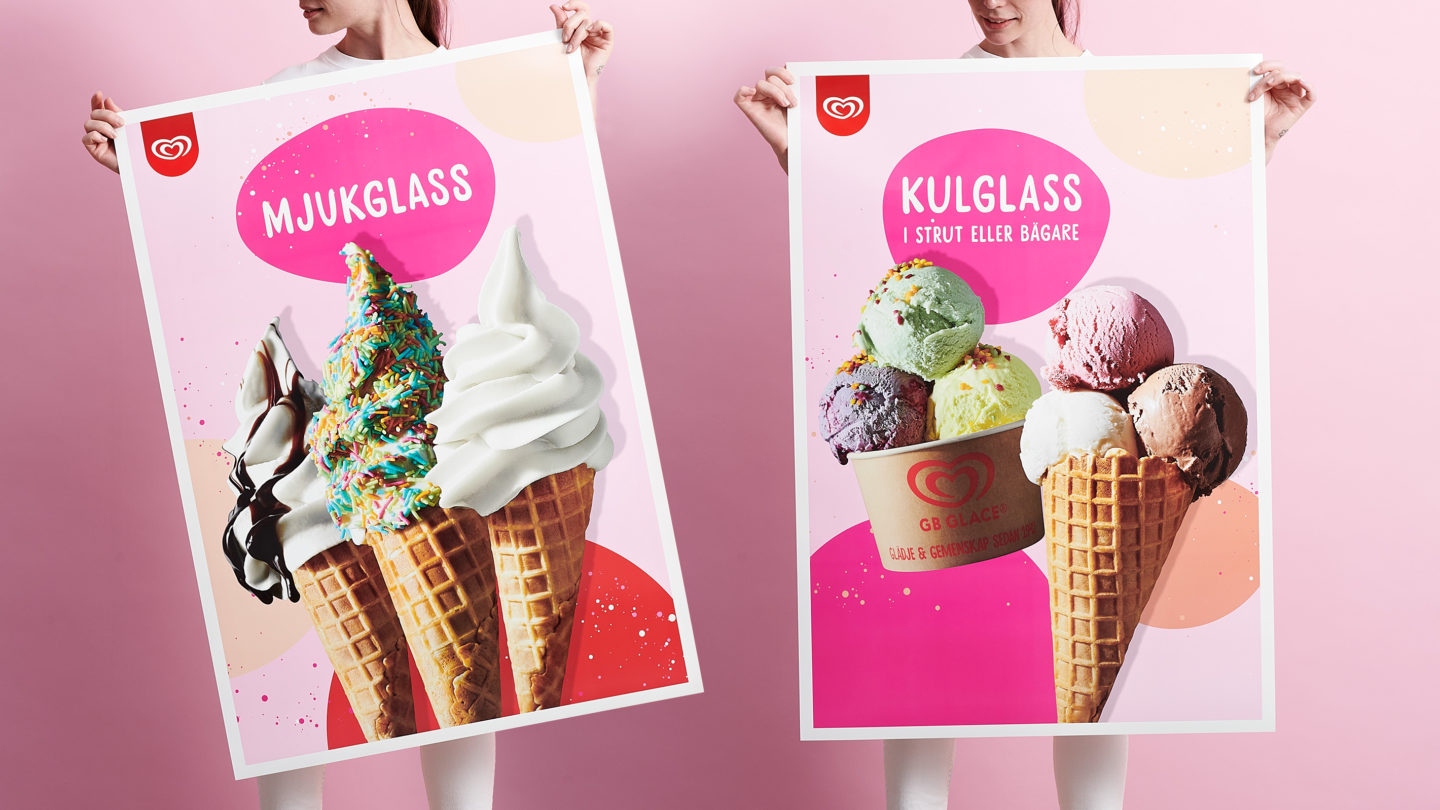
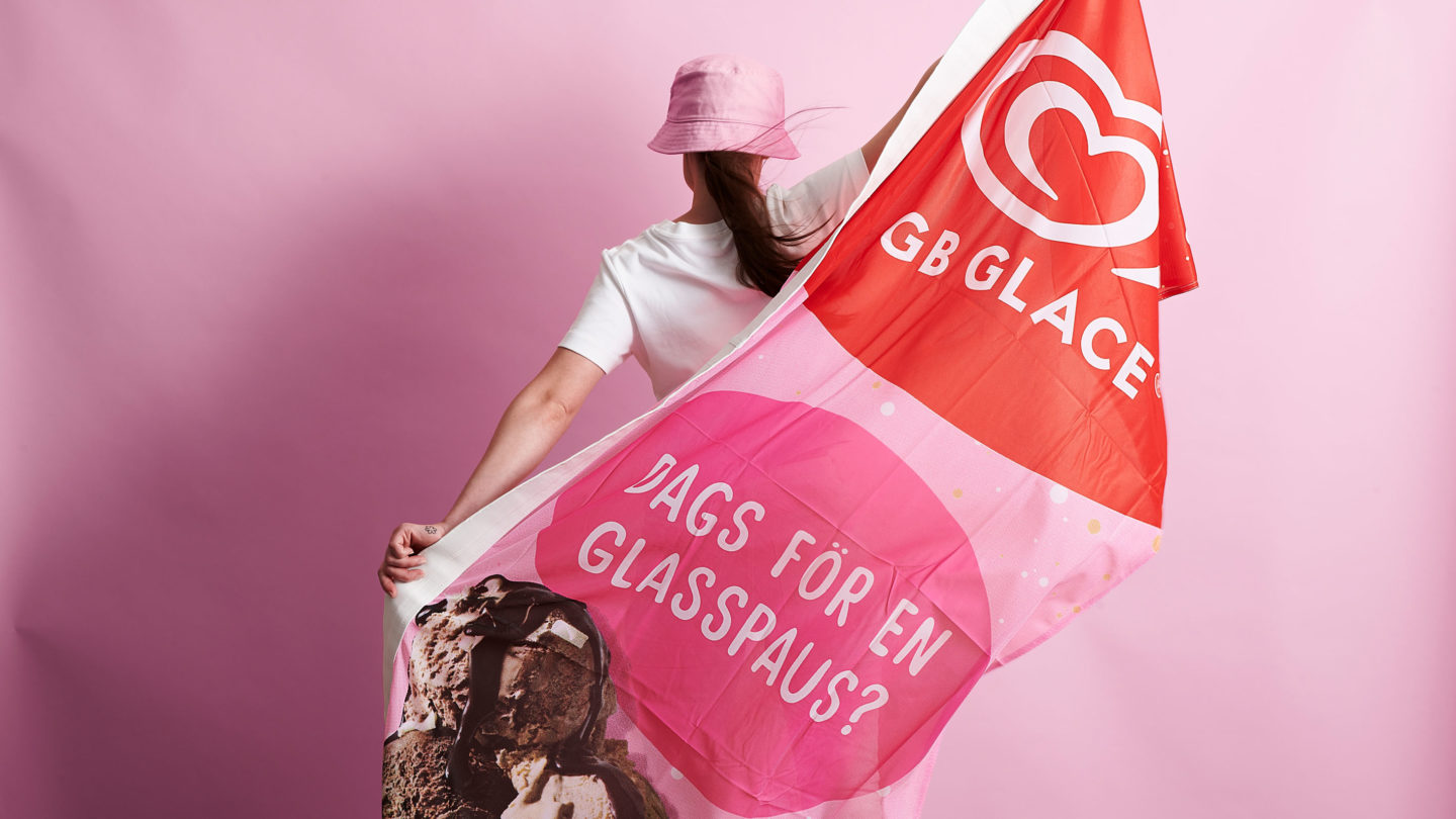
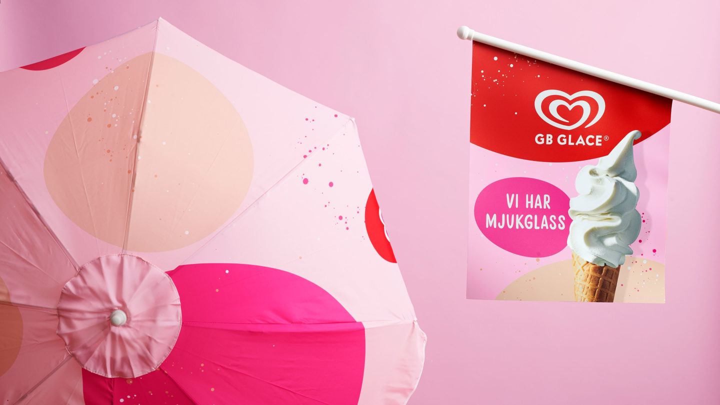
GB Glace Ice Cream Kiosks are iconic in Sweden and have been a cherished part of many people’s childhood traditions for generations. However, the dominant use of the red heart logo across all points of sale had become somewhat overwhelming. To revitalize the brand, we developed a dynamic design system with a wider range of colours to inject more fun into the overall experience.
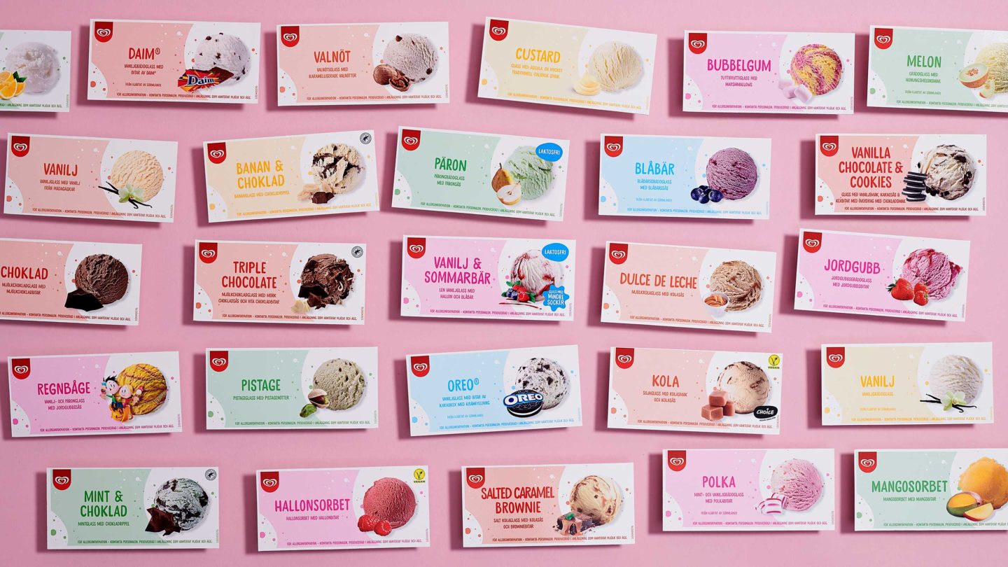
First, we deconstructed the current design. The red heart was retained as a core element but toned down. By incorporating a dynamic pattern as a backdrop, a new and flexible design system emerged, playfully distinguishing all flavours. In terms of imagery, we showcase the ice cream as the true hero it is. Captured from below, magnified in size, and accentuated with impactful shadows for added energy. To enhance the taste experience, we portray the ice cream in its natural form – not flat or flawless, but textured, delightfully messy, intentionally saucy, and generously sprinkled.
All of the above has resulted in a cohesive, harmonious, and adaptable visual expression that truly captures great taste. It provides GB Glace Kiosks with a completely refreshed yet familiar look, inviting people throughout Sweden to indulge in a scoop of ice cream fun.