Poppels, a formerly small craft brewery, originally the brainchild of 15 beer enthusiasts, has grown significantly from its humble start in 2012. With growth came new challenges, one of which was the lack of clearly defined portfolio and design strategies. Without structure, every new release resulted in a painful process to ensure recognition, distinction, shelf stand-out and value.
Clearly, Popples needed to find a system that will allow them to unleash their creativity and focus on their craft. Pond Design was assigned to create a portfolio strategy and design system that will clearly assign roles for each product in the portfolio and map out design principles for both old and new releases.
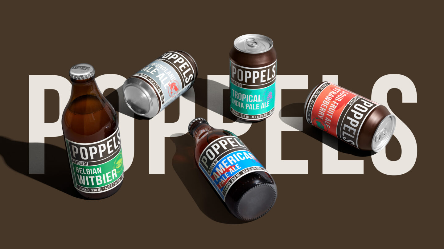
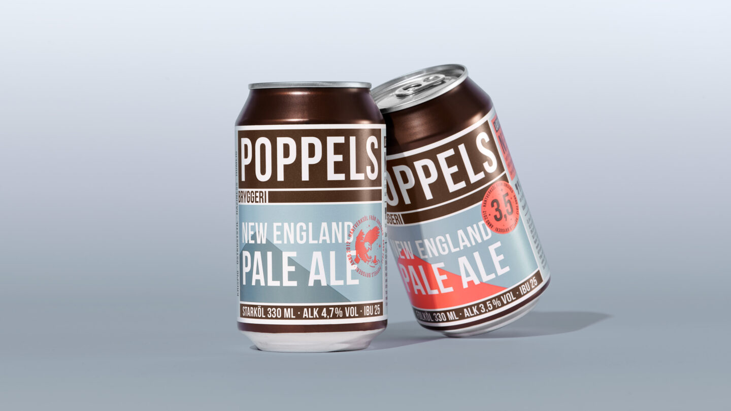
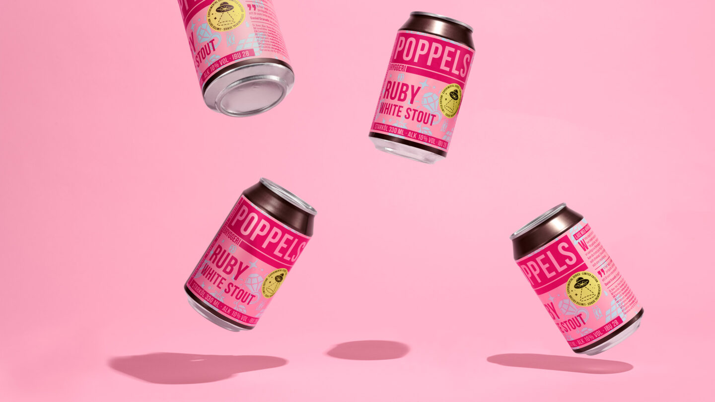
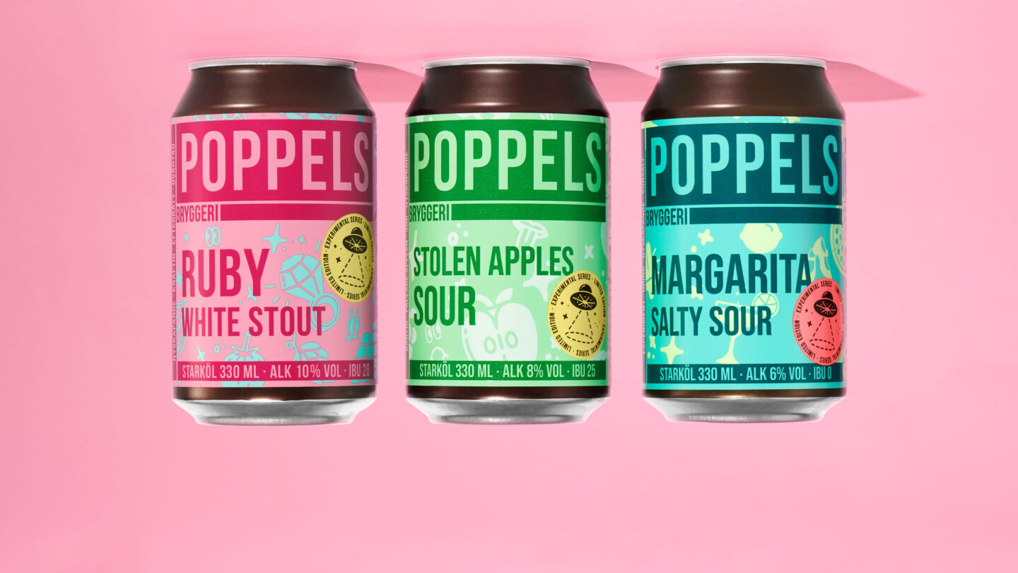
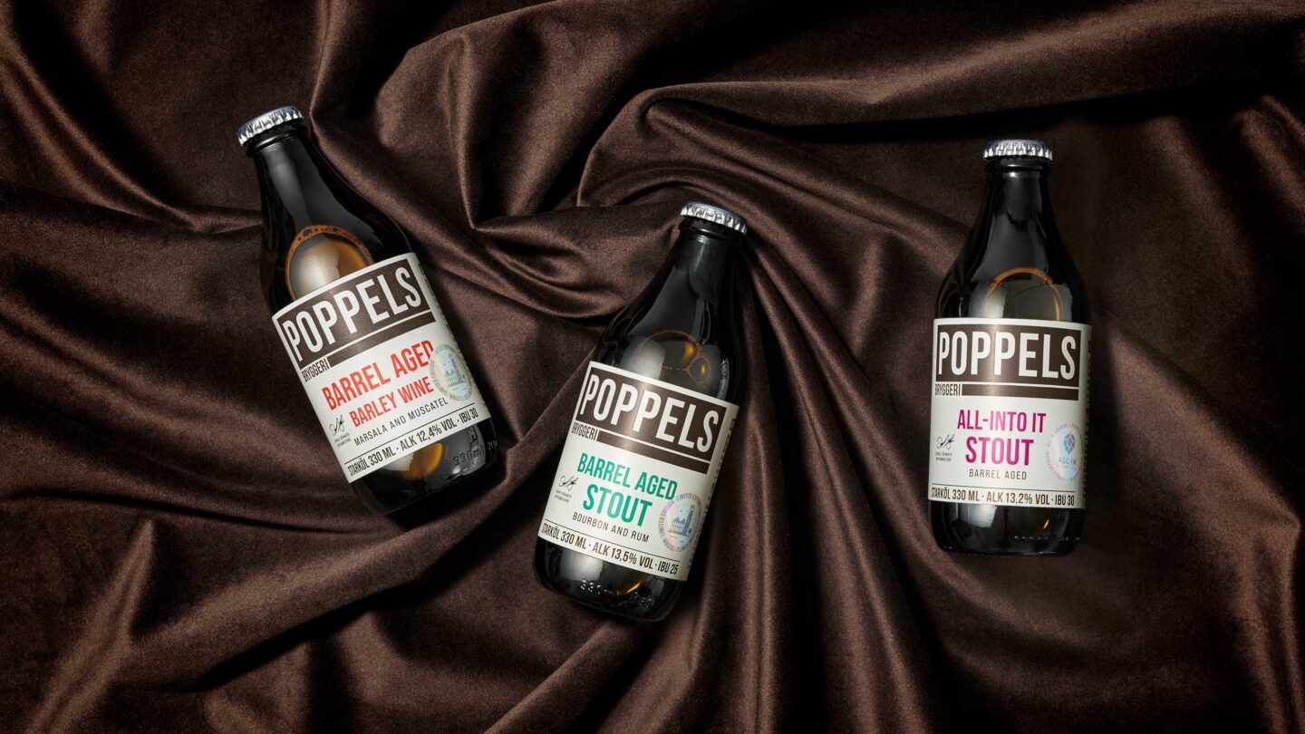
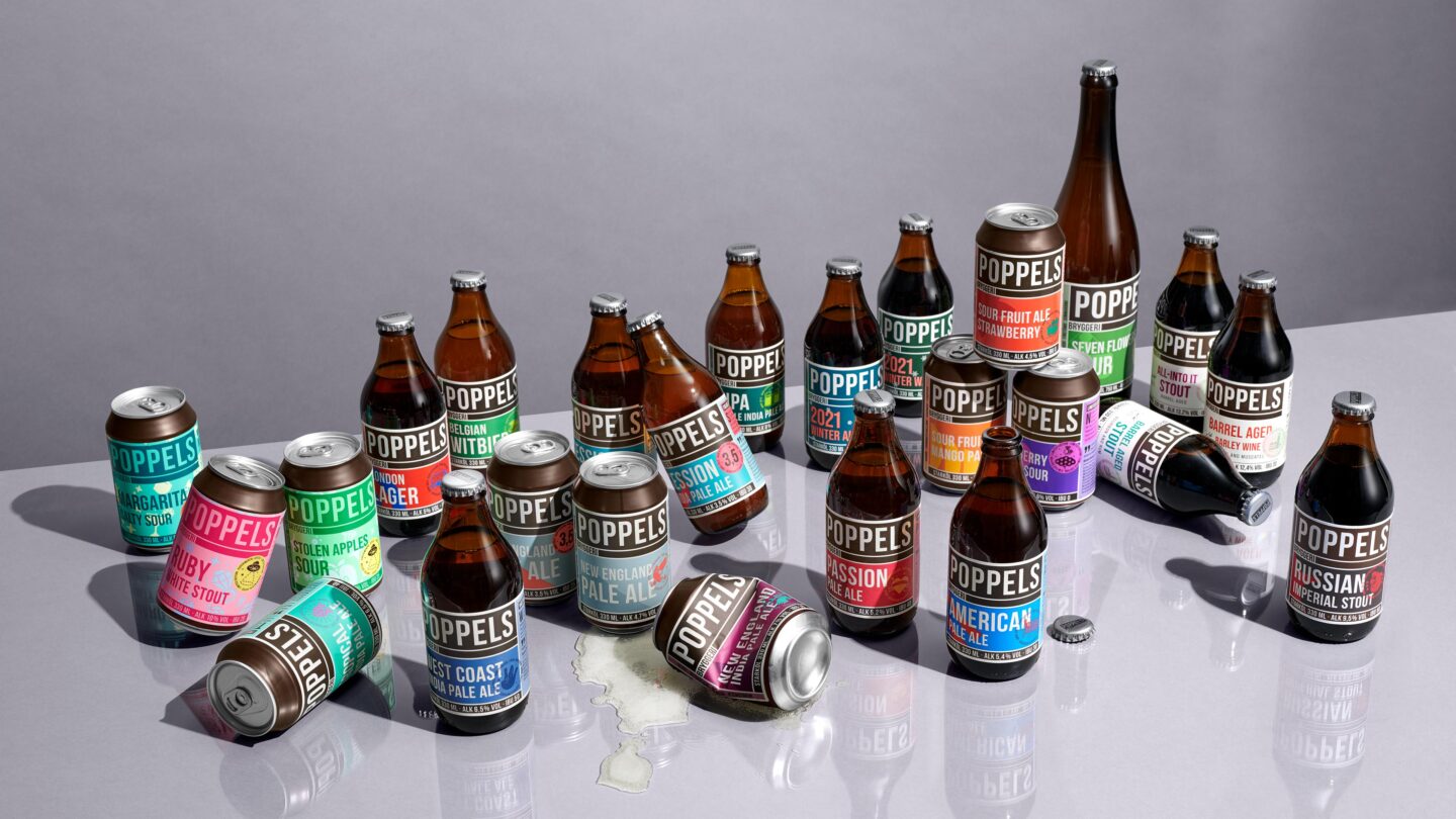
To ensure impact and brand recognition, a conscious choice was made to use Poppels’ original design concept with its strong brand blocking cues. The assortment was then divided in to three clear ranges, each with its distinct role and storytelling; The Core Series, Selection Series and The Experimental Series.
The fundamentals of the new design system consisted of four strong cohesive elements: logo, typography, color blocking and a new illustration style, with unique stamps on the label front to capture the brand’s playfulness and down-to-earth attitude.
The new system helped clarify how to treat new products within each series, such as limited editions, co-labs and seasonal beers. With the new portfolio and clear design structure, every new product now had a place, role and expression. The new structure allows Poppels keep experimenting with new brews, tastes and products with confidence and creativity.