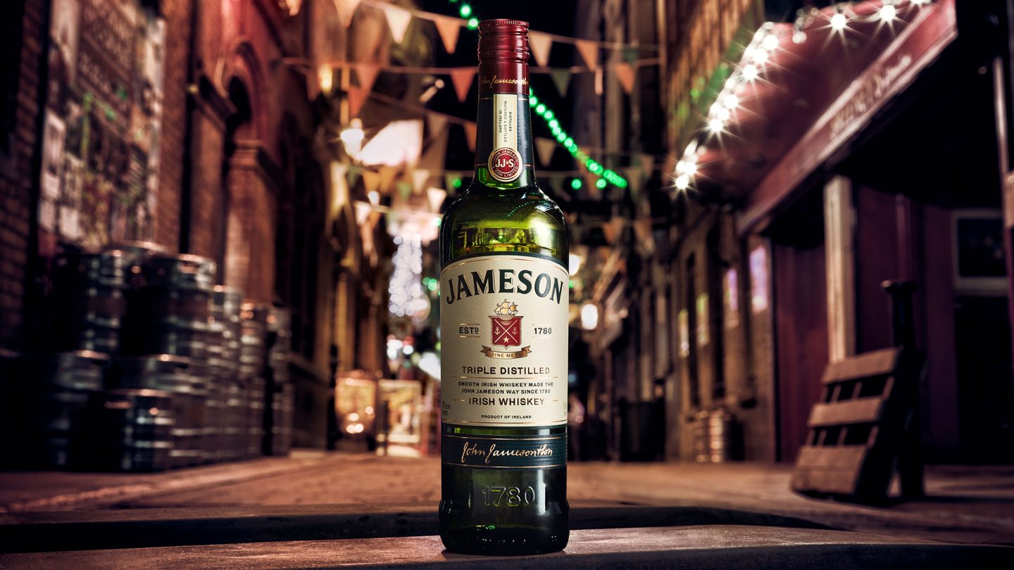
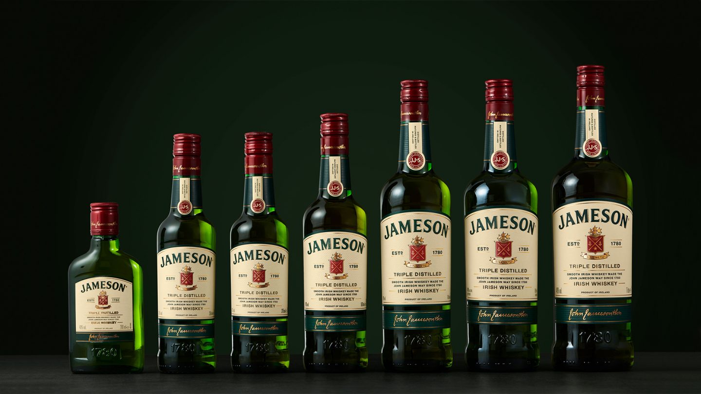
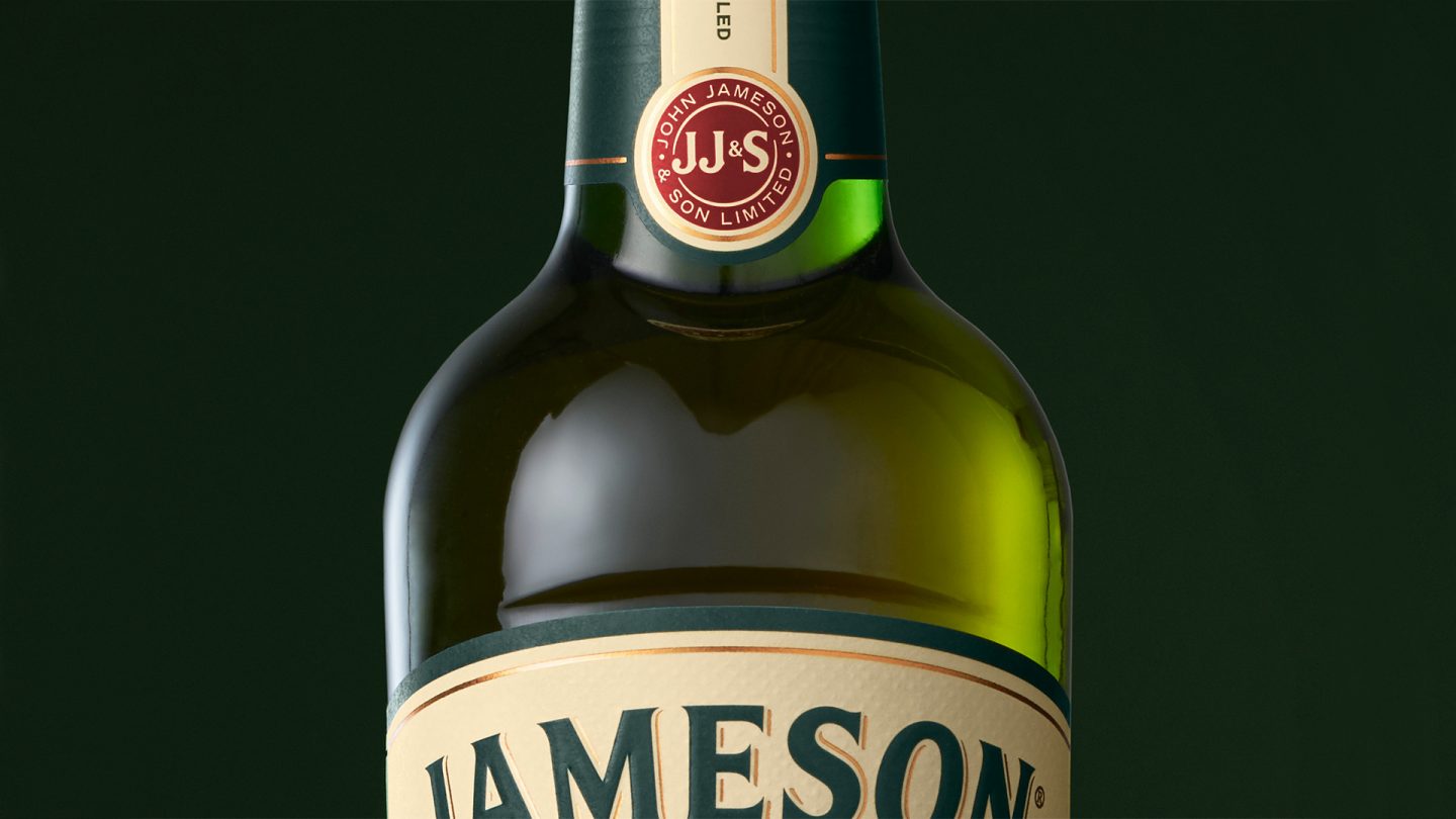
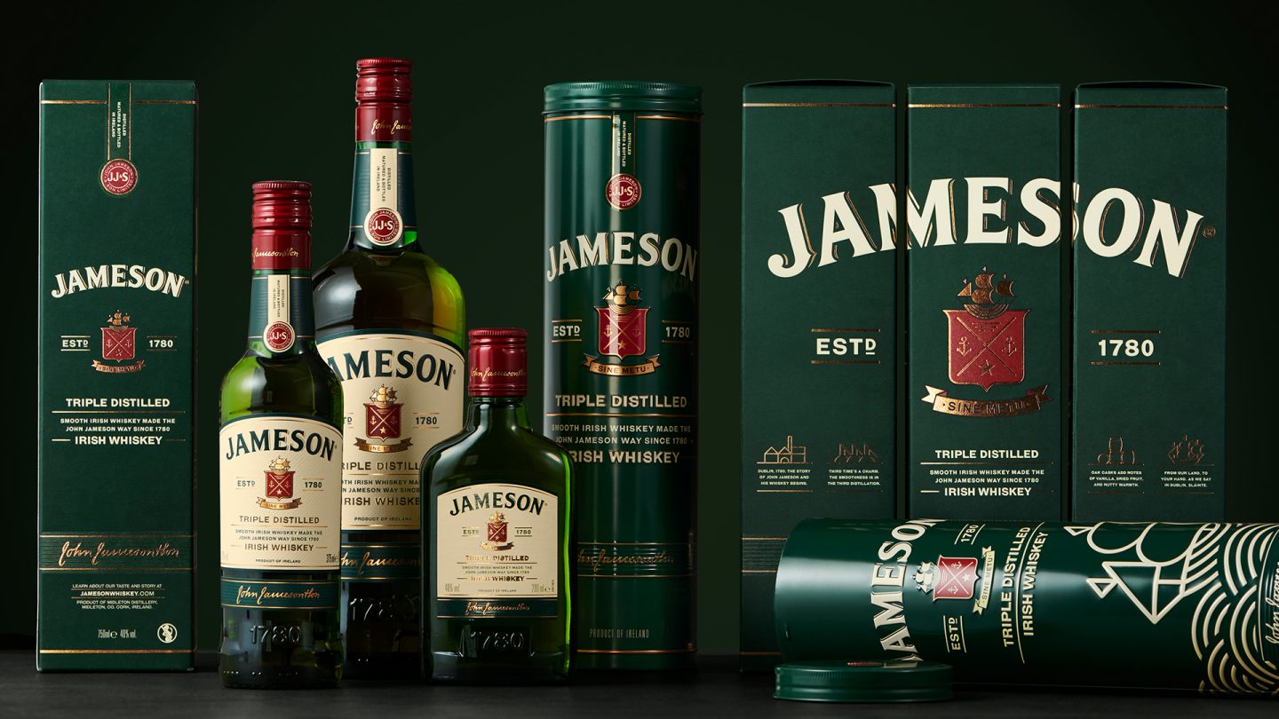
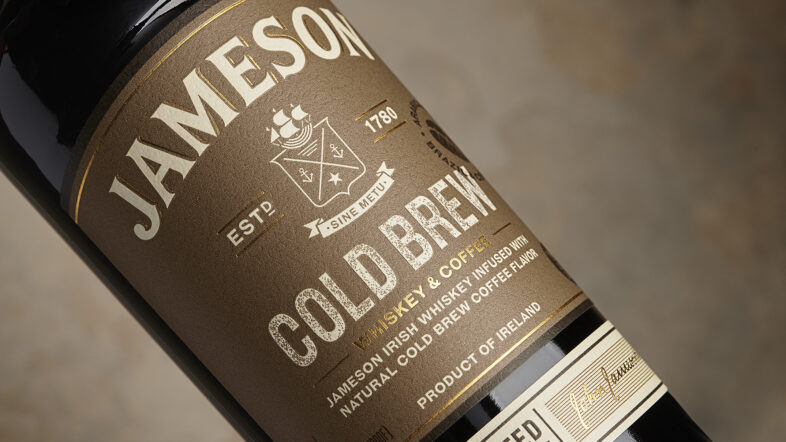
Jameson Whiskey is the best-selling Irish whiskey in the world, with annual sales topping 7 million cases in 130 markets, and with 29 consecutive years of growth. Jameson Original is a blend of pot still and fine grain whiskeys. The whiskey, with its iconic green bottle, is triple-distilled and aged for a minimum of 4 years.
Mission
The Jameson Whiskey brand, with Jameson Original leading the way, is working relentlessly to keep its strong position and to future-proof it. Pond Design was commissioned to help evolve and modernize Jameson Original, the key player and most successful product in the family’s portfolio. The new, modernized design needed to reflect the brand’s idea, vision, personality and values. Deliver strong on-shelf stand-out, resonate well with both bartenders and consumers and establish a strong design base to anchor the rest of the Jameson Family’s product portfolio.
Insight
Conversations in major markets with consumers and bartenders revealed that Jameson Original was appreciated for its unpretentious attitude, personality, approachability and authenticity. In terms of design, analysis showed that although some elements were working well; for example, the green bottle and the ergonomically bottle neck, the design was somewhat outdated and in need of modernization. The label details and overall design expression needed to be optimized to enhance the brand’s impact and to keep it relevant for the future.
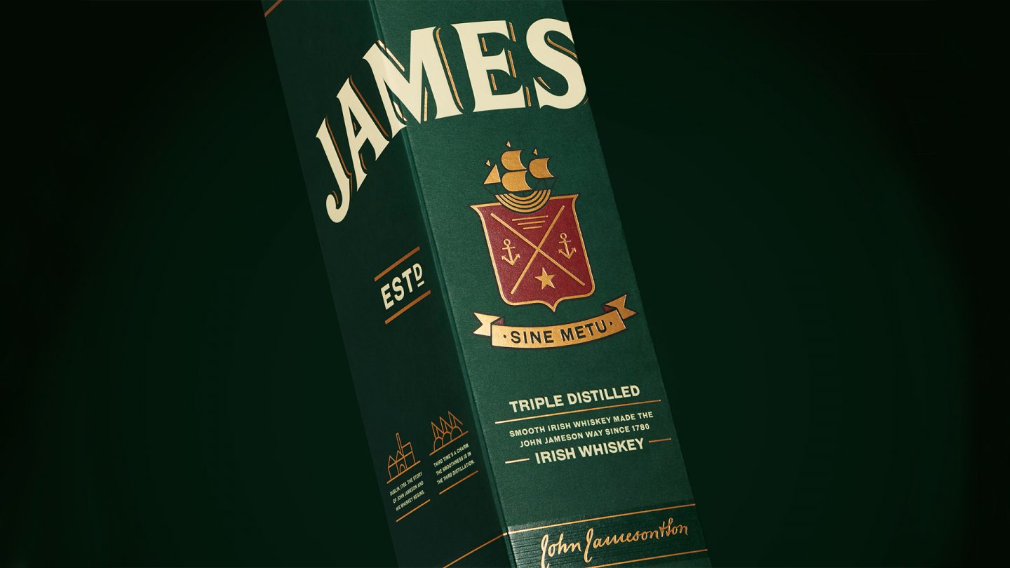
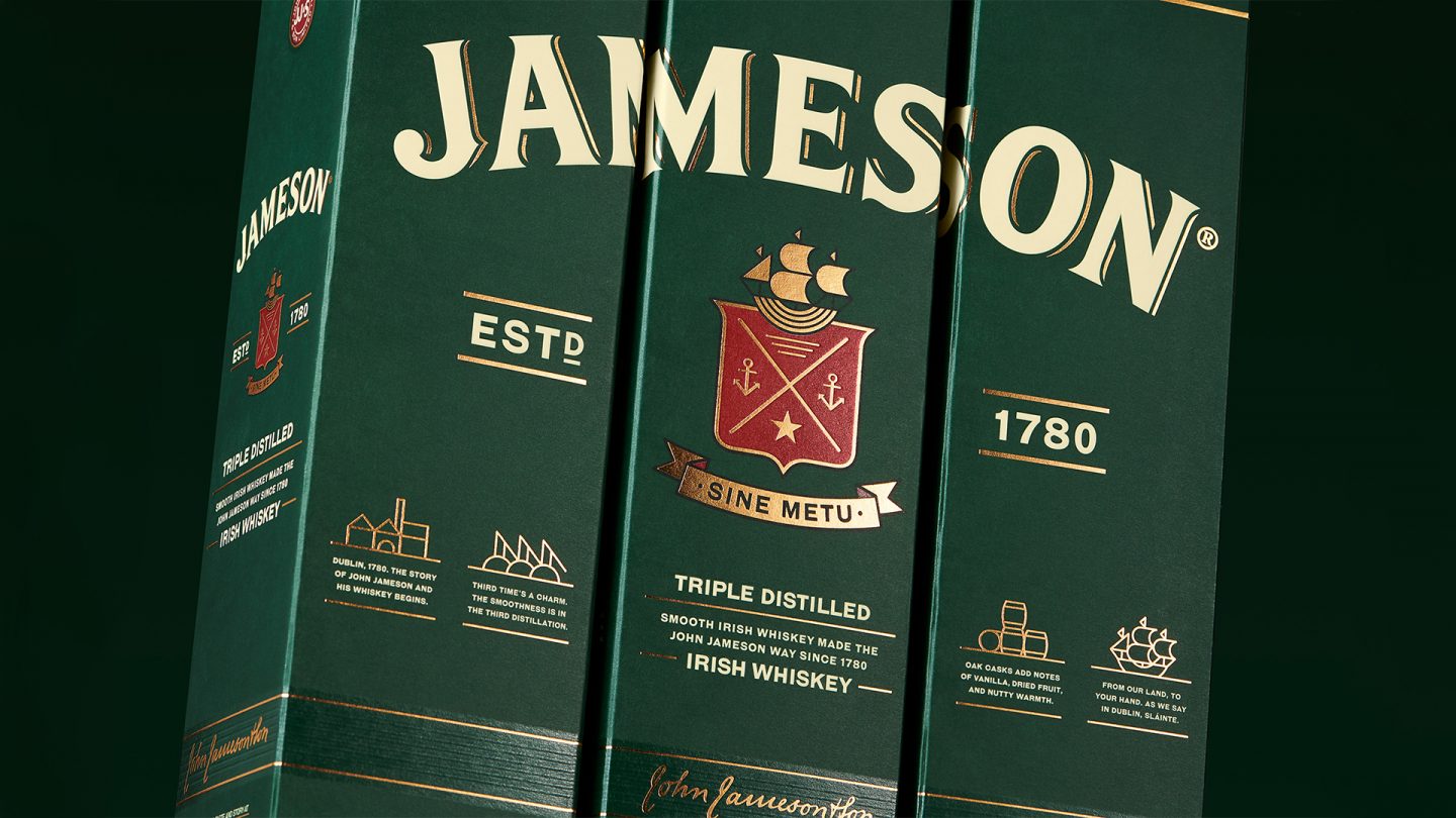
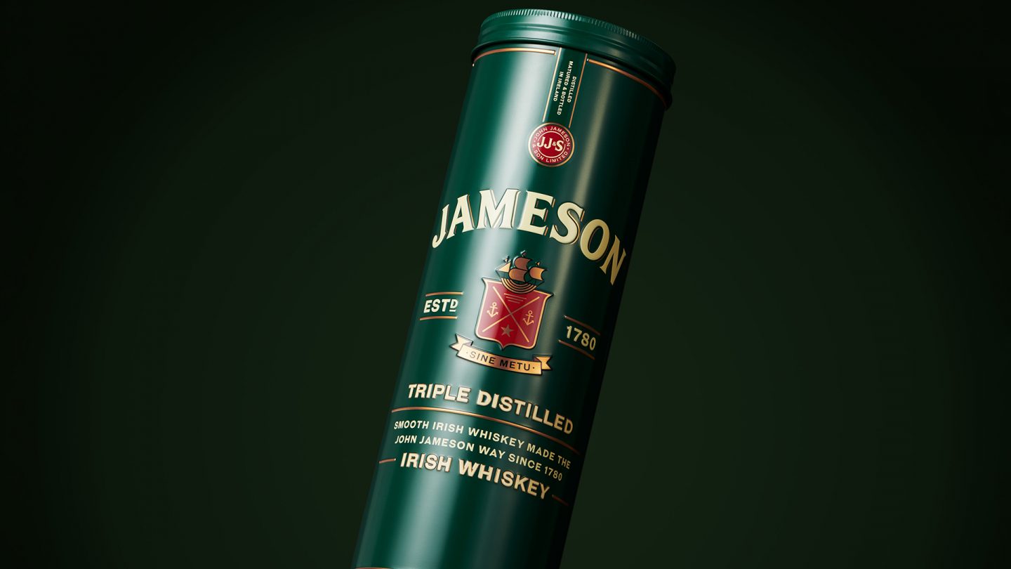
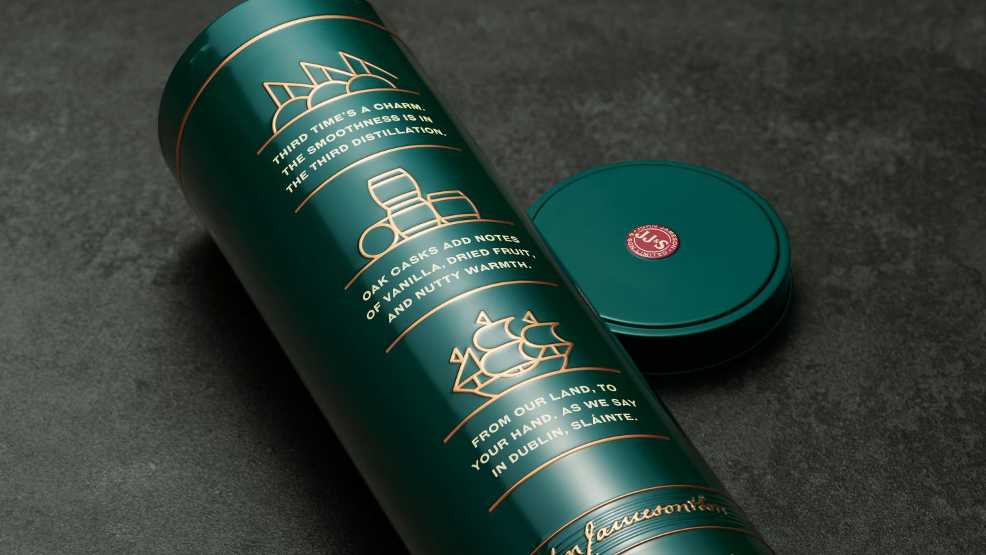
The idea
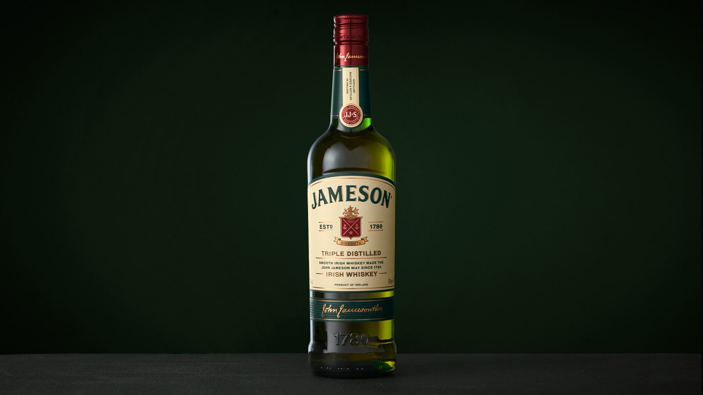
The overarching idea was to create a contemporary and fresh look, tying it closer to the brand identity and to enhance tactility and premium “hand-feel”, without losing product recognition.
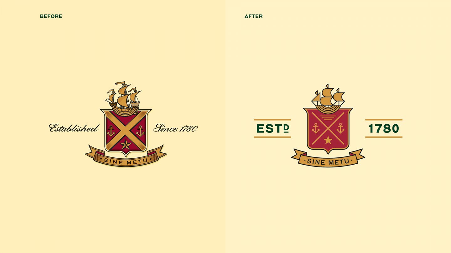
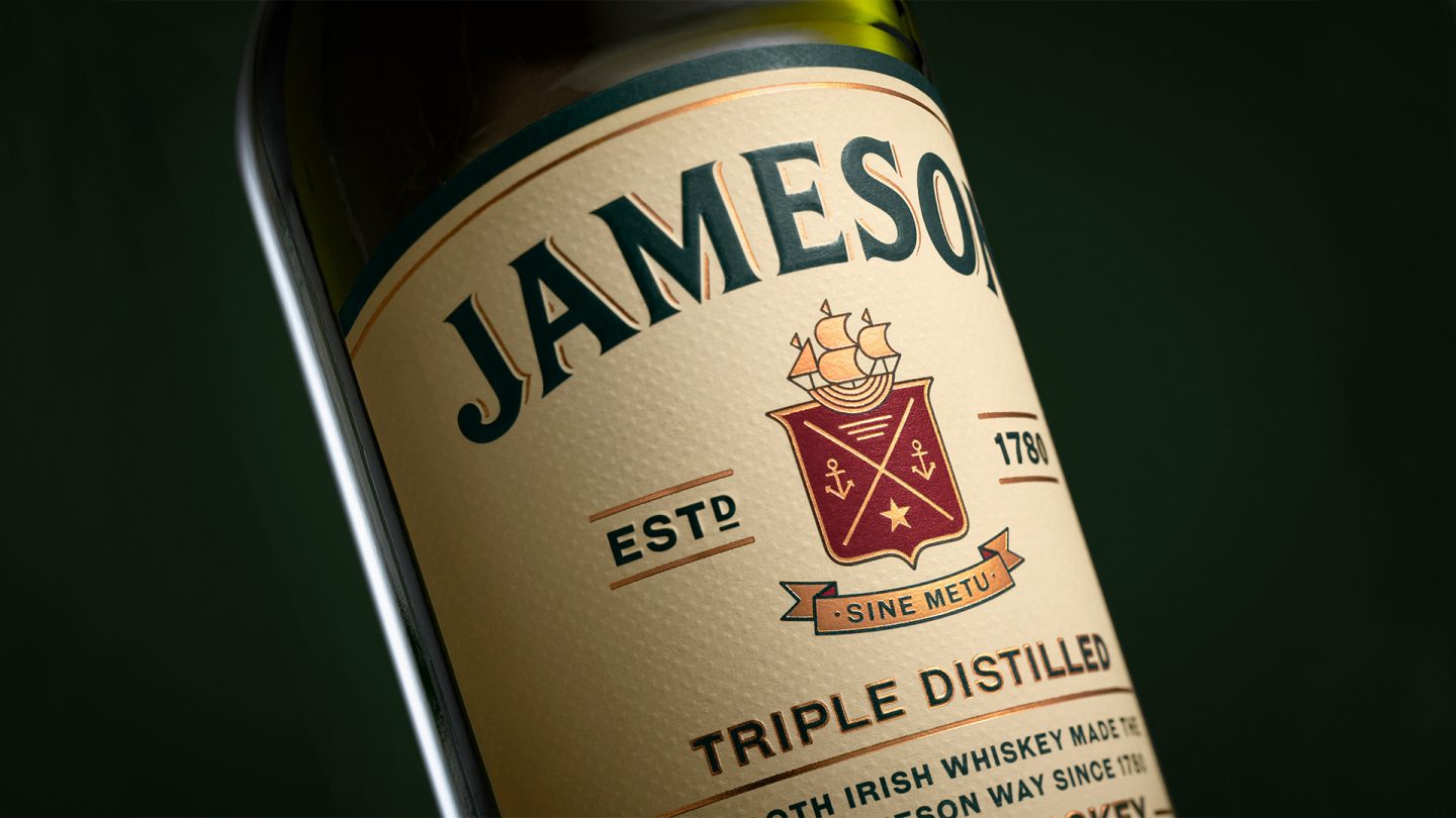
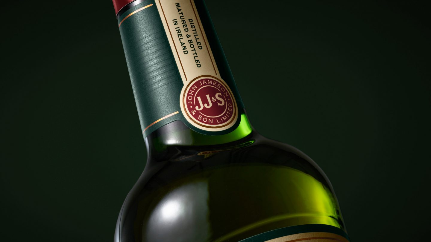
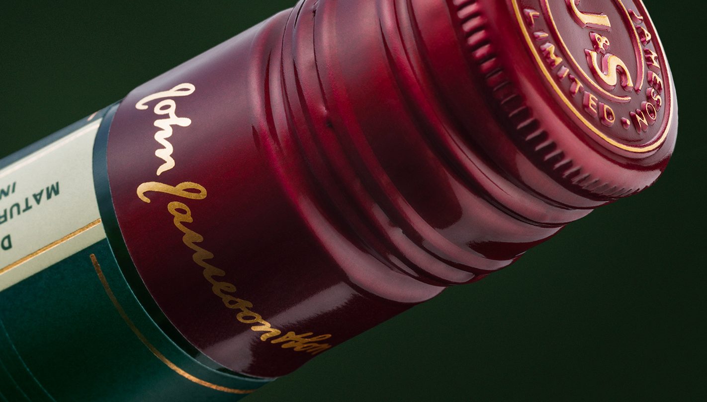
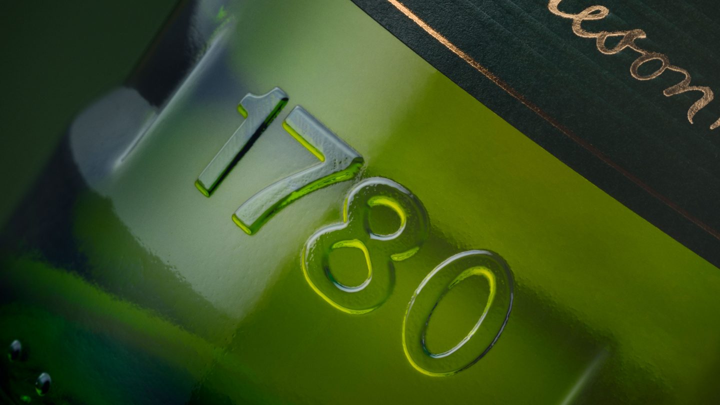
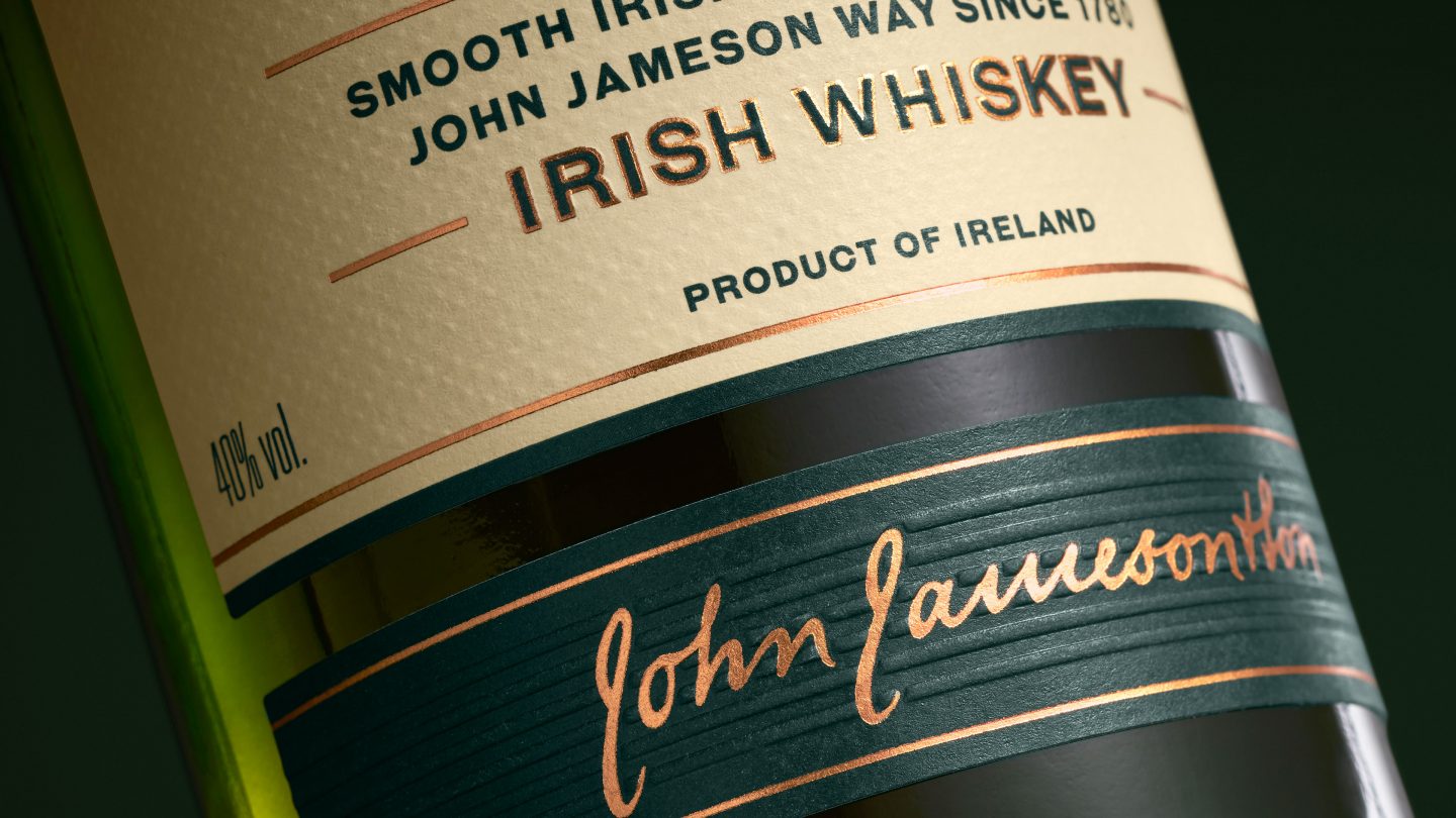
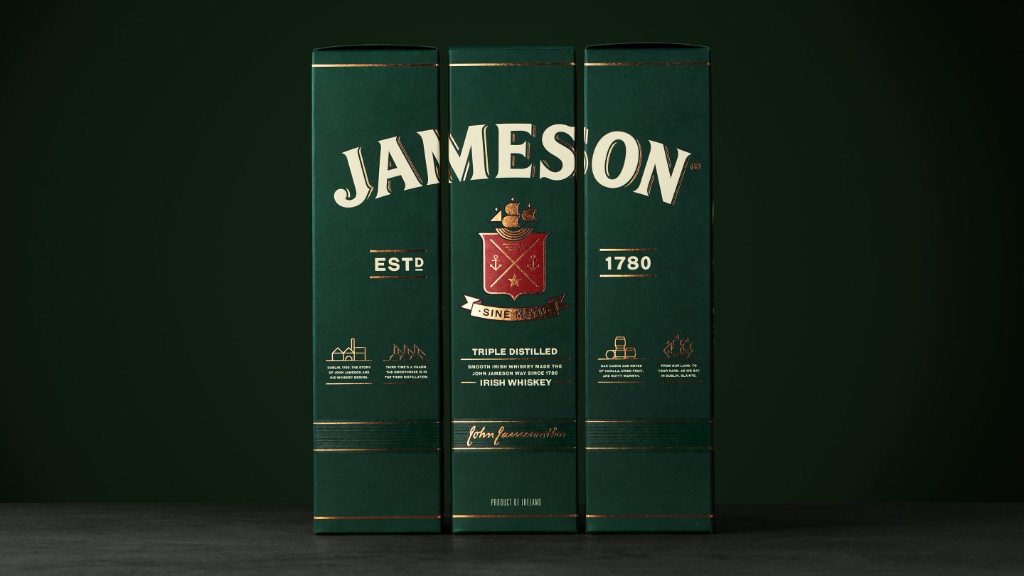
The work included reviewing every aspect of the bottle, structural, as well as copy and graphics. We created a more ownable and Jameson-unique bottle shape with a tapered body. A distinctive embossed label ‘eyebrow’ and heel at the base, gave the bottle a more tactile feel and made it memorable to hold. The green glass and easy-to-pour neck remained in place. On the label, we defined a new label hierarchy, refreshed the colour scheme, revised all design elements, redesigned the Jameson family crest, neck label, cap, copy etc. The refreshed label is printed on textured paper – while still retaining the most recognisable features to create a more timeless and cohesive look. Messaging on the bottle was streamlined to emphasise the triple-distilled production method of Jameson Whiskey.