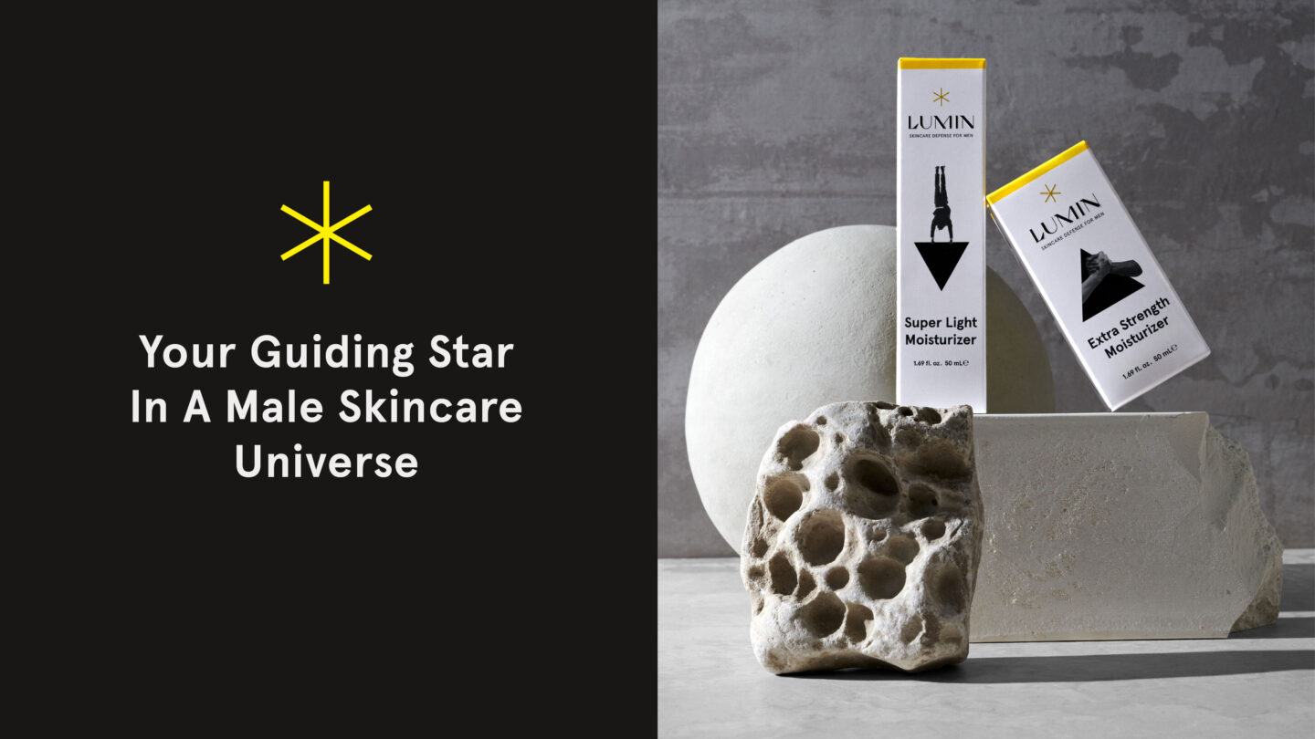
Research shows that men don’t feel included in the cultural context around skincare. Lumin, an American skincare brand, is determined to change that – and invited us to help. For the redesign, we reimagined the entire category. What would skincare look like if it had been created for men from the start? Would the aesthetics be all retrofitted and dark blue? And the narrative so razor sharp, almost like a chainsaw ad? Probably not. We think it would be easy, fun, and disruptive. So, we took off to space and dramatized a whole new universe.
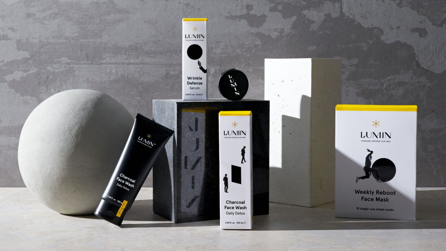
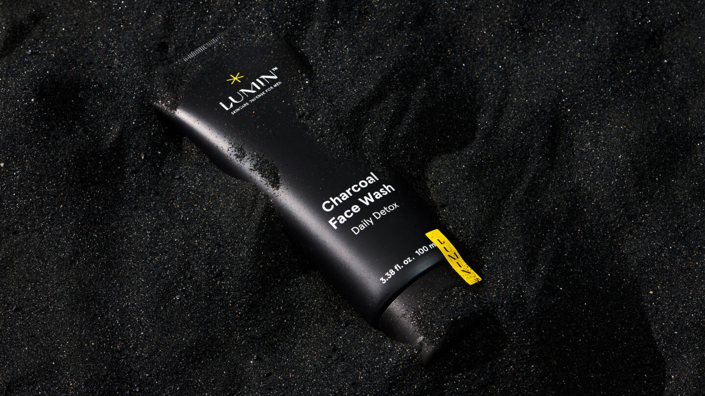
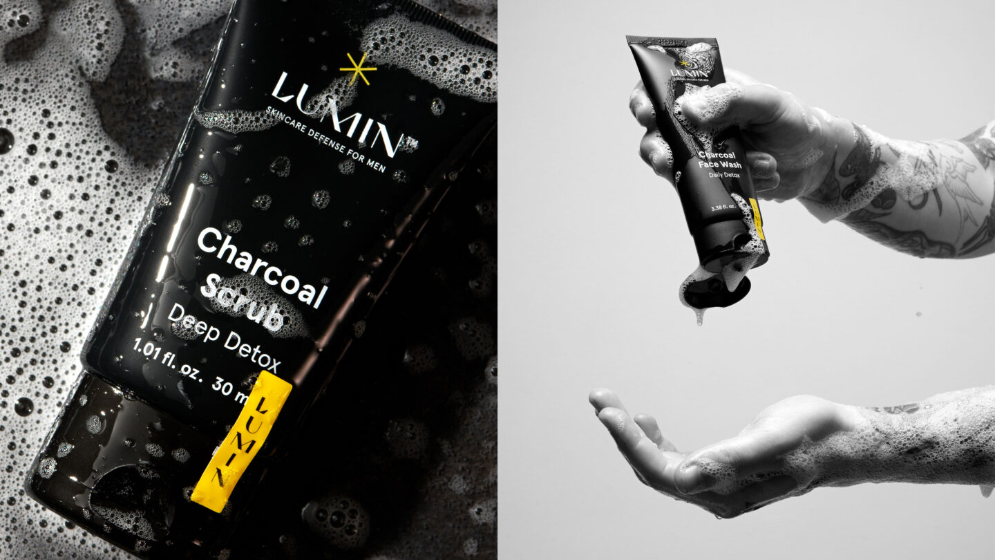
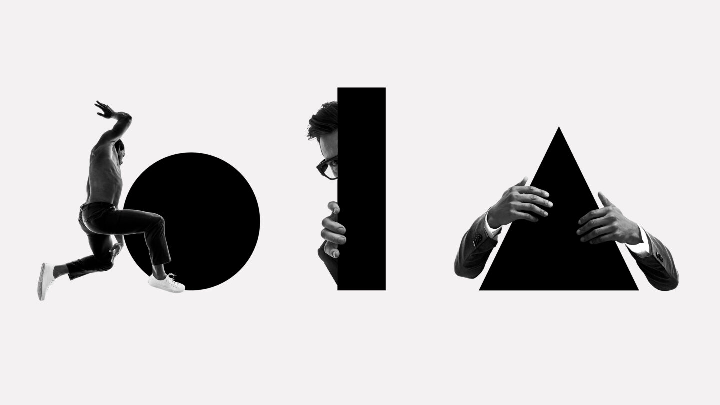
A minimalistic colour scheme. Black products in a white box, paired with a guiding yellow star. Imagery as a nod to cinematic aesthetics, adding fictional character and infusing humour to the daily routine. With phrases like “defense”, “super light” and “reboot”, we flirt with science fiction. Along with bold typography and geometric shapes, we guide consumers on how, when and what to use.
Now, Lumin has landed in American retail and global online stores – and it’s a successful launch. The brand illuminates the entire male skincare category and stands out as the guiding star in its own universe.