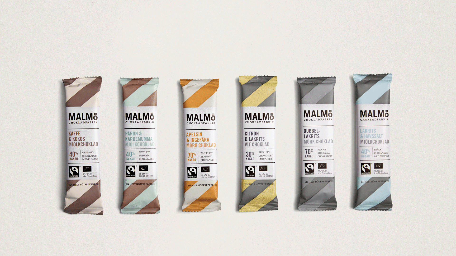
Revitalizing and modernizing a brand as iconic as God Morgon require both respect and dedication. God Morgon, a pioneer within organic juices and sustainable thinking, is one of Scandinavia’s most beloved brands, instantly recognizable by millions of consumers.
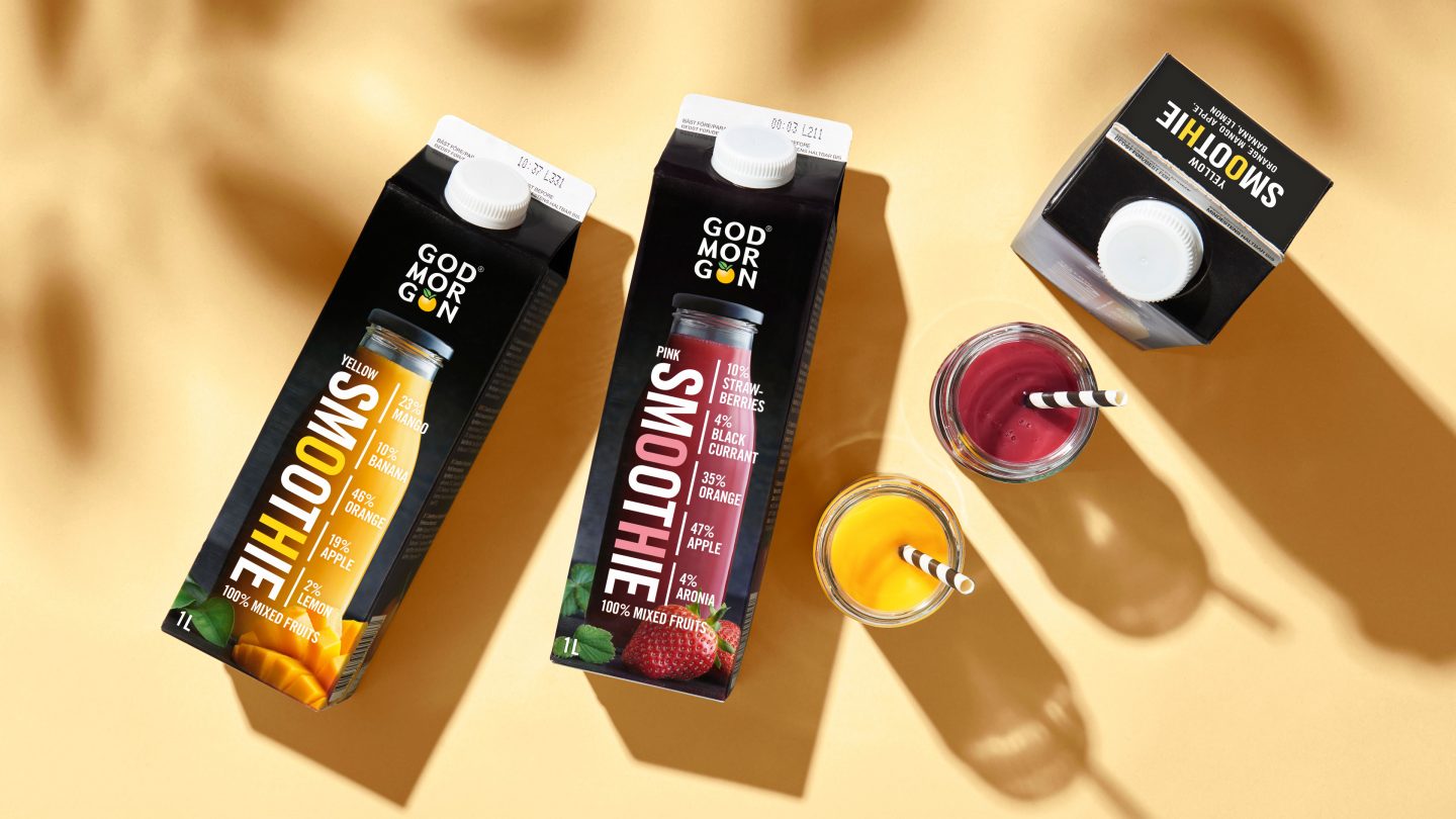
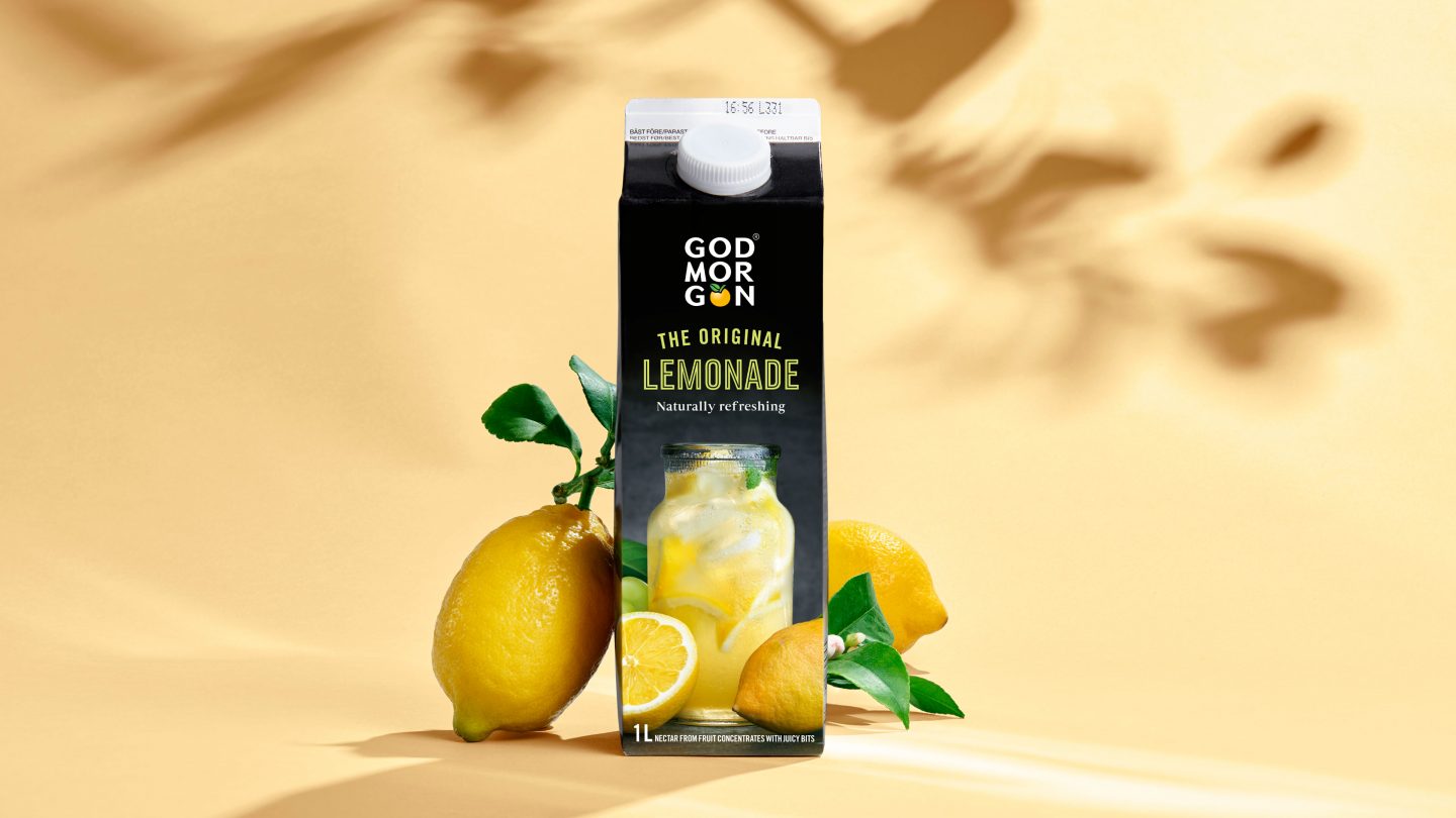
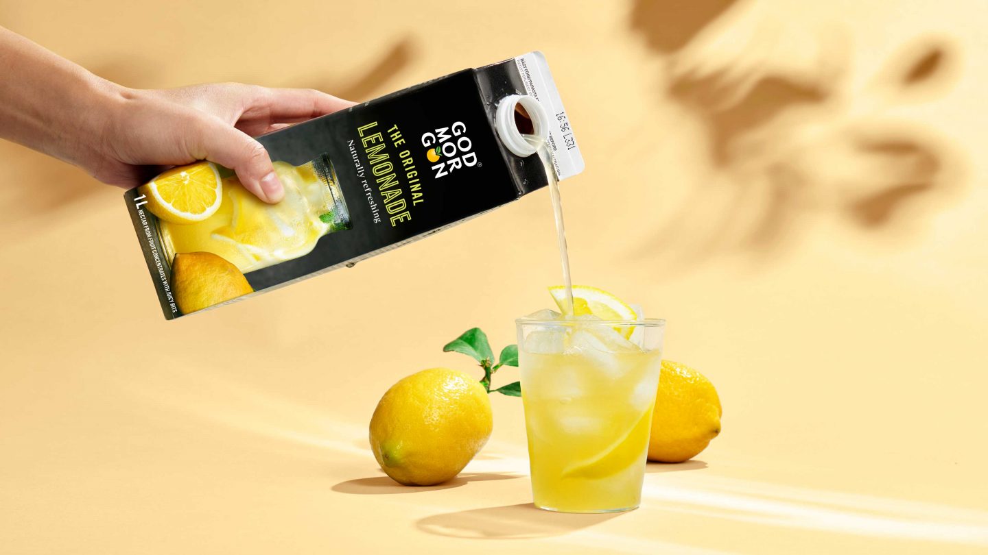
About 50 years of juice knowhow had seen God Morgon’s portfolio expand from classic breakfast juices to smoothies, lemonades and functional juices. As the range grew, the visual impression of the brand was becoming both dated and inconsistent. Furthermore, the brand was embarking on a journey to strengthen its social responsibility and sustainability impact, and needed to create a visual platform that would be able to support the strategy and future-proof it. There was a need to develop a new design strategy and an overarching visual identity to clearly demonstrate the breadth of the portfolio and at the same time unify the visual language for the whole assortment.
The solution
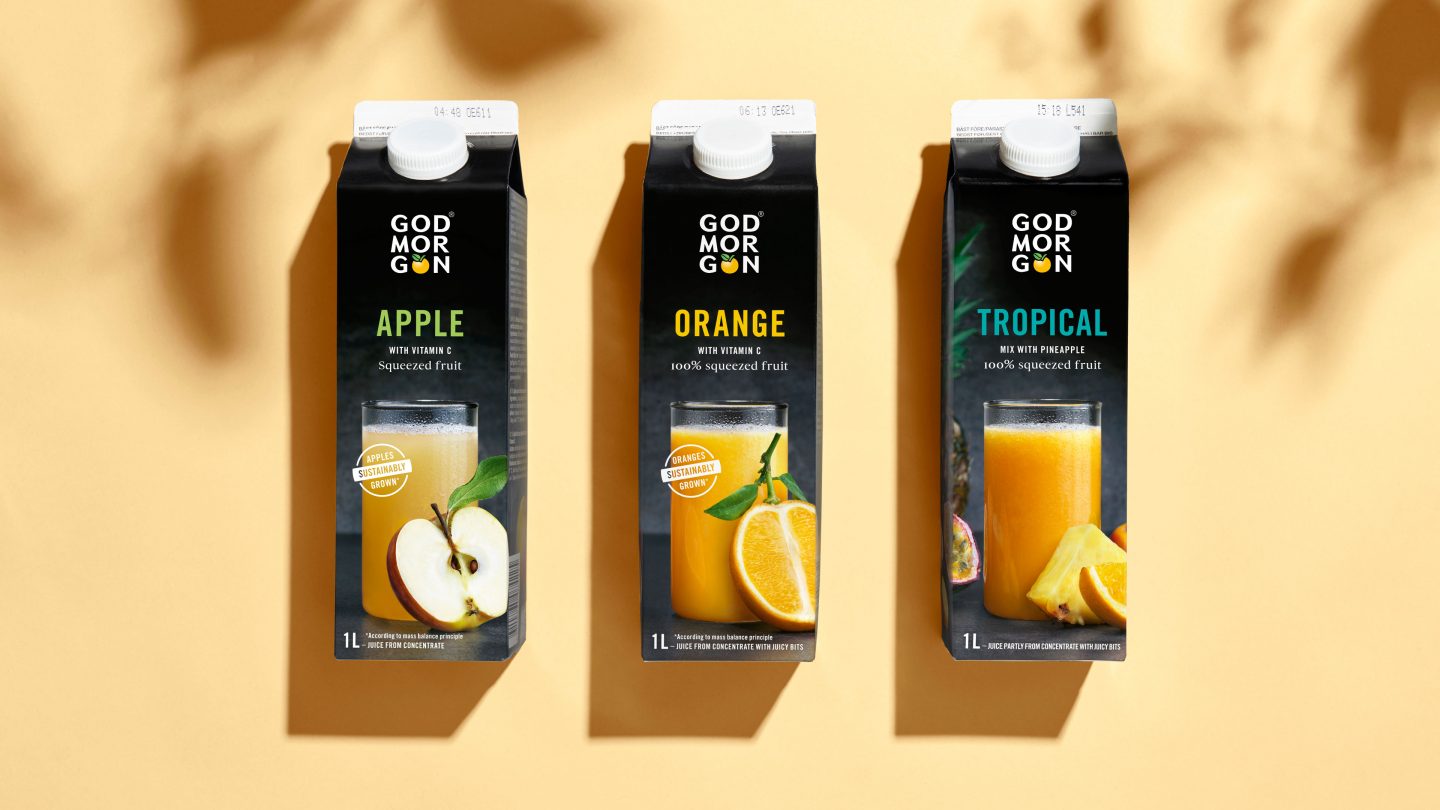
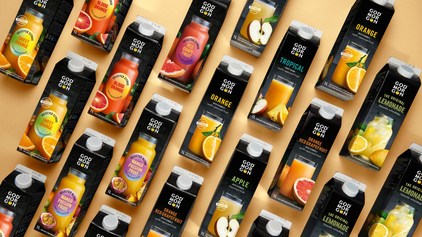
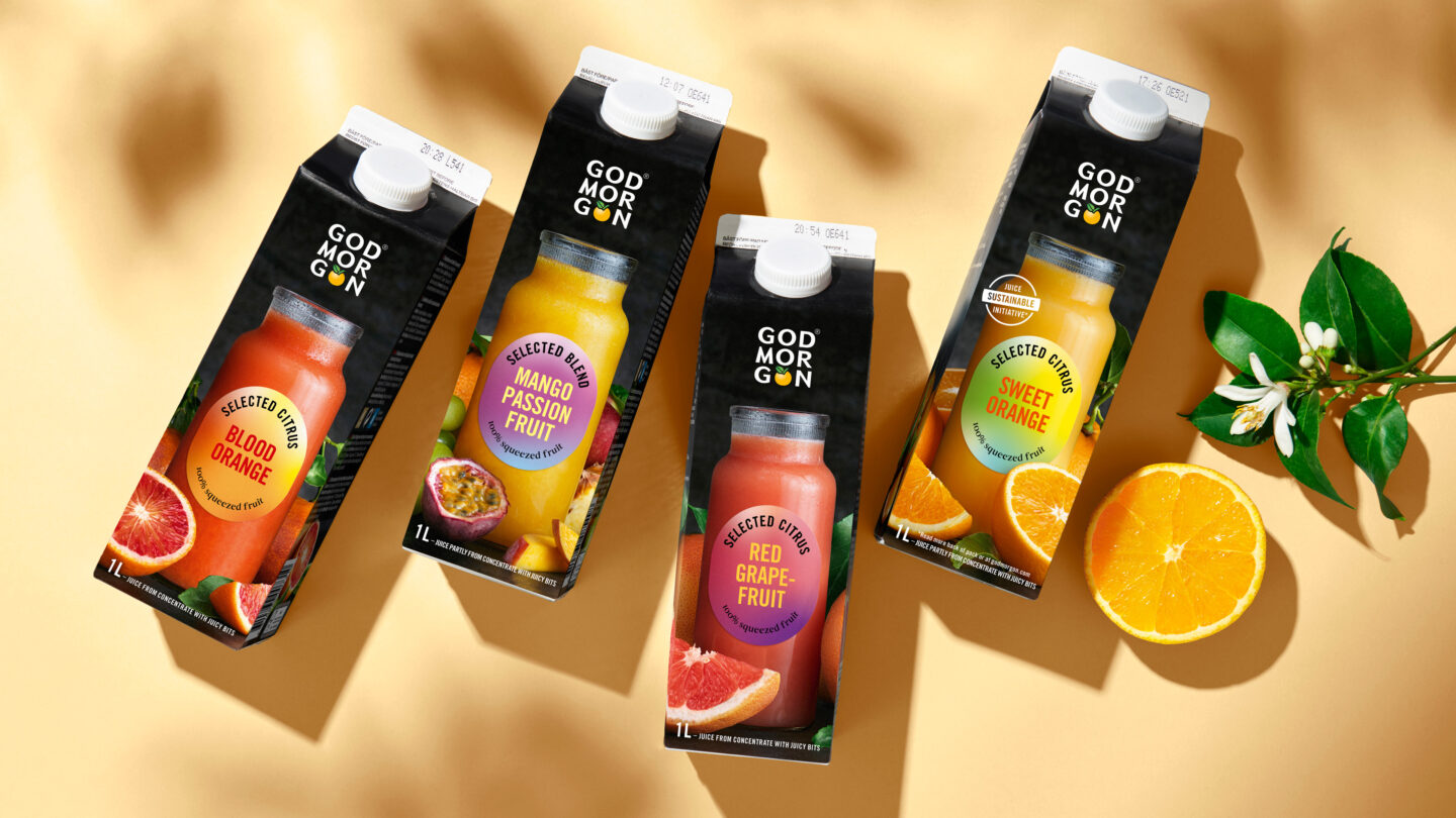
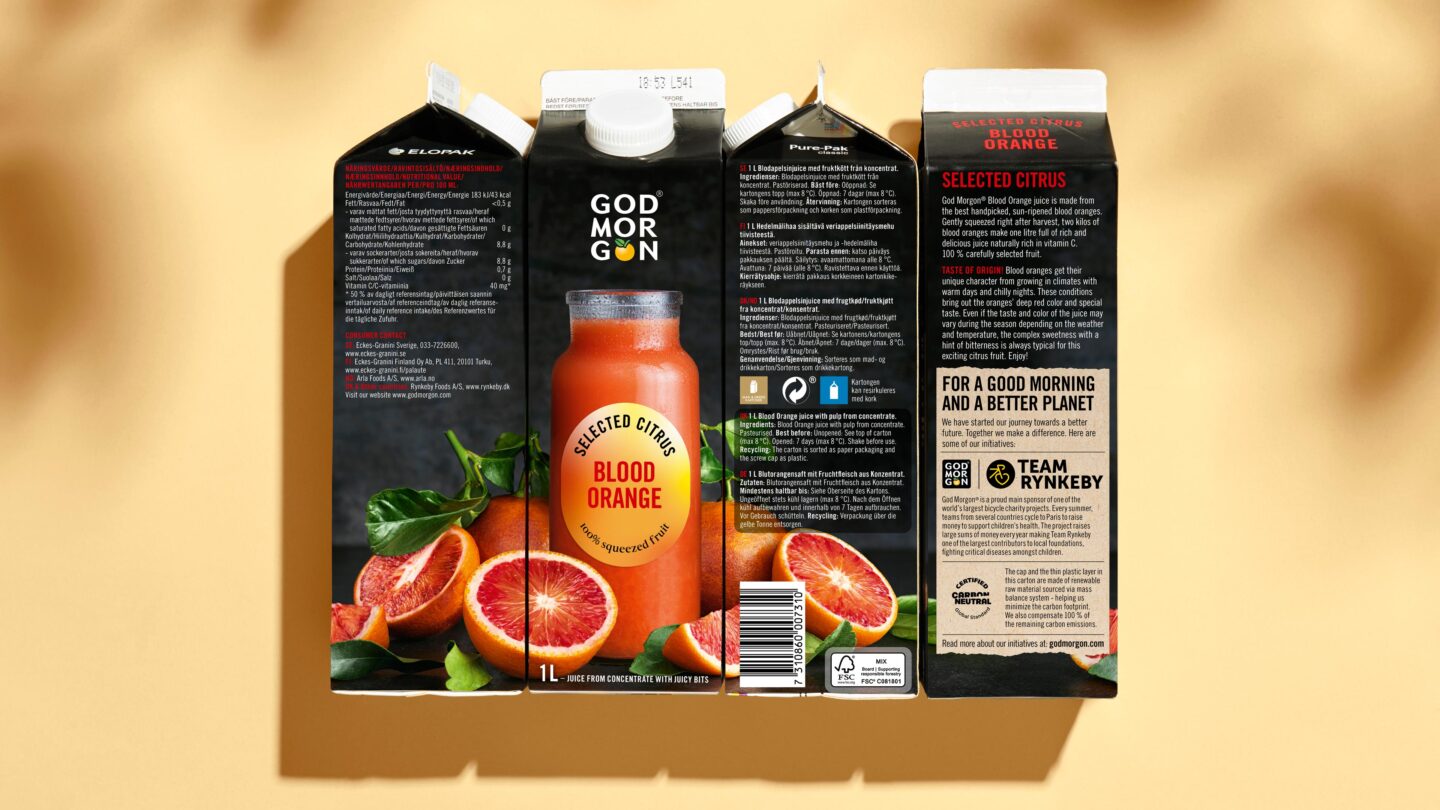
The focus was to create a design that reflected God Morgon’s values and personality, delivered strong on-shelf standout, resonated well with consumers and was easily identifiable. To optimize the product portfolio, a new naming hierarchy was created, complete with updated product names that clearly distinguished between ranges. Core design elements and typography were revised and modernized. Design assets were streamlined and strengthened, and a refreshed color scheme created a new impact, while the black brand color was kept intact.
The result is a flavor-forward design which is very much God Morgon, with a modernized and authentic look. The style is dynamic with fruits and juices photographed using natural light, which creates a genuine and inviting impression. Although each range is distinct, the overall unity of the design is kept. To further strengthen the experience of taste and authenticity, the design story is told around the whole pack with a 360-degree perspective approach. All in all resulting in a contemporary design that reflects the brand’s spirit, personality and values and forms a solid foundation for God Morgon’s ambitious future journey. The design has been positively accepted by the market, with a visible upswing for the products on shelf and a growing YTD performance across the portfolio.