Jameson Whiskey is the best-selling Irish whiskey in the world, with annual sales topping 7 million cases in 130 markets, and with 29 consecutive years of growth.
Mission
Jameson brand was enjoying significant growth with an ambition to grow even further. For this strategic purpose, there was a need to create a visually impactful brand experience with a single-minded, yet dynamic identity, that would lead the way forward.
The large number of brand-assets previously in use made the brand look and appear cluttered. We were commissioned to create a clear future fit design strategy and visual identity for an iconic passion brand. Assets had to be reviewed, selected, refined and redefined. There was also a growing need to hold the brand expression both congruent and unified across markets, and at the same time, adapt to local conditions. The ambition was to create a new strategic identity and toolbox, that would guarantee consistency/flexibility across markets, portfolio and communication.
Insight
As the Jameson brand look towards the year 2030, a more gender-neutral, global and diverse audience is emerging, with appreciation of brands that promote social inclusion, globalism, diversity and human connections. Honest ‘human’ brands, that facilitate fluid, dynamic and social experiences, will win consumers’ appreciation. In addition, signals from local markets indicates the importance of focusing on local needs, cultures and specific market dynamics.
The idea
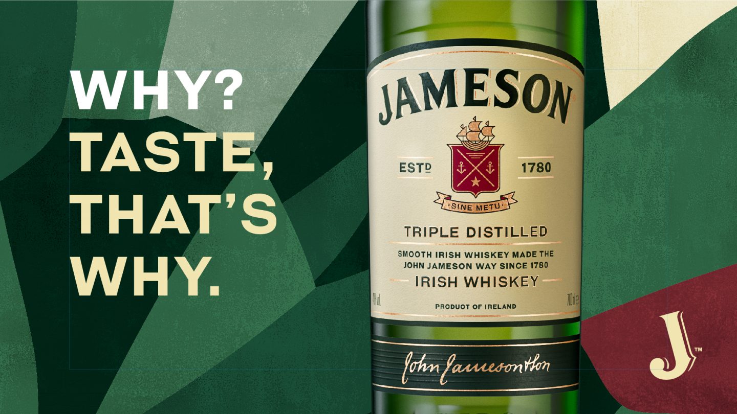
The Jameson brand, with its unpretentious personality and inclusive tone of voice, appeared to be a good match to consumers’ expectations from future brands. To enhance consumers’ emotional connection to the brand it had to be single-minded in its expression, recognizable, powerful and clear. We needed to create a distilled, dynamic and contemporary visual identity for the impactful brand.
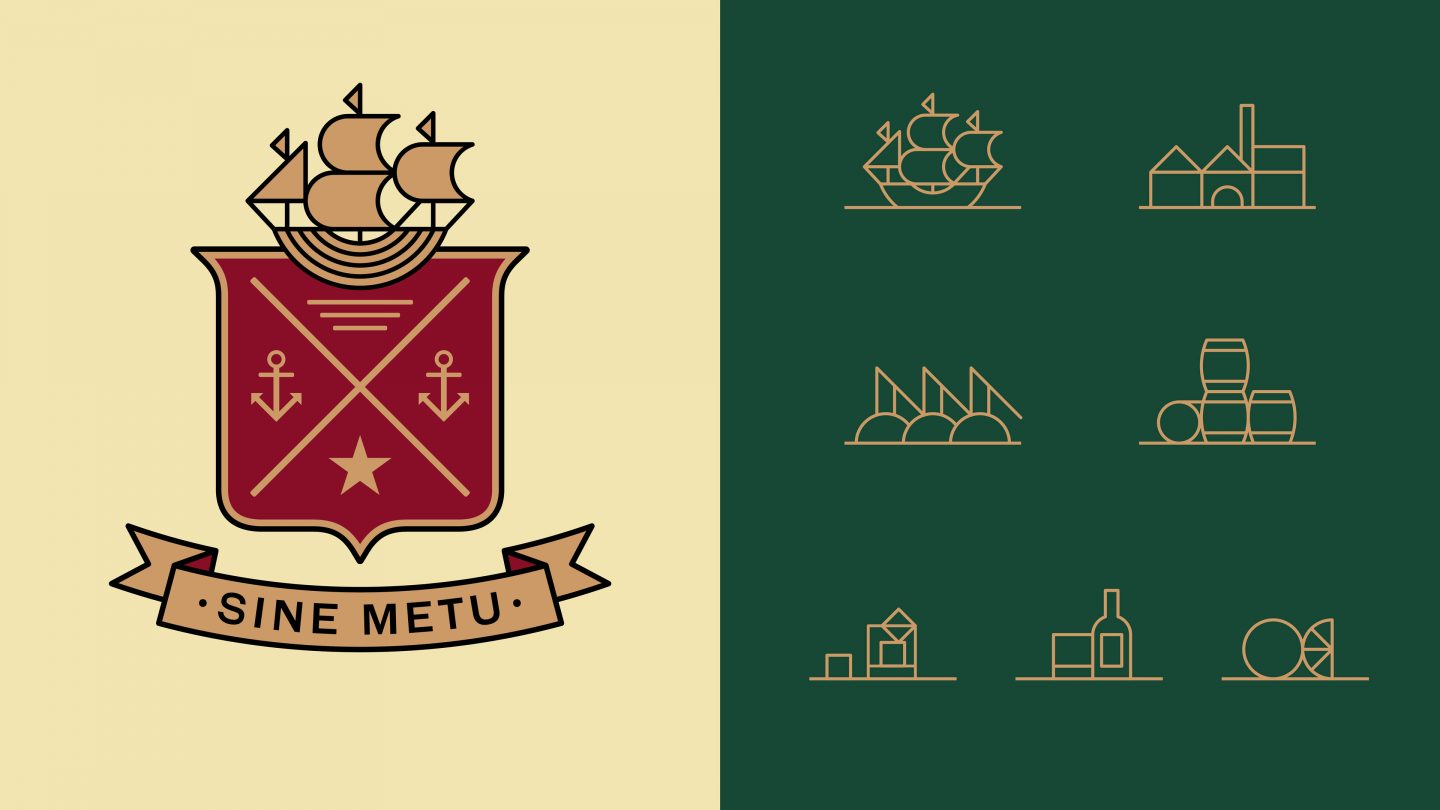
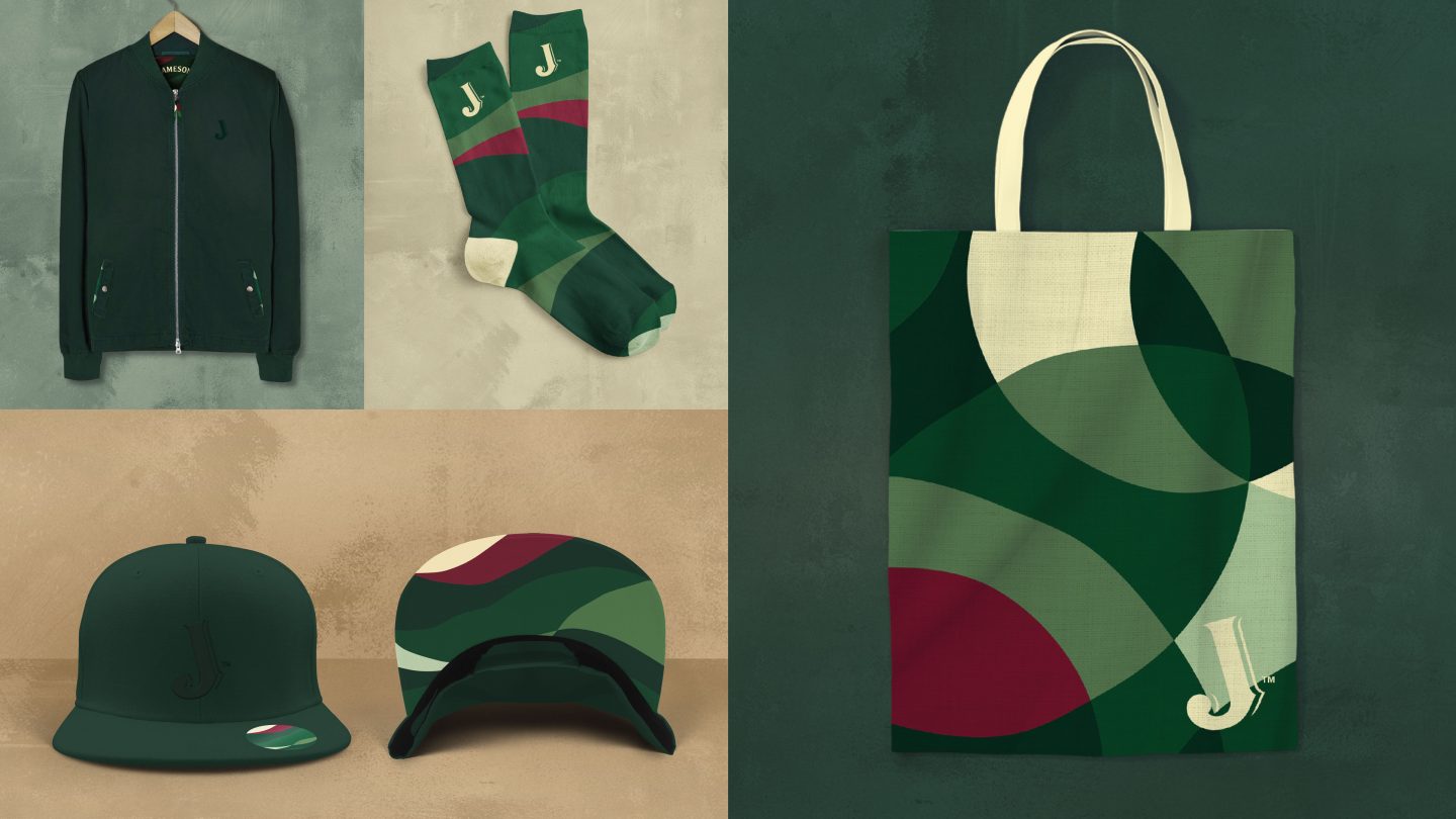
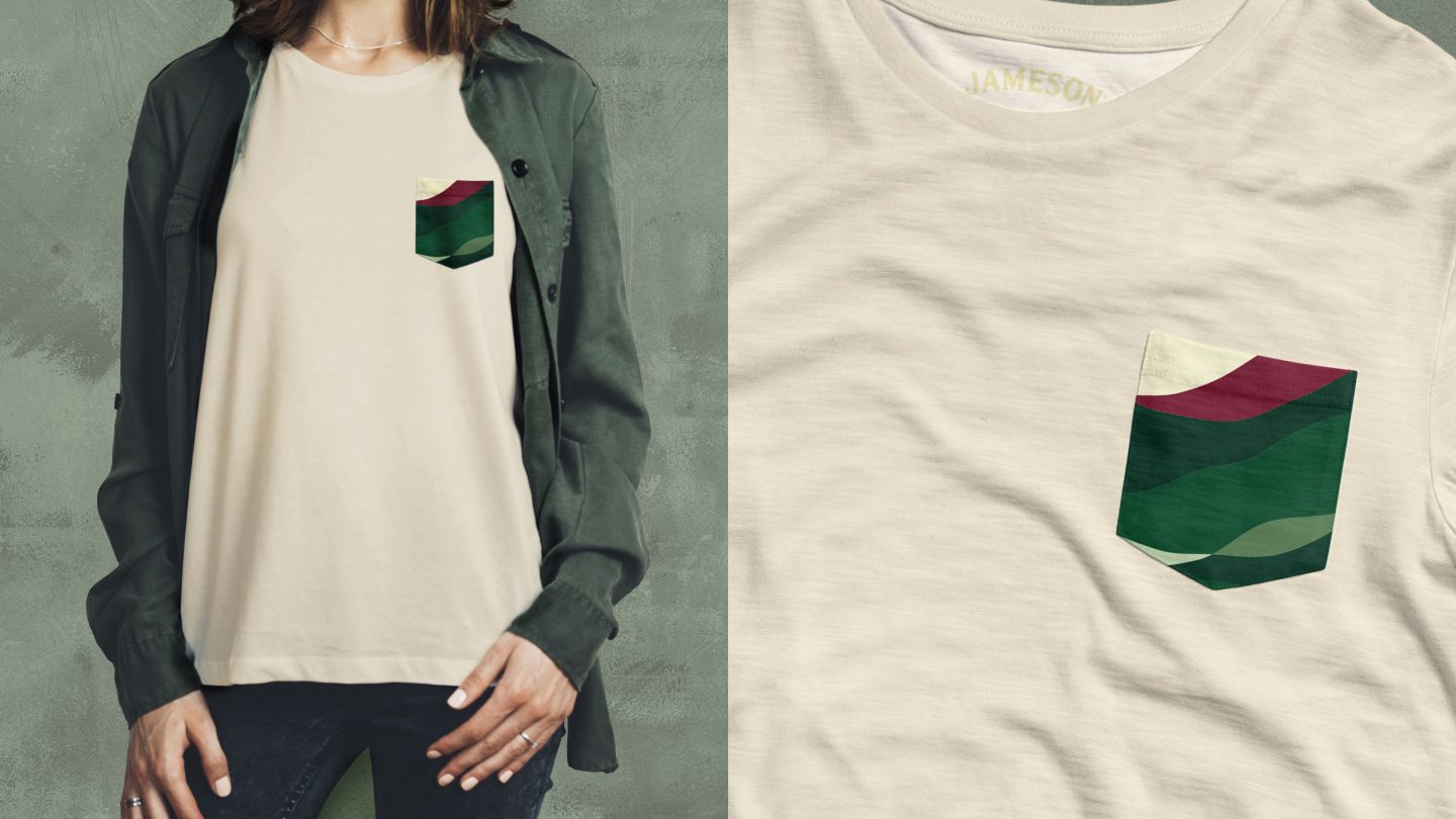
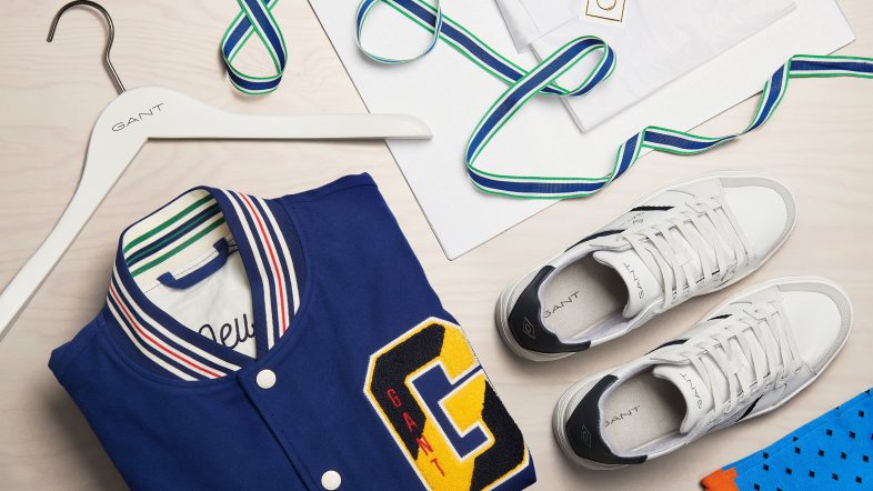
We started by analyzing all of the brand’s assets for a distinct core and created a unique recognizable Signifier for the brand. The Jameson’s “J”. A visual shape slightly tilted to make it more evident. Followed by an update of both typography and fonts for a clear visual identity, including a handwriting style based on John Jameson’s signature. A new set of icons was designed as well, based on the Jameson family crest. We also developed a modernized colour scheme for a more versatile and flexible application. Photography and the overall imagery style was defined, with focus on authenticity, diversity and inclusiveness through true-to-life situations, real people and shoots done in natural light.
We also looked into the DNA of Jameson, and a number of elements emerged; barley, water, wood, fire, time and glass. The true nature of the brand. Those were transformed into a number of deconstructed patterns, used as a canvas, subtle enough for backgrounds, still dynamic and adaptable to different markets.