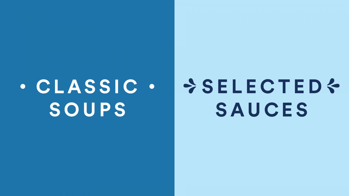
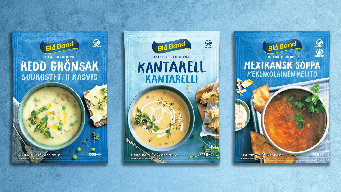
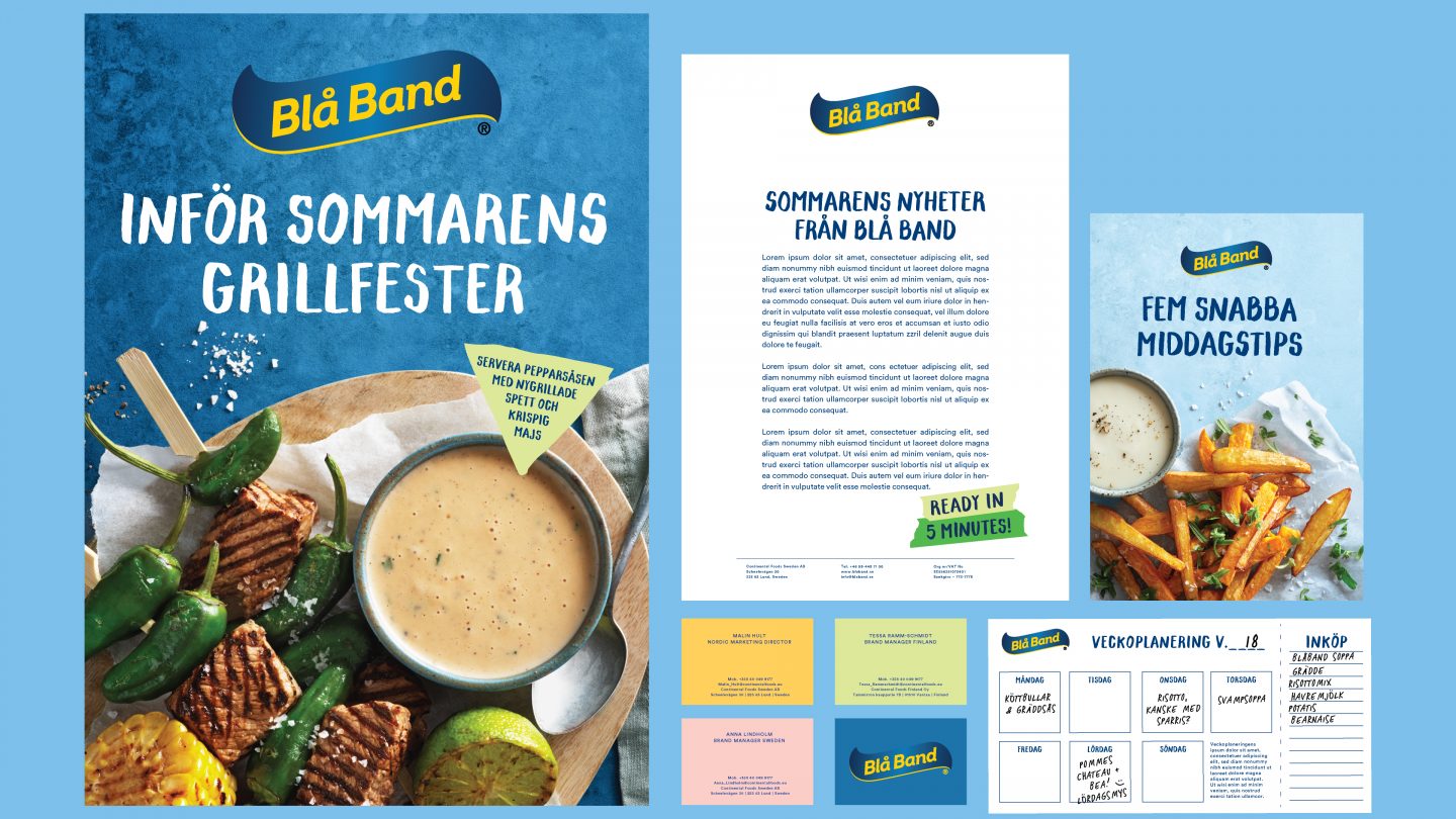
Blå Band, a classic food brand, launched its first chicken soup in the 50s. Today the assortment includes around 60 different products – mainly dry soups, sauces and food mixes.
Mission
The Blå Band brand was facing a number of challenges, ranging from growing competition, to a somewhat vague brand position, inconsistent communication and unclear portfolio- and naming strategy. Pond Design’s mission was to strengthen the Blå Bands’ portfolio and overall identity and to create a new brand and visual identity, applicable across the brand’s different touchpoints.
Insight
Food and cooking are, for many consumers, a source of frustration. Faced with the lack of time, money, and knowledge, but with the desire to eat well, people look for convenient solutions. Although dry foods can help them manage some of their cooking needs and ease their frustrations, dry foods are perceived as outdated, artificial and over-processed. Shopping for dry food is neither fun, exciting nor inspiring.
The idea
Given the challenges posed by both category and brand, the overarching goal for the new brand identity was to create a relevant, modern, inspiring and attractive design and brand world, full of positive energy.
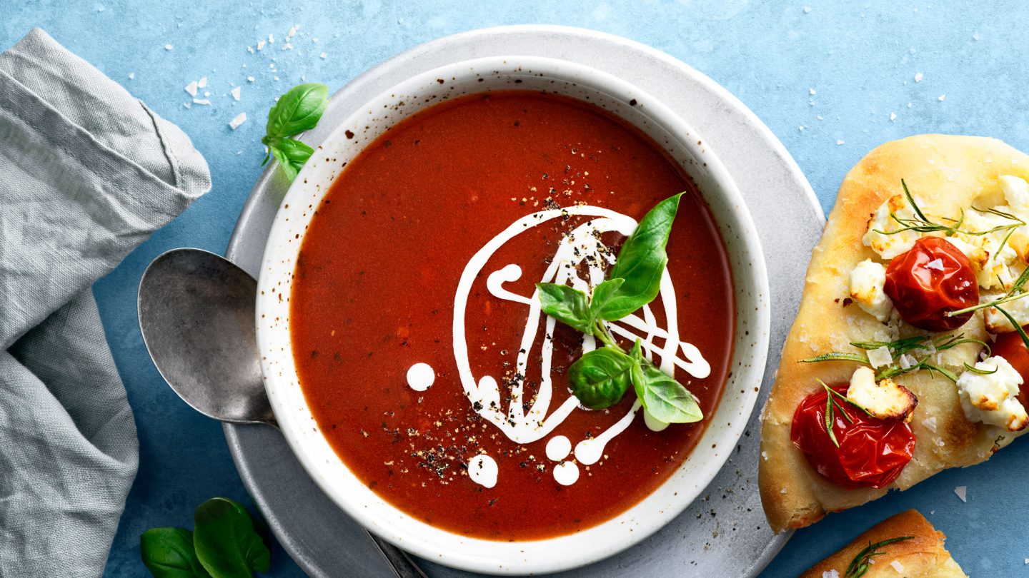
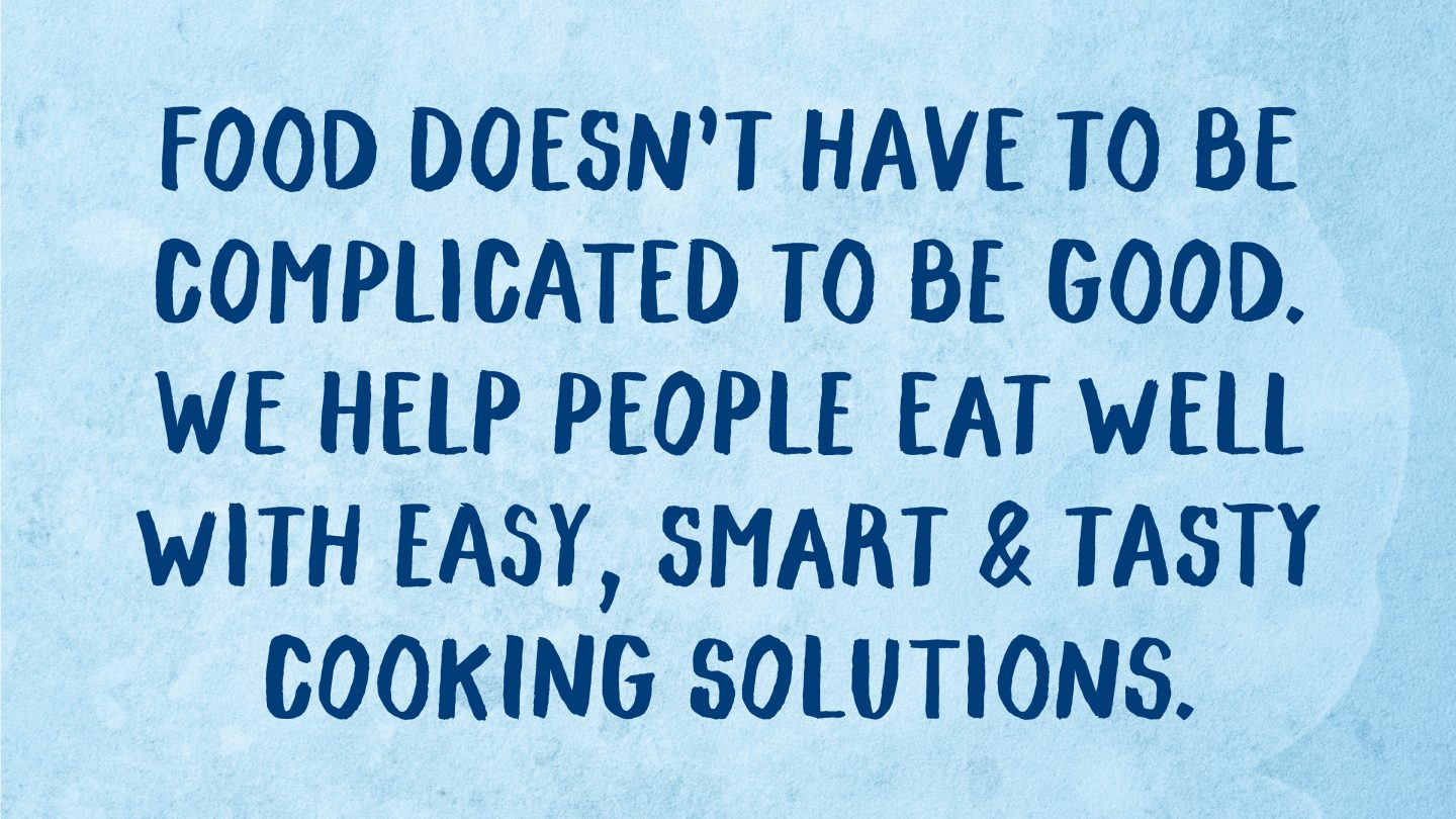
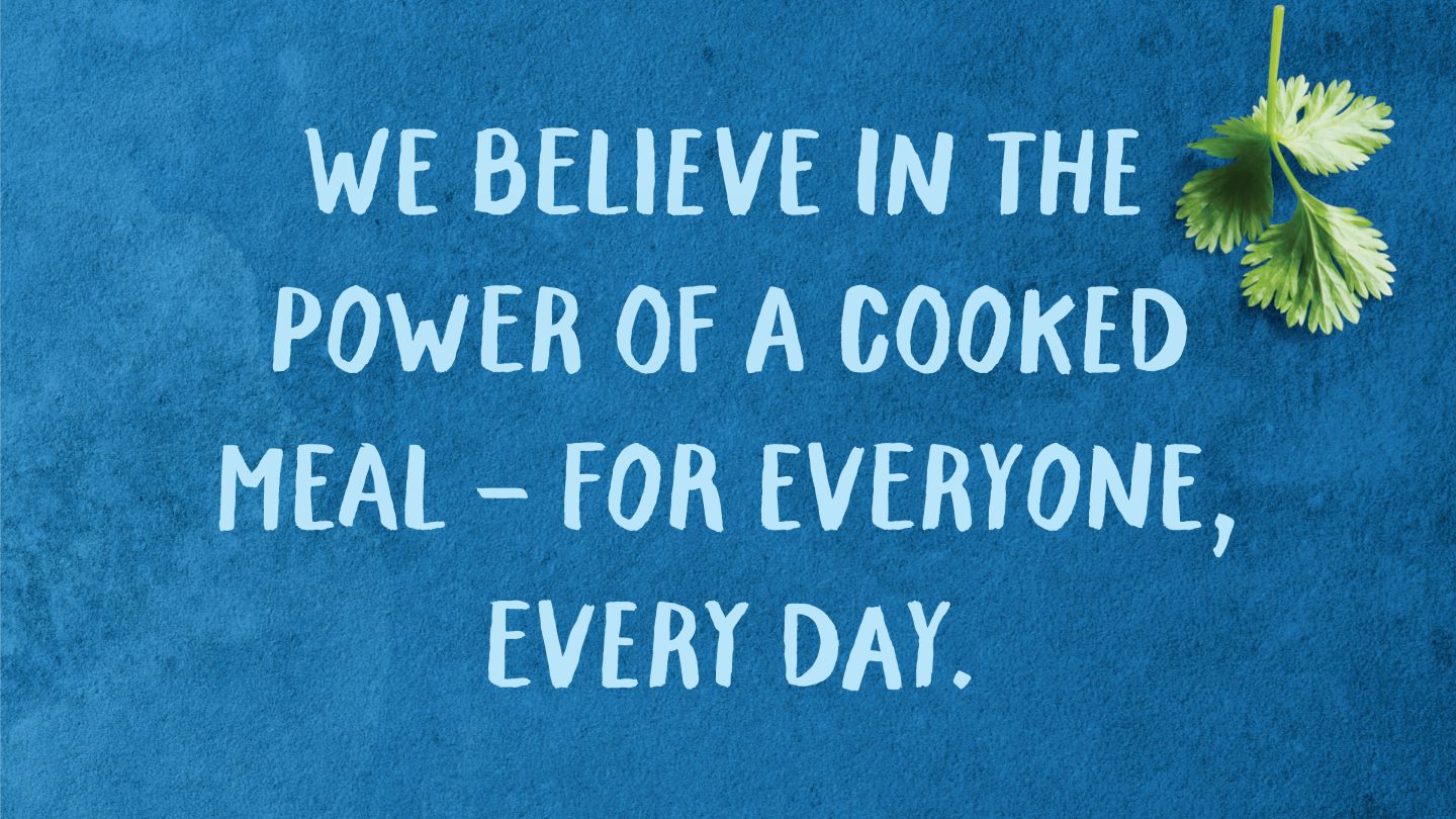
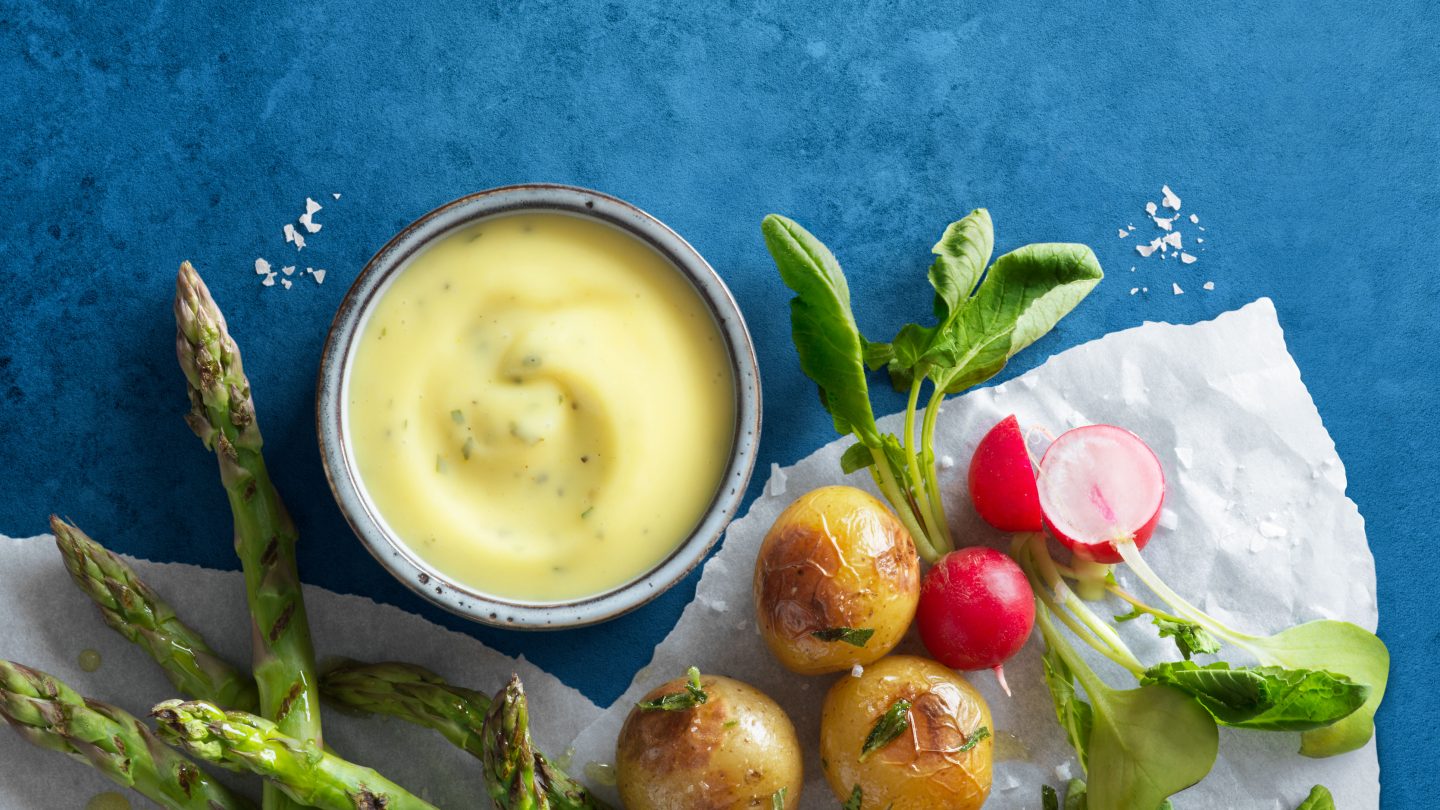
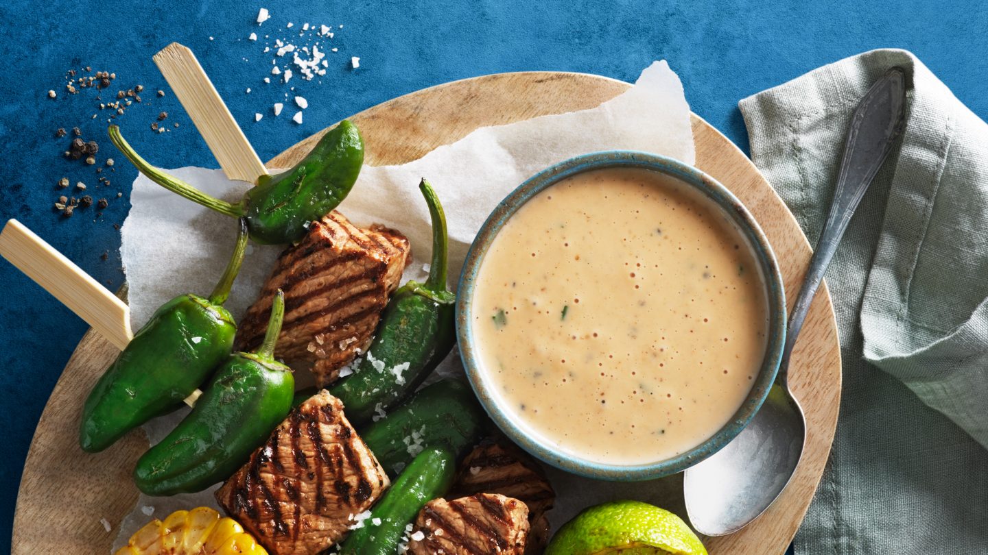
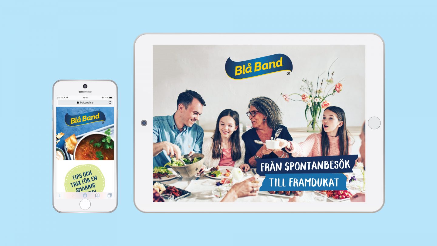
We created a warm, happy and inviting identity, called Happy Blue. The logotype was modernized, and a completely new visual language was designed. To achieve an authentic, vibrant and personal impression, we created a visual world inspired by home-cooking, which looked warm, tasty and inviting. Food images showed actual dishes, photographed in a realistic way, with bread crumbs, spices and herbs strewn on the table. New graphic elements and typography were created, focusing on playfulness and joy. The message was that it should simply feel great to cook with Blå Band, with its Happy Blue world that welcome consumers and invites them to be creative.
