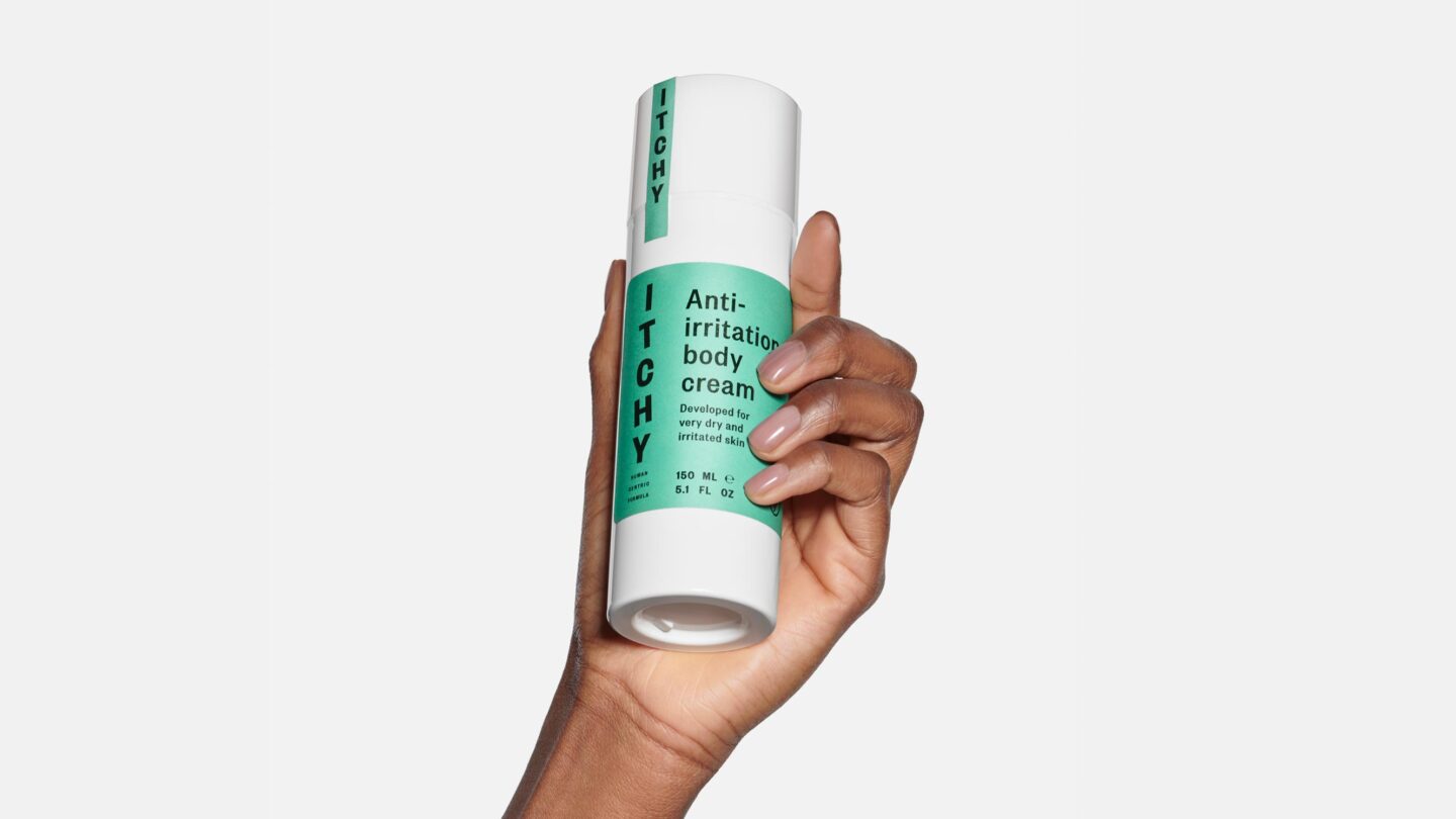
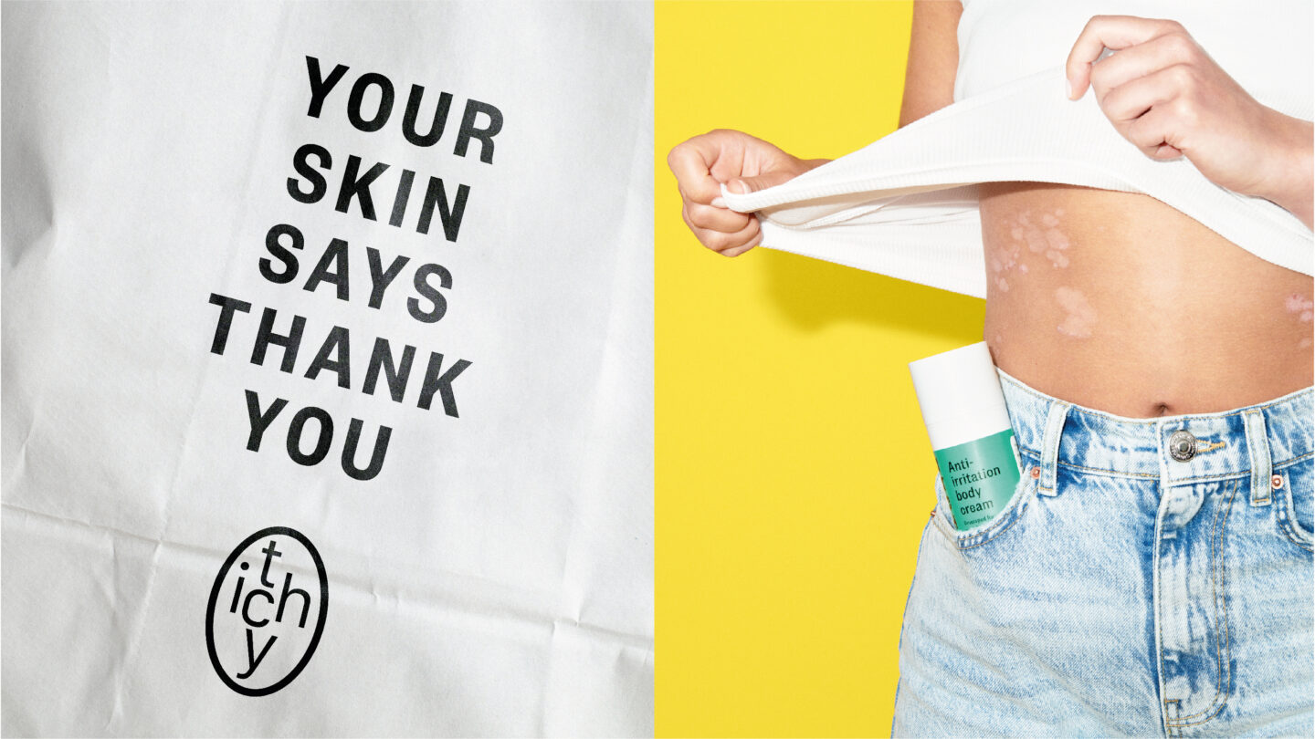
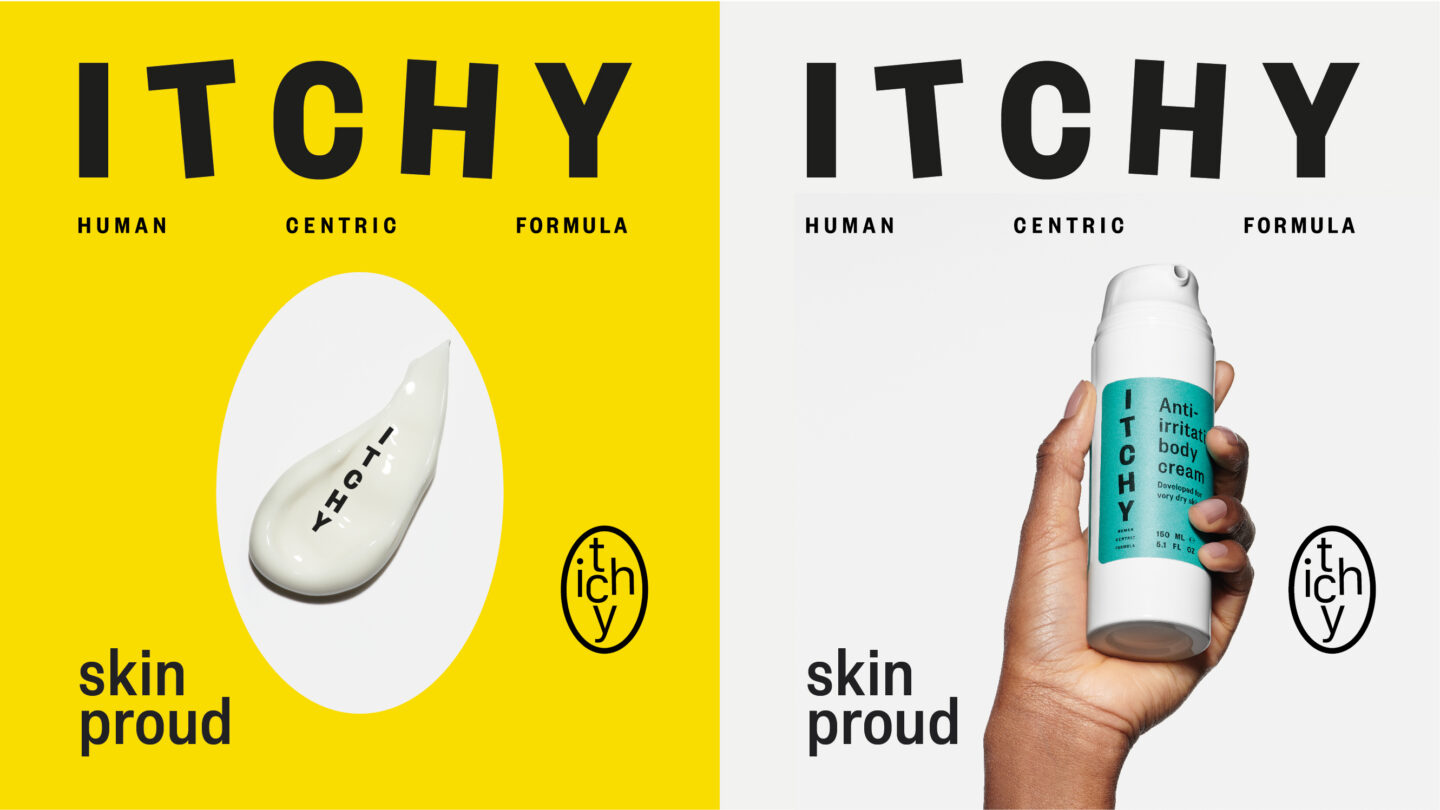
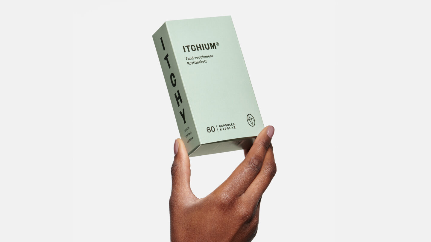
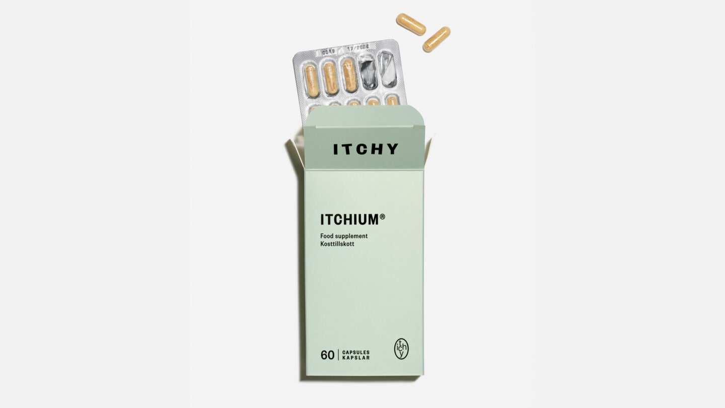
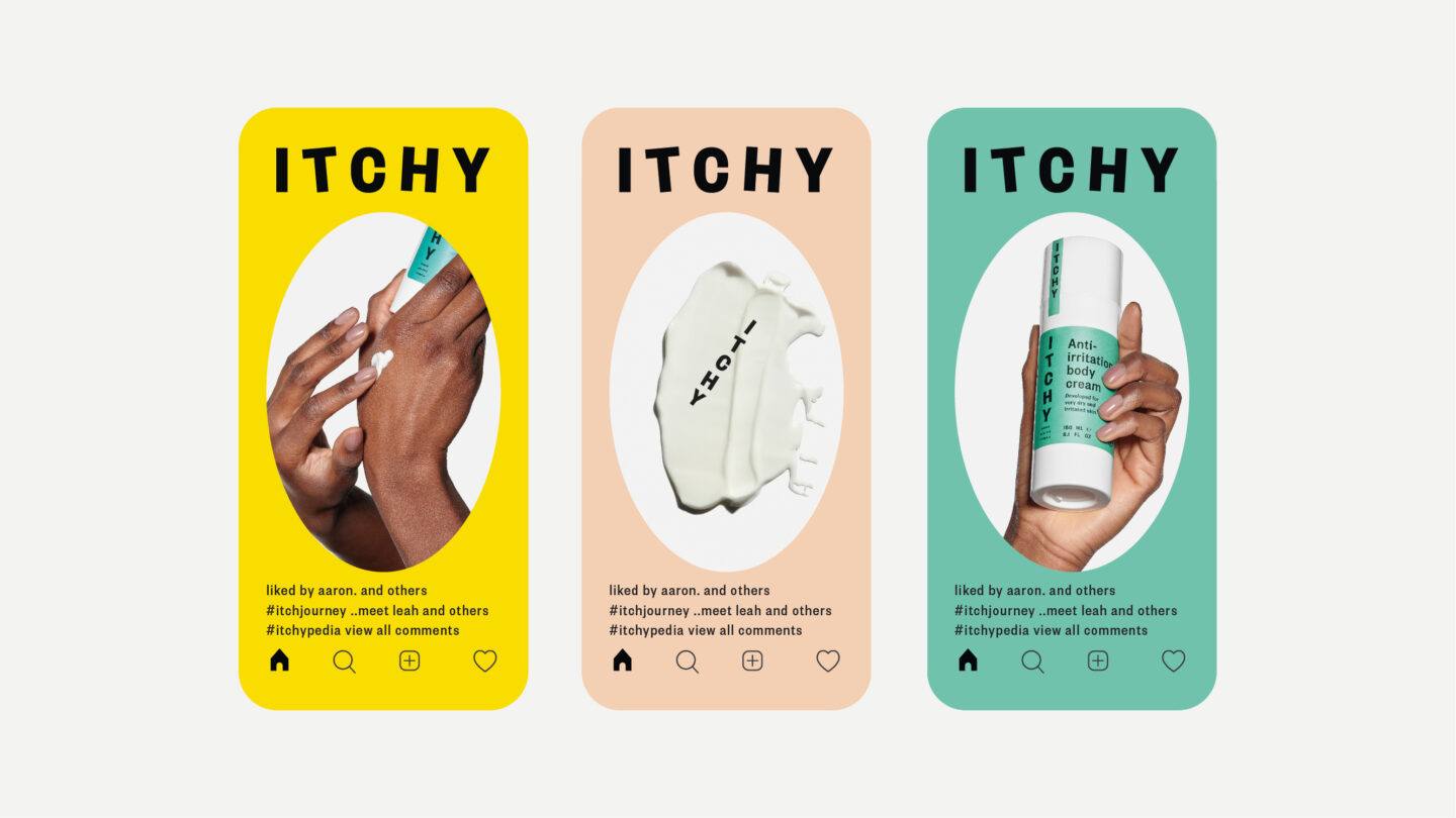
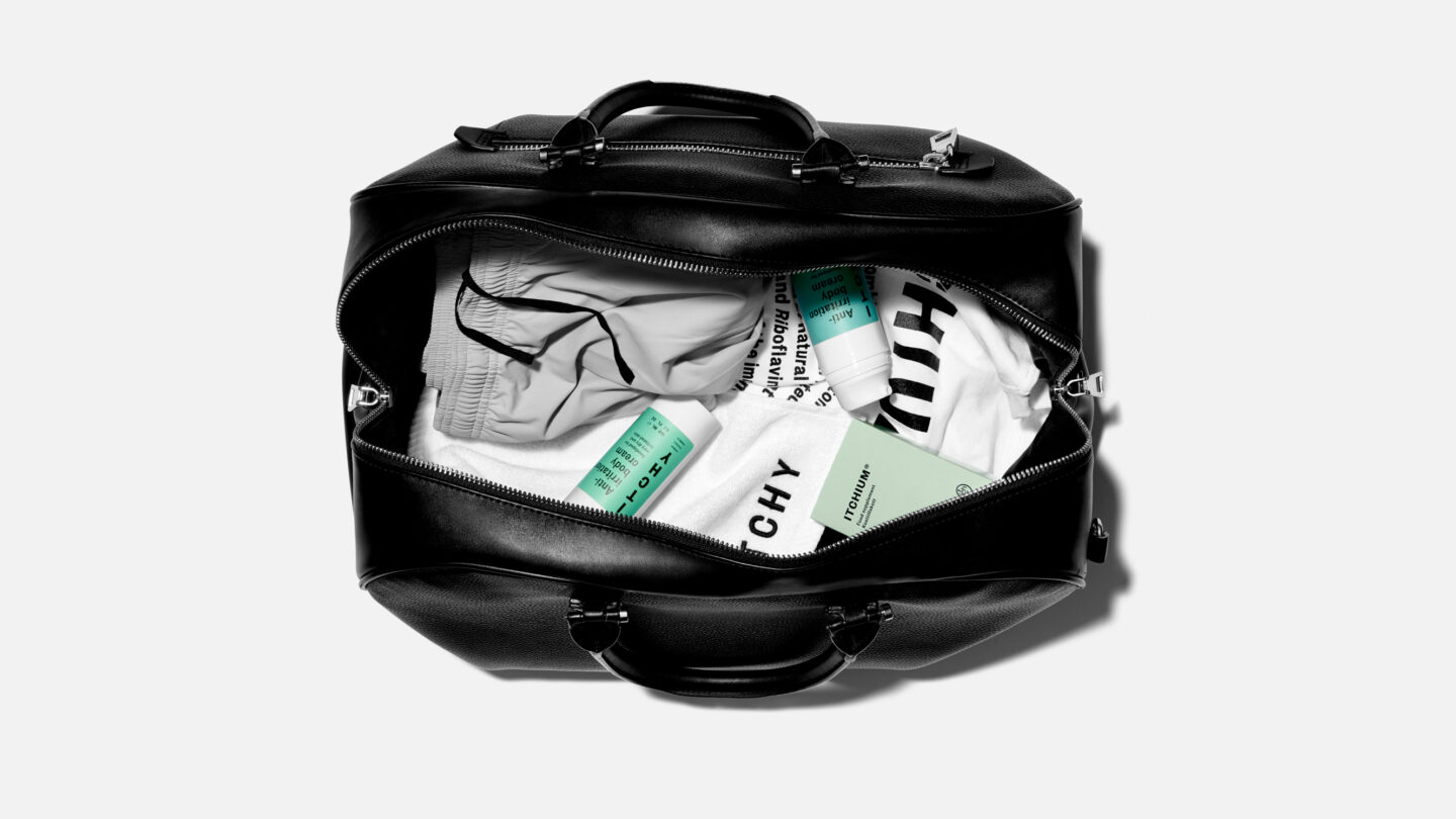
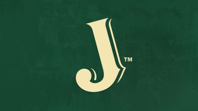
ITCHY’s skin care solutions help take control over psoriasis and atopic dermatitis; two common diseases that goes deeper than the skin, affecting people’s minds. The category lack a human perspective and mainly focus on the problems. So, we created ITCHY’s identity to go about it differently. With the statement “Human Centric Formula”, everything from packaging to community is tailored around not hiding problem skin but to always be skin proud. Even the logotype is made itchy to bring the idea to life. It’s a modern and human friendly brand – proving that problem-solving doesn’t have to feel clinical.
When the founder of ITCHY was diagnosed with psoriasis in the early 80’s, he entered a problem focused and uninspiring world where you had to hide visible spots in long sleeves and suffer from daily itching. He got constantly reminded of his “problem skin” by the products he was prescribed. He therefore wanted to change this with a new take on pharma – and ITCHY was born. Together we re-invented the expression. Or even better, we re-invented the history! We defined it as to make “Human Centric Products” – and to bring in the human perspective throughout the customer journey.
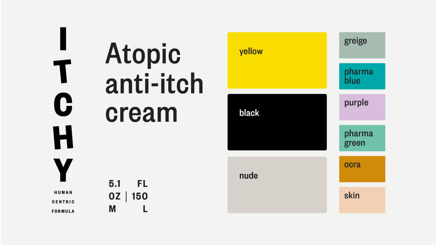
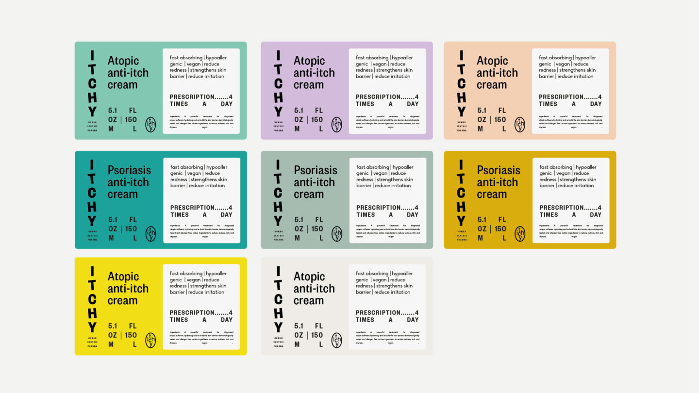
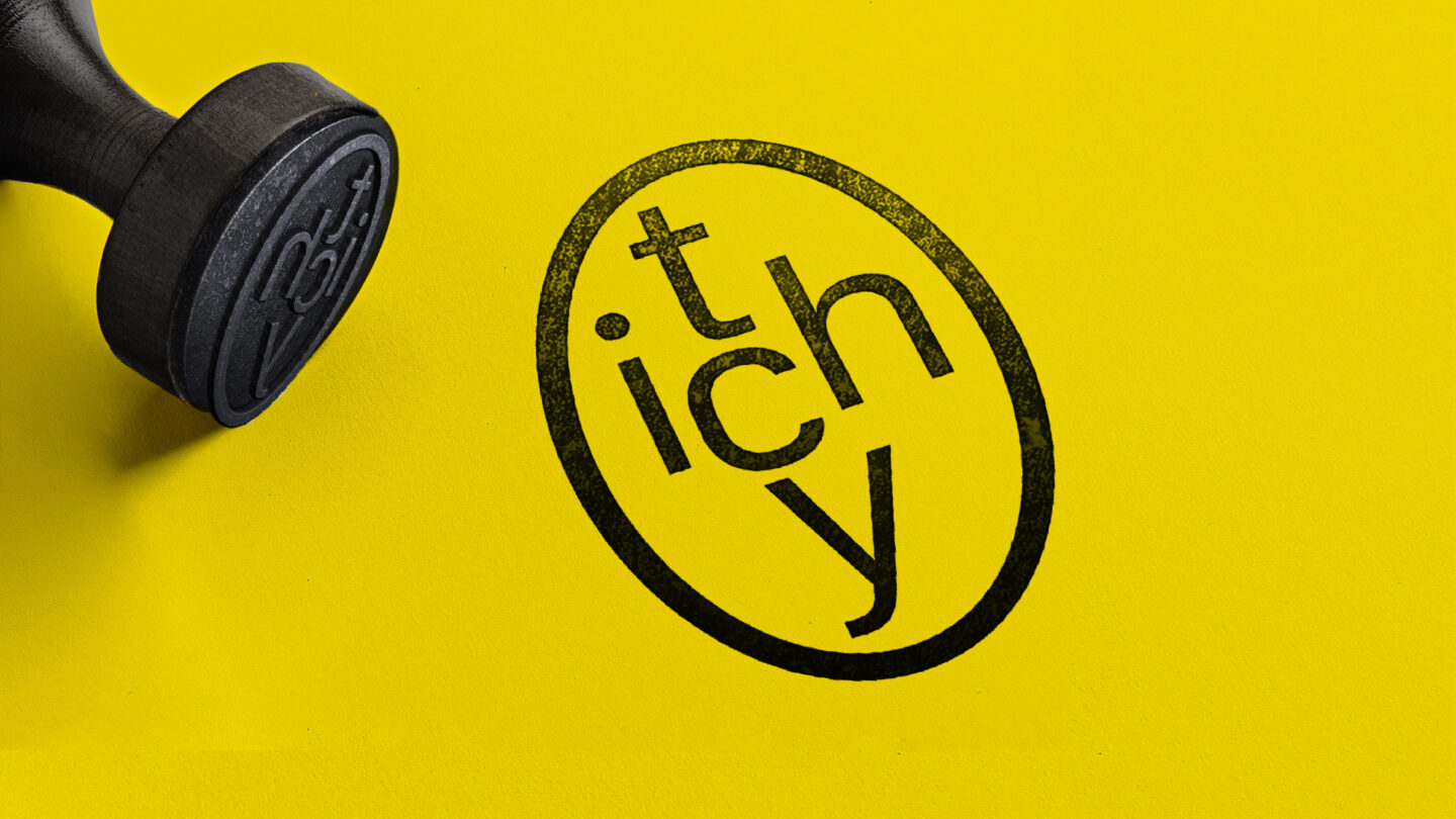
The logotype was made itchy, scratching and moving – adding lightness to the serious problems of skin itch, atopic dermatitis and psoriasis. For the brand signifier we were influenced by the 80’s pharma brand logos. We created an oval that was made into a versatile graphic element – a perfect brand asset to use for images. For typo, we chose a classic pharma font with a twist; Founders Grotesque. And everything from the unboxing experience to the greetings card is topped off with retro medicine influences.
The ITCHY community is now giving self-confidence – encouraging to stop hiding beautiful skin and to always be skin proud. With ITCHY you’ll get human centric pharma cosmetics for a lifetime.