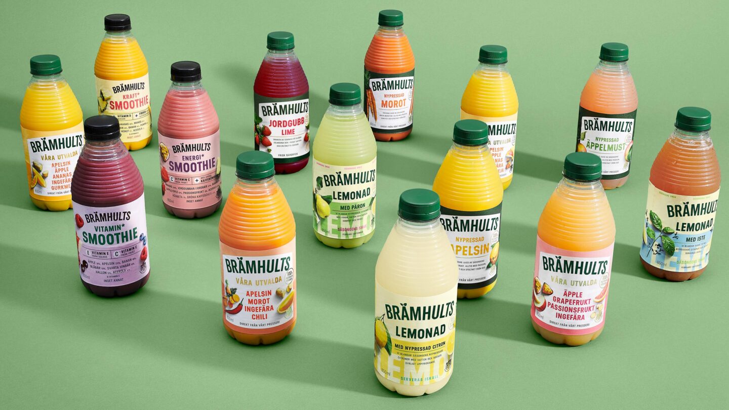
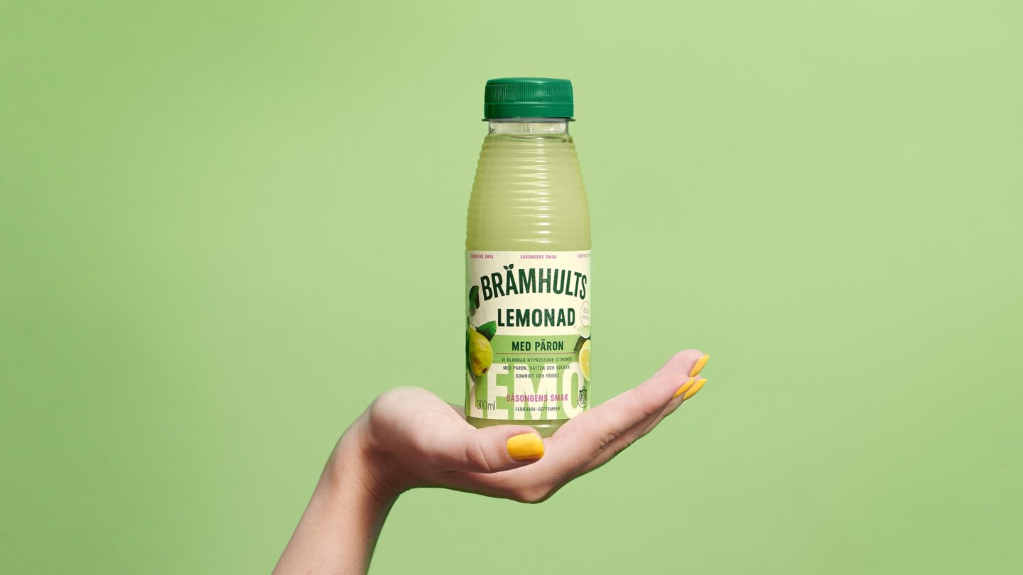
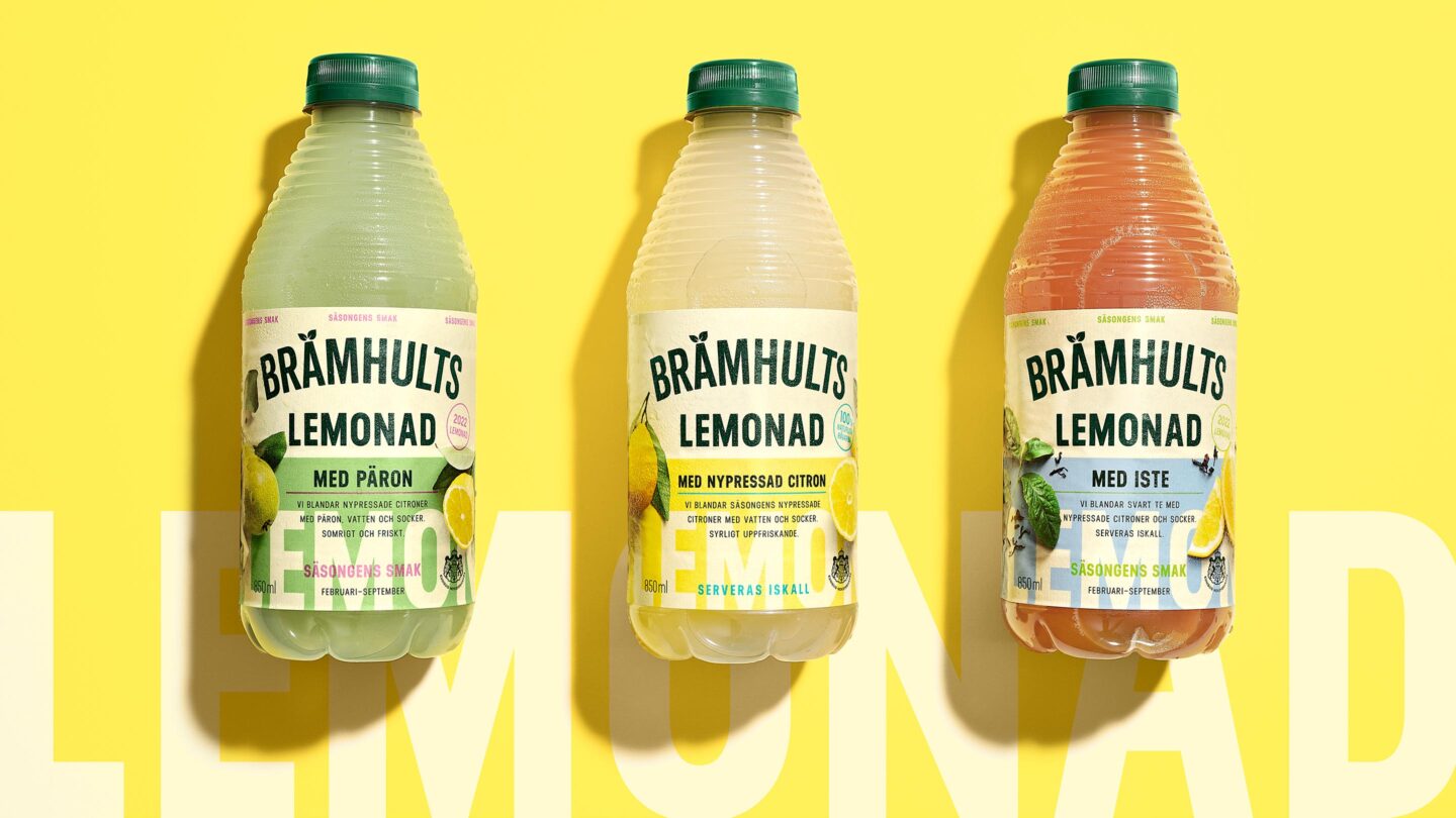
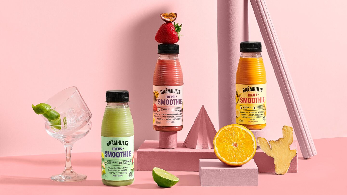
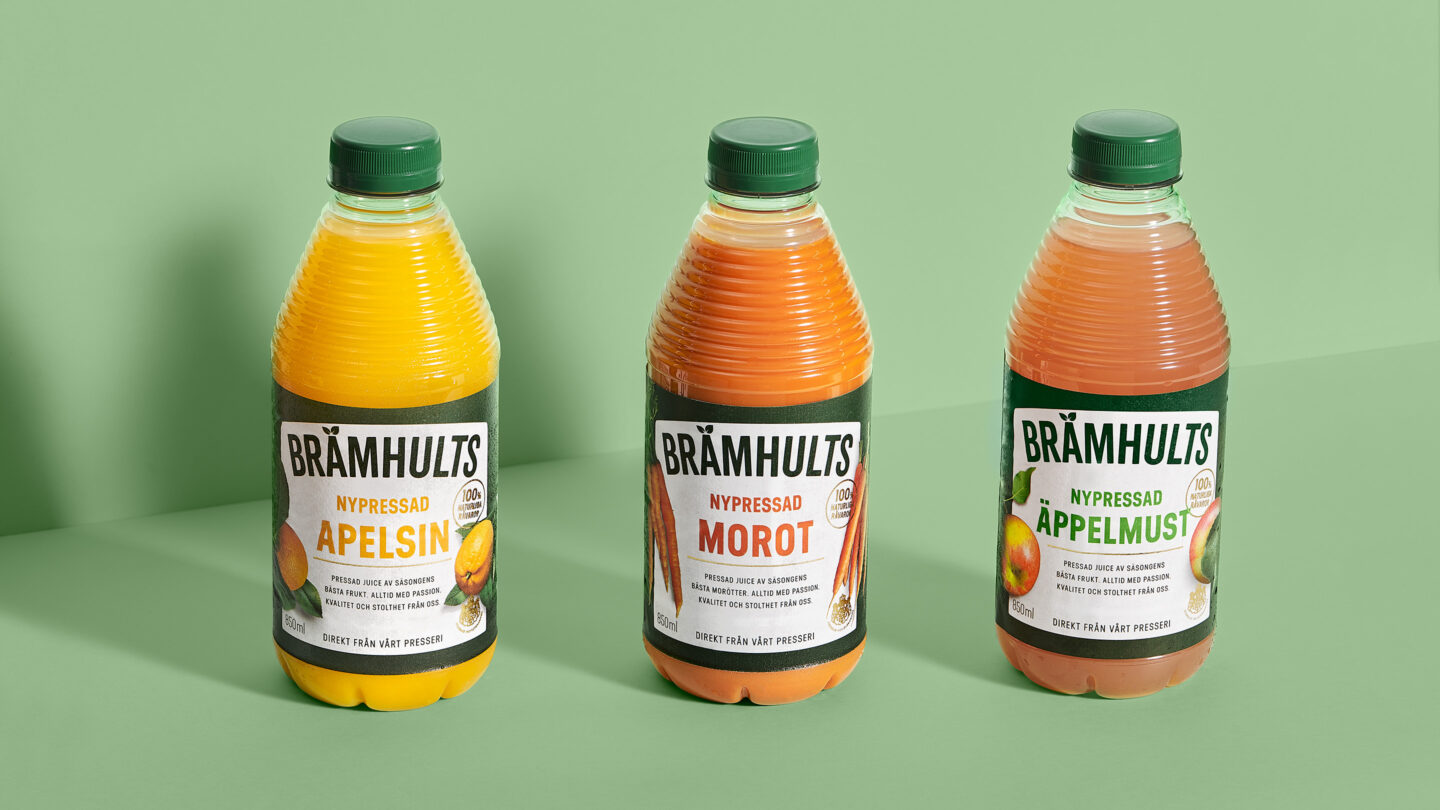
A dose of vitamins? Sunshine in a bottle? A deliciously healthy smoothie? All of that and more is what Brämhults is about. The bottle, with its iconic raffles and fruity design always promises a freshly squeezed juice experience. As new competition entered the market, we embarked on a refreshment journey. The result is a juicy design that truly captures the Brämhults’ heart, a celebration of fresh fruit.
Brämhults is an iconic Swedish brand and one of the leading companies within the fresh juice category. Pond Design has been a long-time branding-, and design partner to Brämhults, a creative collaboration that formed many of Brämhults’ classic packagings.
As the market for fresh juice evolved, there was a need to revisit the portfolio line-up and bring a new vibrancy and boldness to the brand. Brämhults wanted to add a dash of contemporary confidence to the original crafty vibe. Additionally, there was a need to win new consumers’ hearts (and mouths) and keep loyal Brämhults lovers close to home. How do you then go from an already nice-and-crafty design to an even juicier, sassier one, and from a great promise to even a greater one?
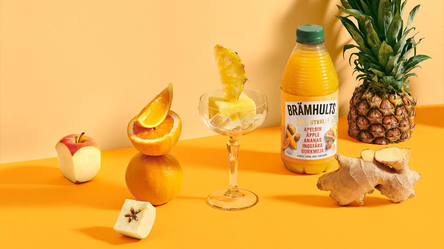
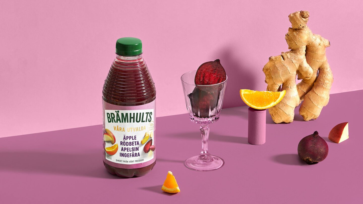
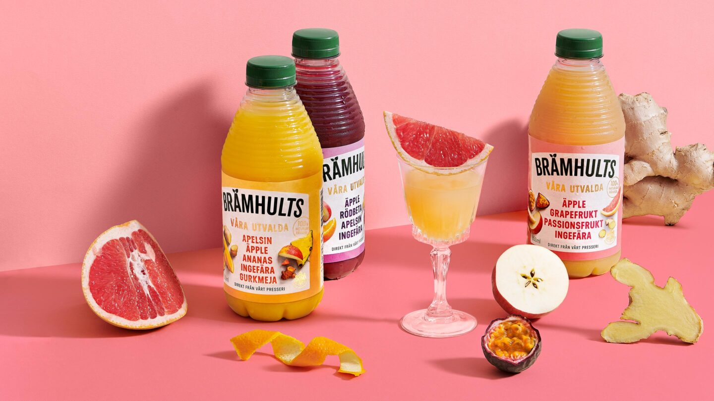
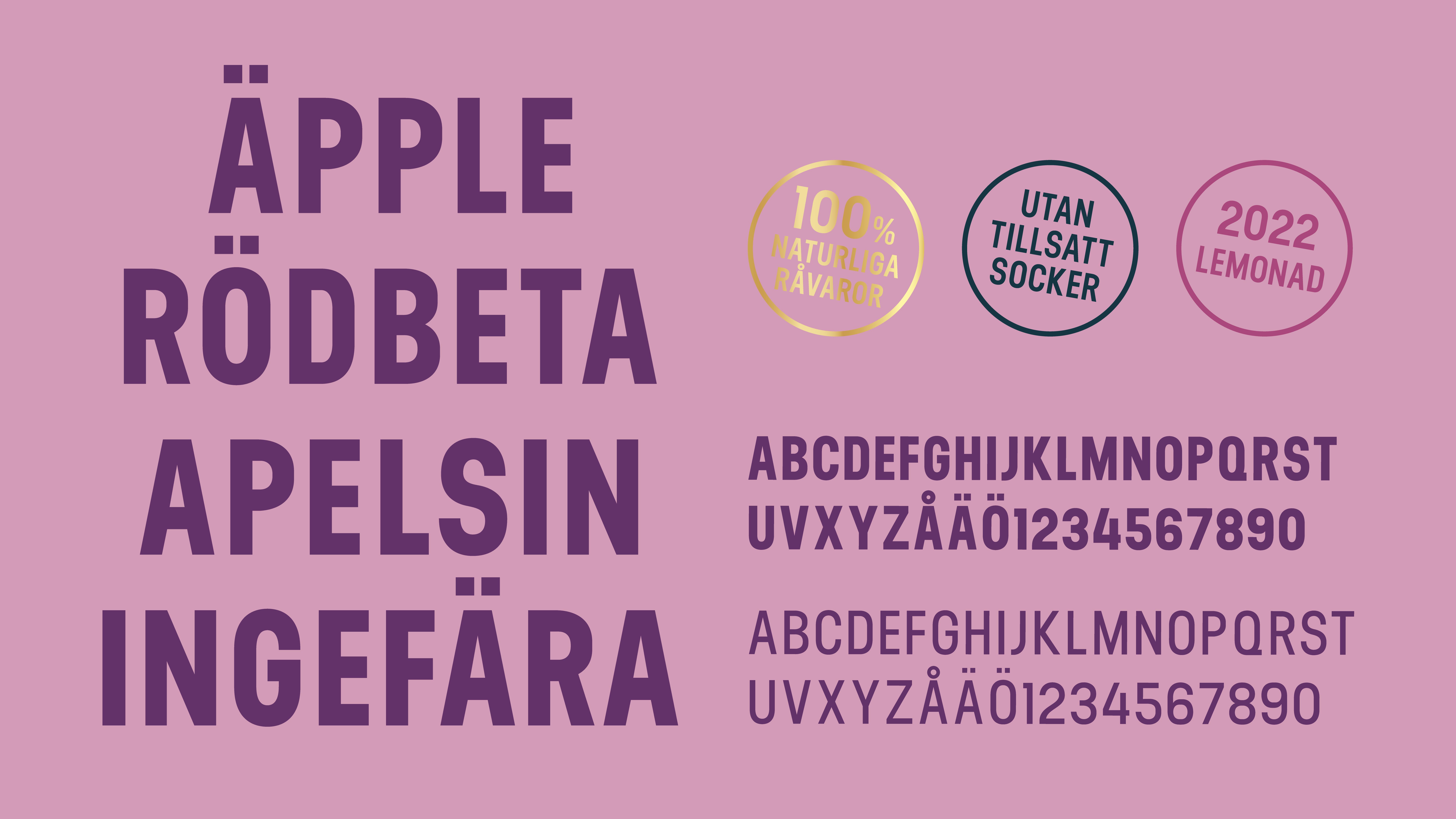
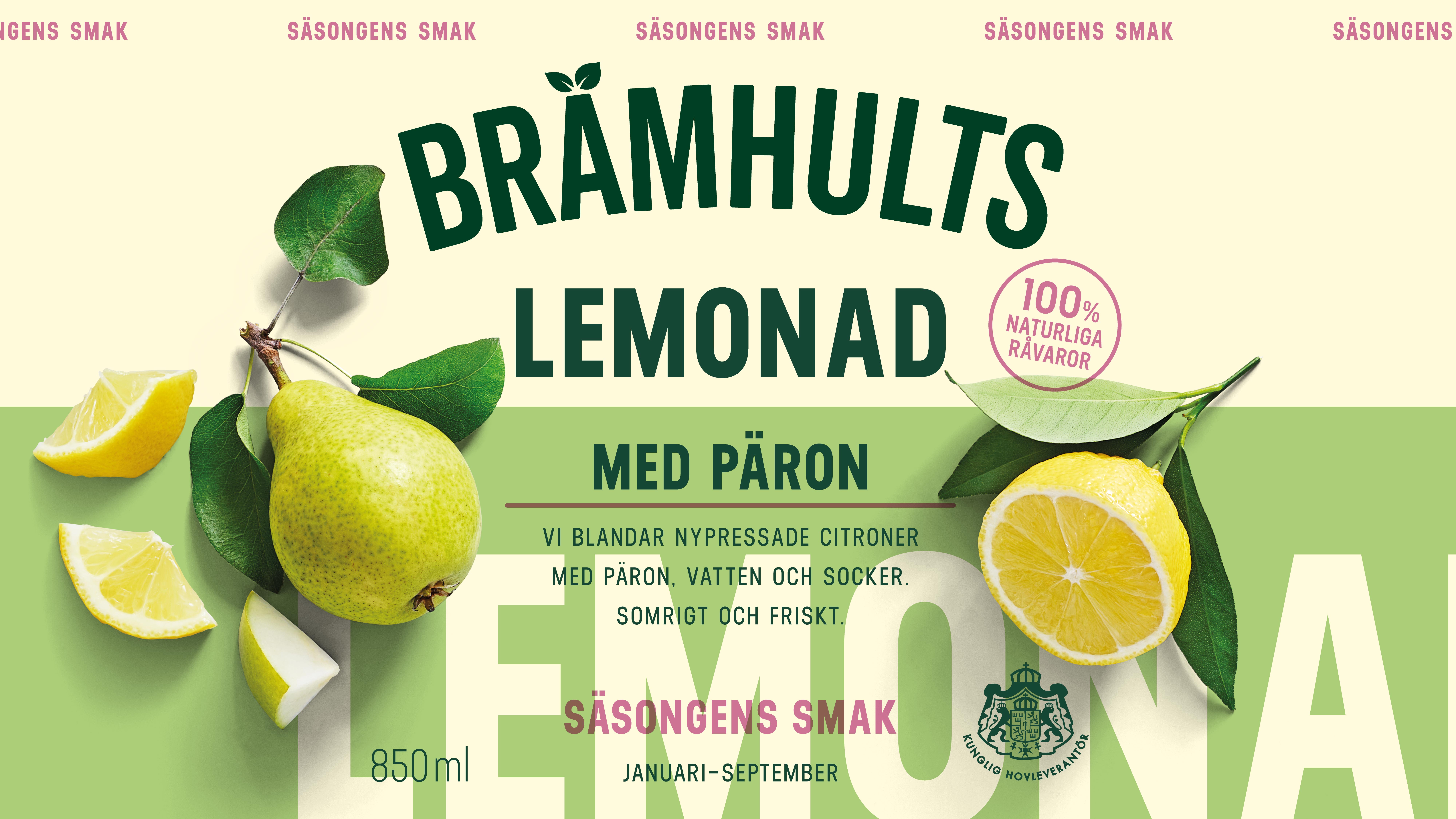
Armed with our in-depth knowledge of the brand, we tackled the assignment with both respect and a sense of excitement. We refined and added mouth-watering, thirst-quenching elements to the packaging. We created a bold, confident, and dynamic design system that can be applied to the different ranges without losing brand promise. To enhance both on-shelf and social media stand-out, we refreshed the overall impression of the design, starting with a contemporary and vibrant colour palette. Besides revitalizing graphics and colours, photography and ingredient imagery are drenched in sunlight. Additionally, we used a bold typography that injected new freshness to the designs.
The result is a juicy vibrancy that truly captures the Brämhults heart: a celebration of and love for fresh fruit, and a genuine knowledge and passion for the craft of juice pressing.
