Absolut Vodka is the world’s third largest spirit brand and is sold in 126 countries.
Mission
The mission was to redefine super premium vodka and create a new, Travel Retail Absolut proposition for the discerning consumer. The new proposition expands the Absolut portfolio with a completely new product positioned between the classic Absolut Vodka and ultra premium Absolut Elyx.
Insight
Most of the vodkas on the market focus on smoothness, captured by the number of times the vodka has been distilled. The higher the number, the more neutral the vodkas becomes, to the point that consumers can’t differentiate between them. The vodka’s character and complexity tend to get lost in the process. However, during the past few years, both the vodka category and consumer’s taste profiles have evolved. Consumers are now looking for a more complex, yet approachable, vodka profile. They are also looking for authenticity, craftsmanship and personality.
The idea
Absolut’s Master Blender created a completely new kind of fresh, bright and aromatic vodka without adding any flavours or sugars. He did so by hand-selecting and re-introducing “raw” cuts from the distillation process into the liquid, resulting in a crafted, flavor-rich vodka with a lot of character and charisma.
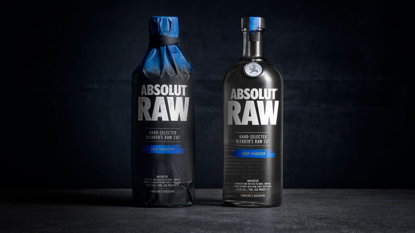
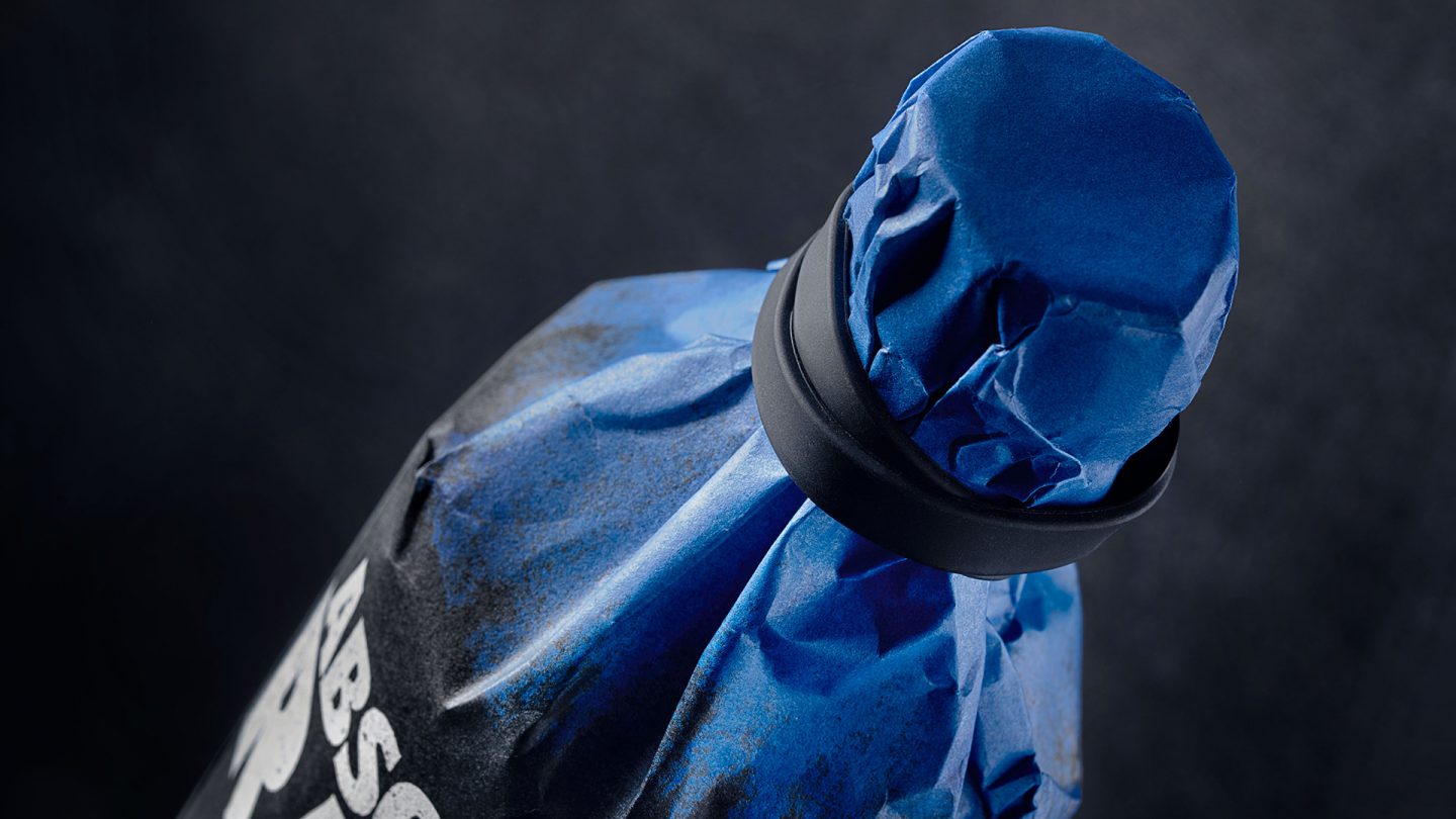
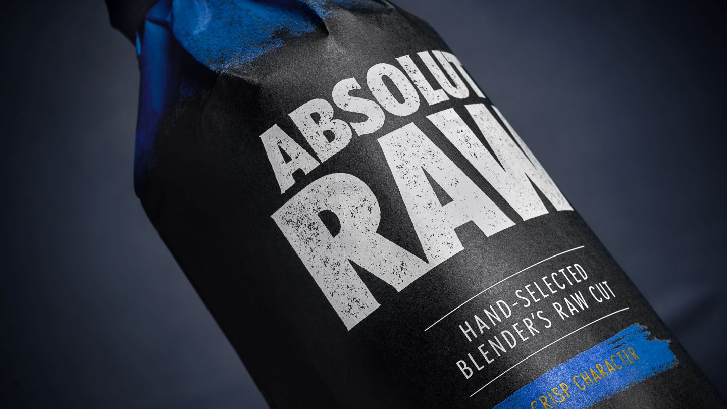
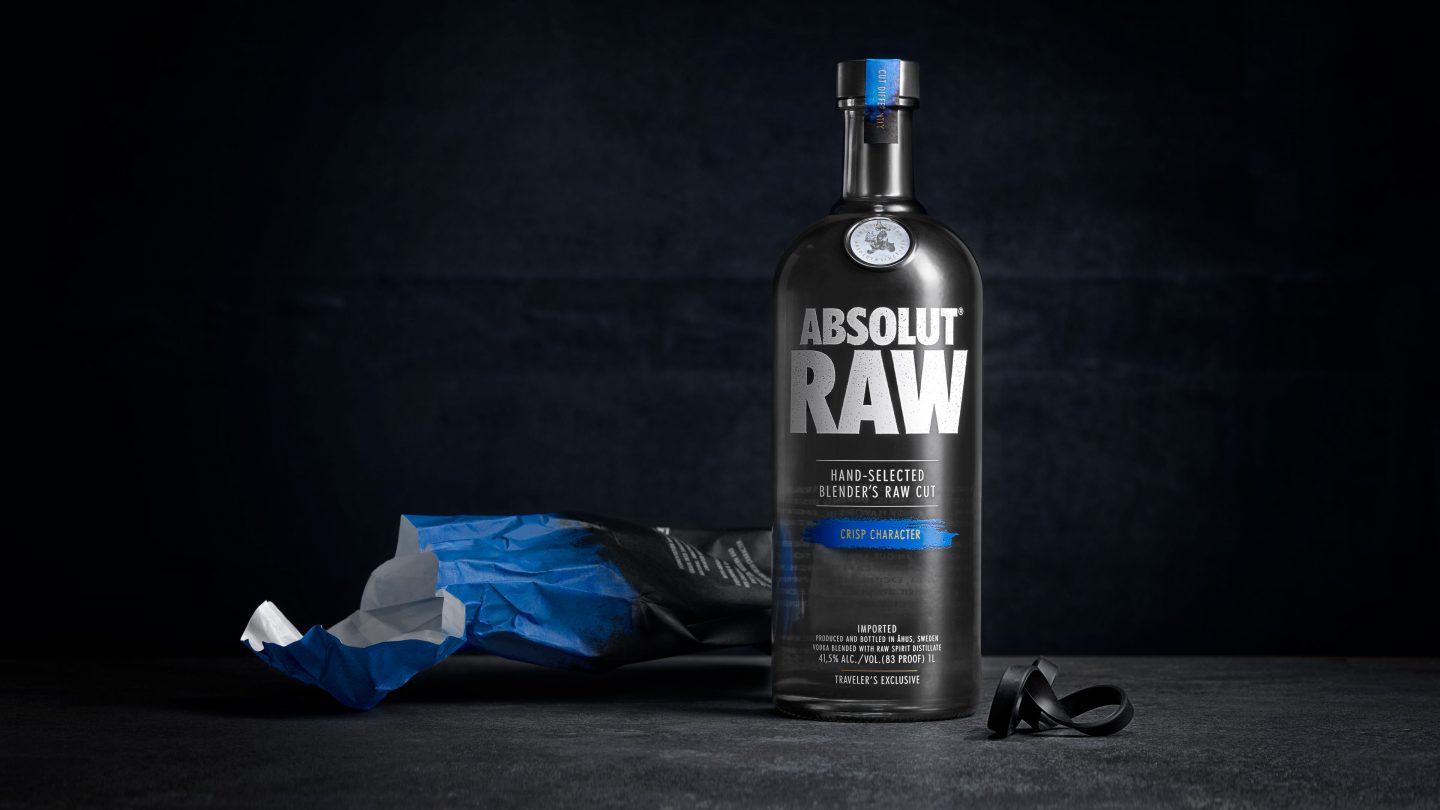
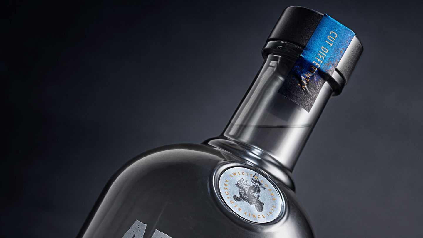
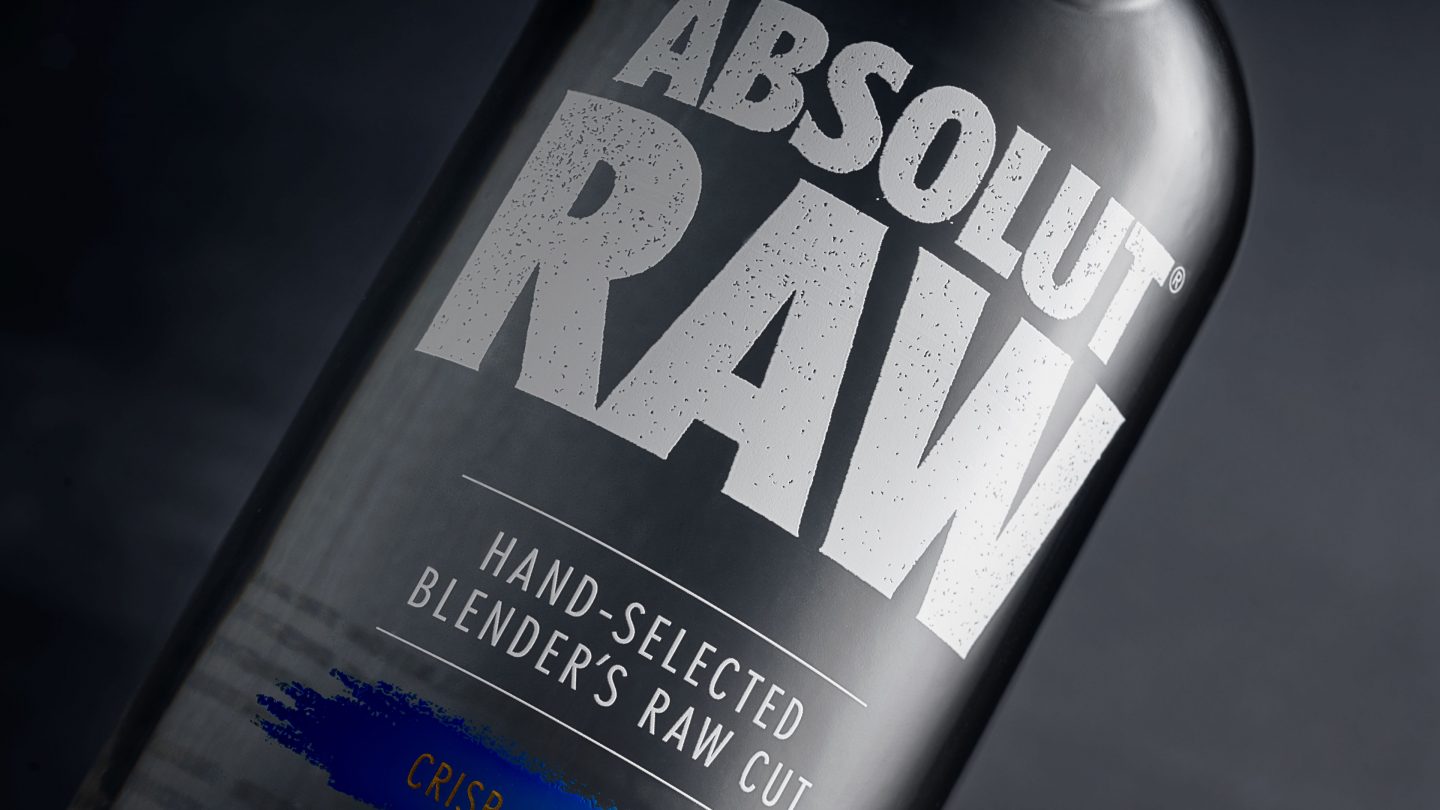
The design aimed to emphasize the uniqueness of hand-selected raw cuts and their influence on the liquid’s character. The idea was to focus on taste and craftsmanship through colours, details, finish and copy. The iconic Absolut Bottle was screen-printed and to further enhance a handcrafted look, the product logotype was rubber-stamped and then hand-scanned. The bottle has a tinted, smoky hue with a metallic cork and is wrapped in charcoal black paper injected with blue tones. Around the neck there is a black rubber band that strengthens the bottle’s artisanal impact and symbolizes the unique raw personality of the vodka. The classic LO Smith seal was redesigned to dramatize the re-introduction of cuts and character to the vodka. A paper lollypop label in blue and black with a foiled product description further strengthen the premium feel of the bottle. The name RAW creates immediate taste associations and the product copy highlights the blender’s craftsmanship and process of hand-selecting specific cuts to enhance taste.
