Here’s some food for thought; what we eat and how far it travels has one of the largest negative effects on our planet. This is what Gullspång Re:food is working to find solutions for. To profile their enormous undertaking for a better future, we tailored a strategy for the brand, a name, an identity and a website.
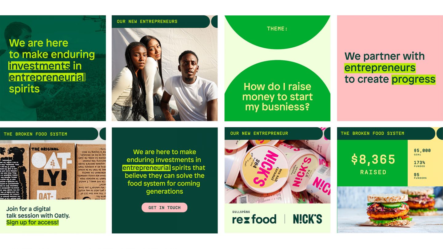
Gullspång Re:food is a venture capital company, which means they fund entrepreneurs who help resolve the food system’s structural problems. To understand their complex world, we worked closely with the Re:food team of researchers, thinkers and investors. We wanted to make their deep knowledge and information accessible – and identified the brand positioning to allow the brand to stand out and inspire positive change.
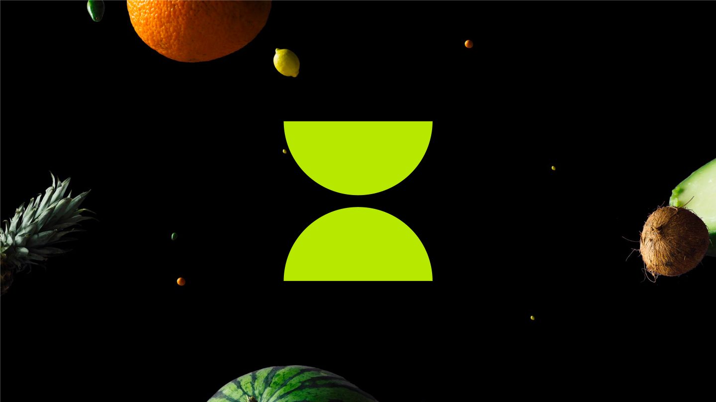
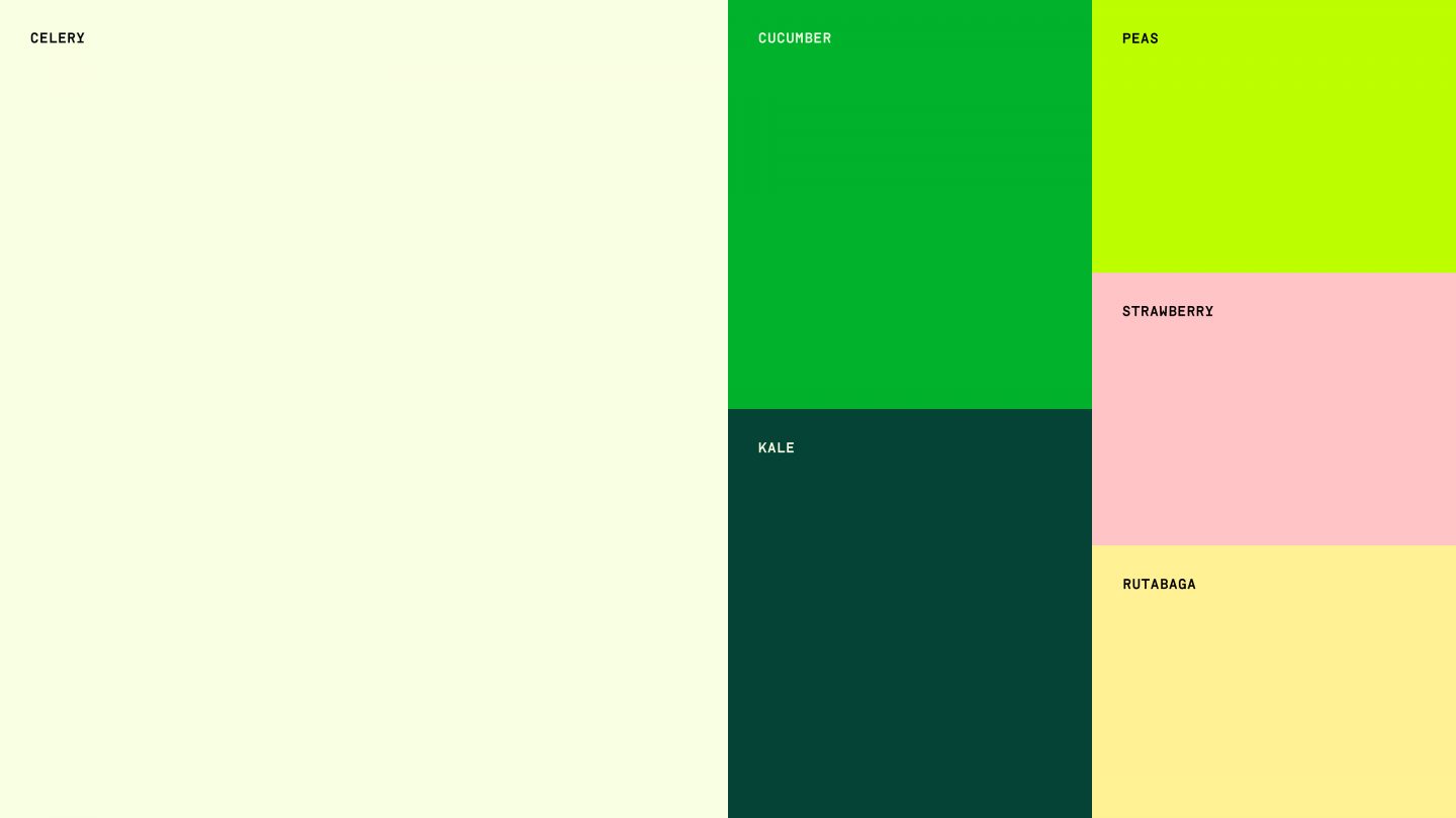
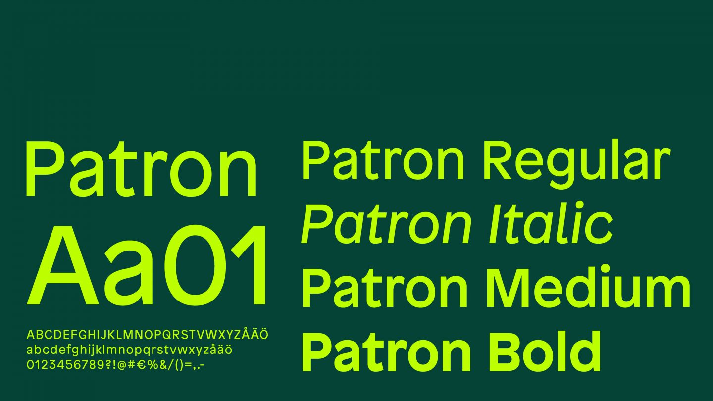
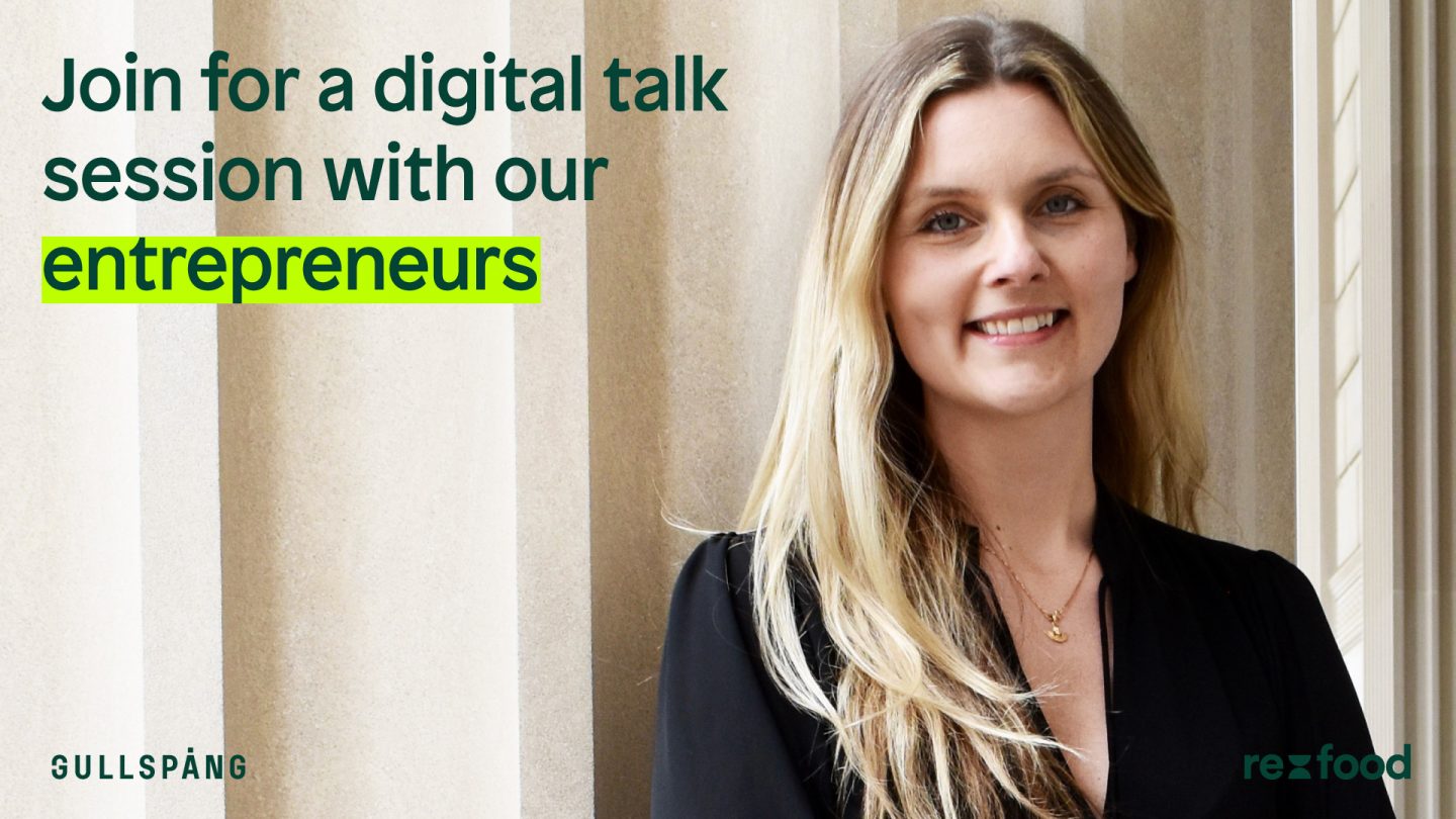
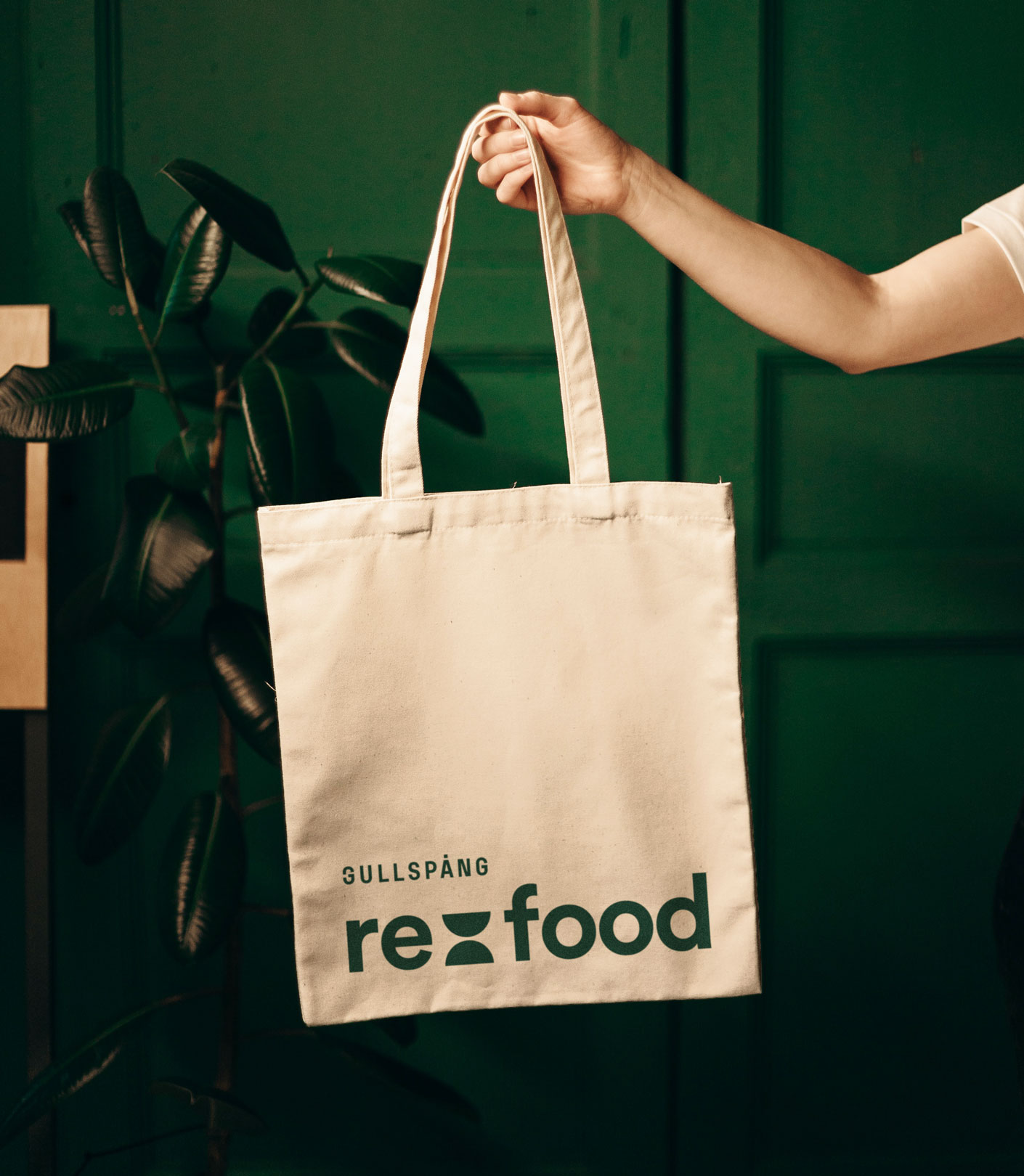
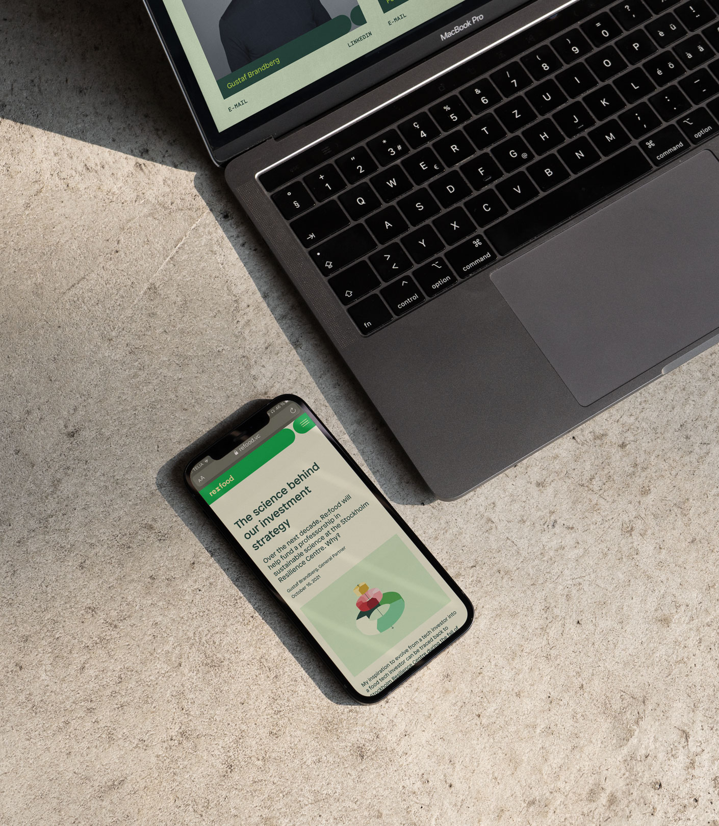
Our creative process started with adding the brand name “Re:food” to the parent company Gullspång. From there we built the identity upon a playful logotype in the center, where the colon is made of two plates put together. The colon can also be seen as an hourglass and symbol for time running out. Together with a vibrant colour palette, illustrations and infographics for an uplifting and clear way of communicating the brand’s vision; we shaped a foundation for a strong future. We brought the new identity to life on a new website; enabling sharing of stories, fresh research and discussions to keep engaging in the crucial topic of saving the planet.