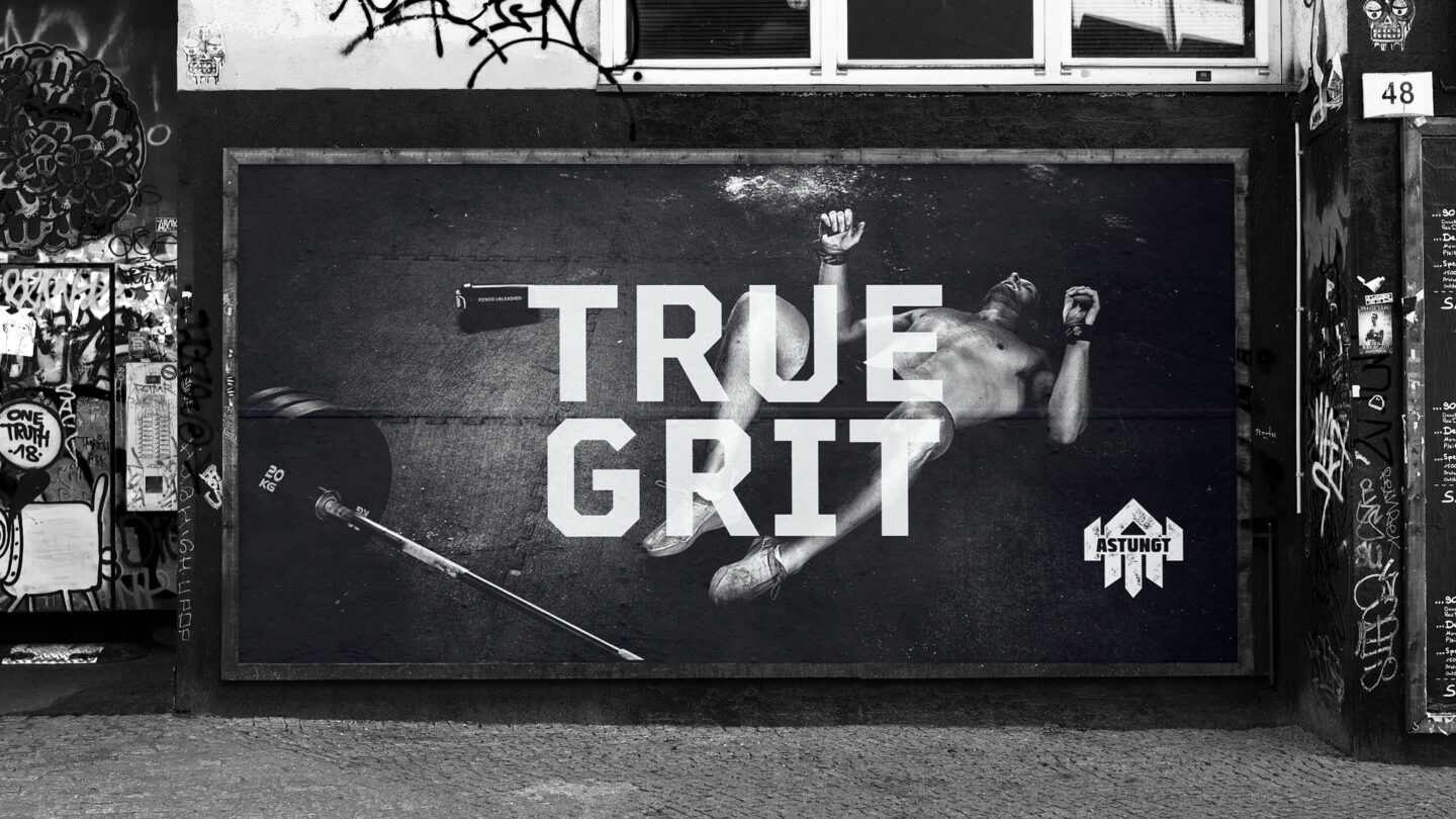
Astungt – or “awfully heavy” as it means in English – is a Swedish brand with the global ambition to become world leading within heavy weight training. A tough goal? Or just perfectly fit to their strong drive in empowering people to push themselves over the limit. To give an extra push, we elevated the brand experience with a rock-solid brand platform – and tailored the identity to capture their attitude.
It all started with us identifying Astungt’s reason for being and their positioning on the weight training map. By defining their vision, mission, and value statements we added clarity to the brand and gave them a stronger and more energized personality. In the process we saw a widened, yet specific target group, truly passionate and dedicated to heavy training.
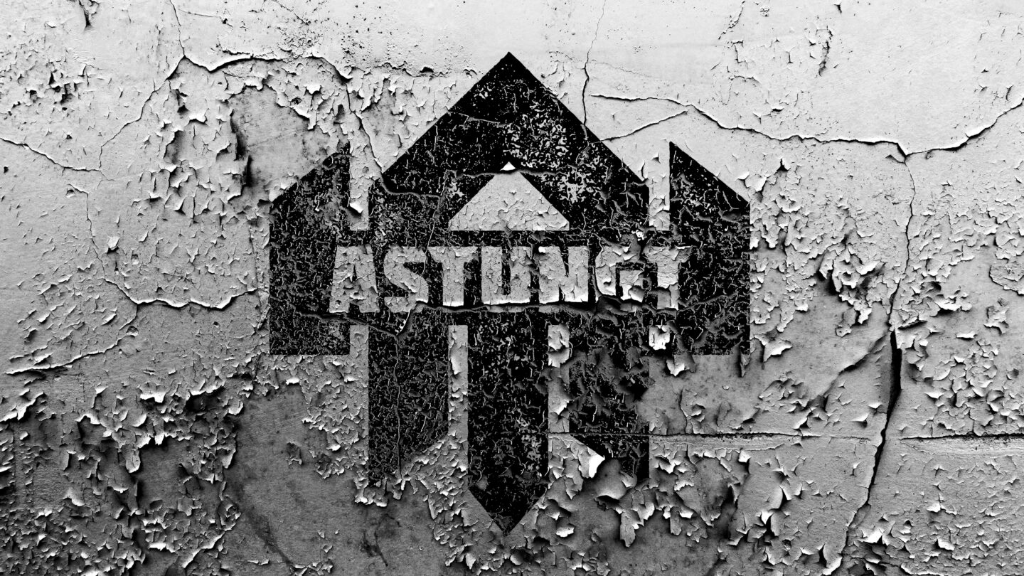
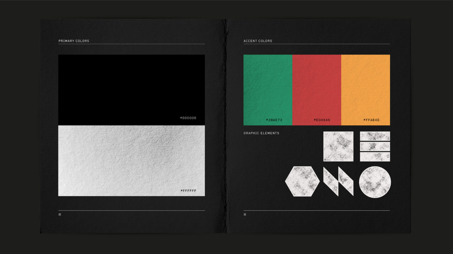
With the strategy set, we moved into the visual identity with evaluating the existing brand assets such as the Viking-logotype and the overall Nordic Asa aesthetics. Instead of alienating consumers we wanted to broaden Astungt’s attractiveness – it became clear that we needed to remove the Nordic Asa connotations.
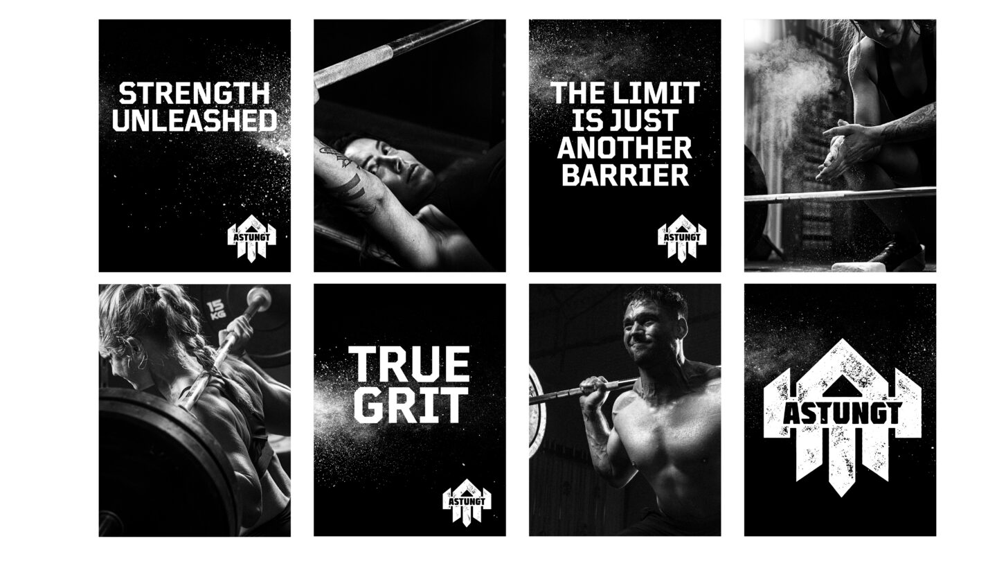
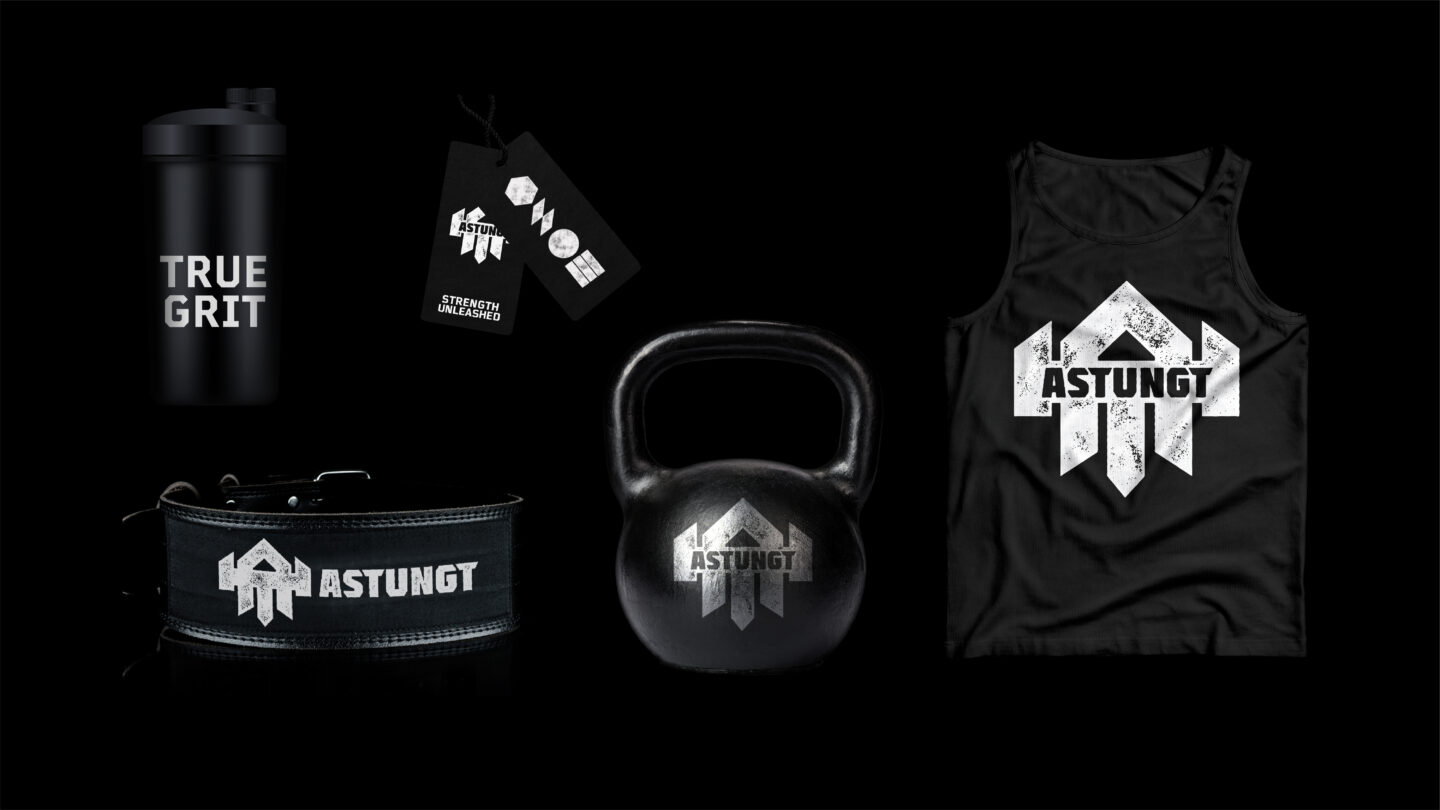
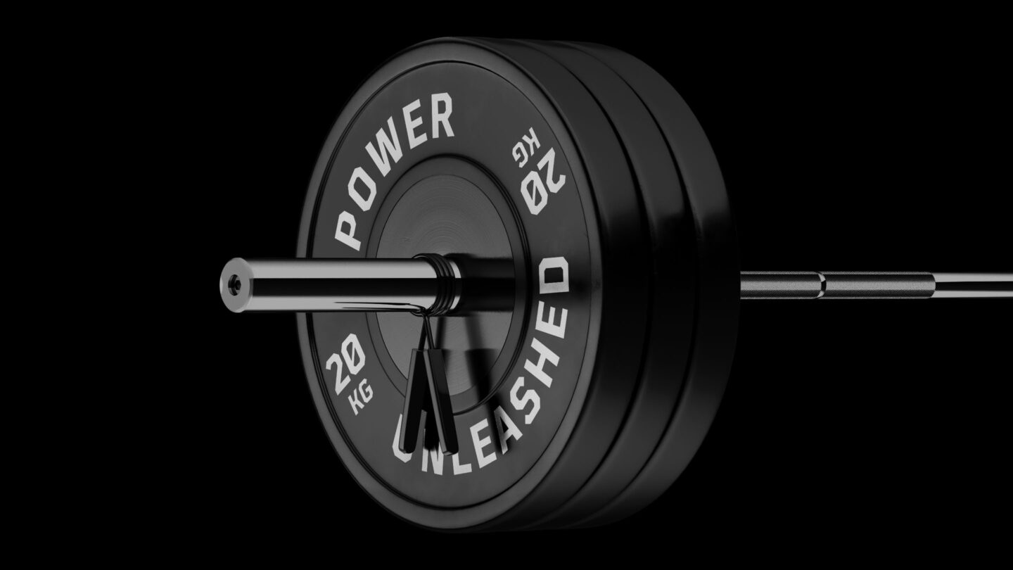
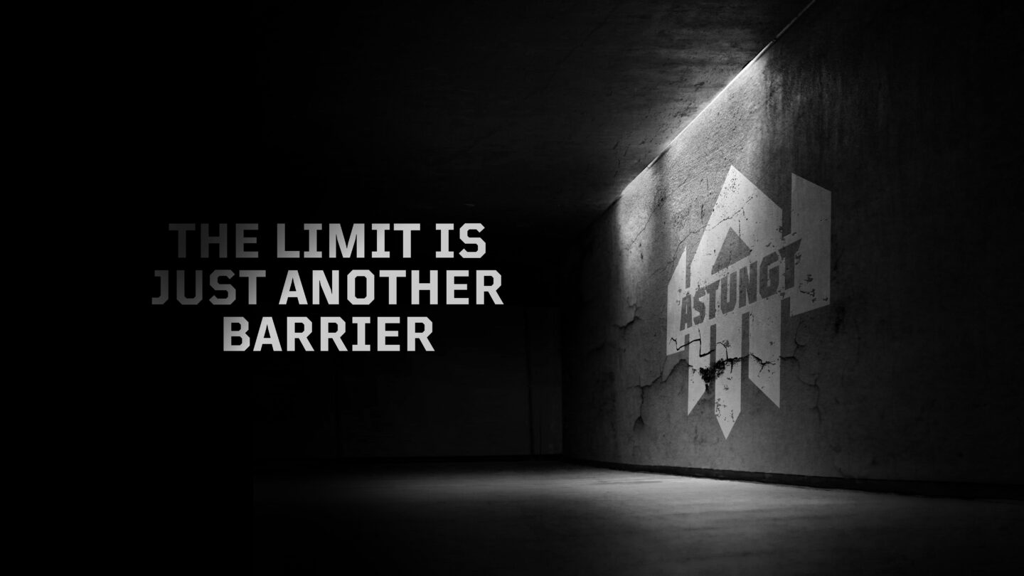
The logotype was updated – enhancing the characteristic features of a Viking such as bravery, strength, and power – but with a more subtle reference to the Viking. The logotype was based on the letter A and combined with forms taken from weightlifting equipment. Together, they formed a powerful warrior, a Viking that exudes just the rawness and attitude Astungt wants to communicate.
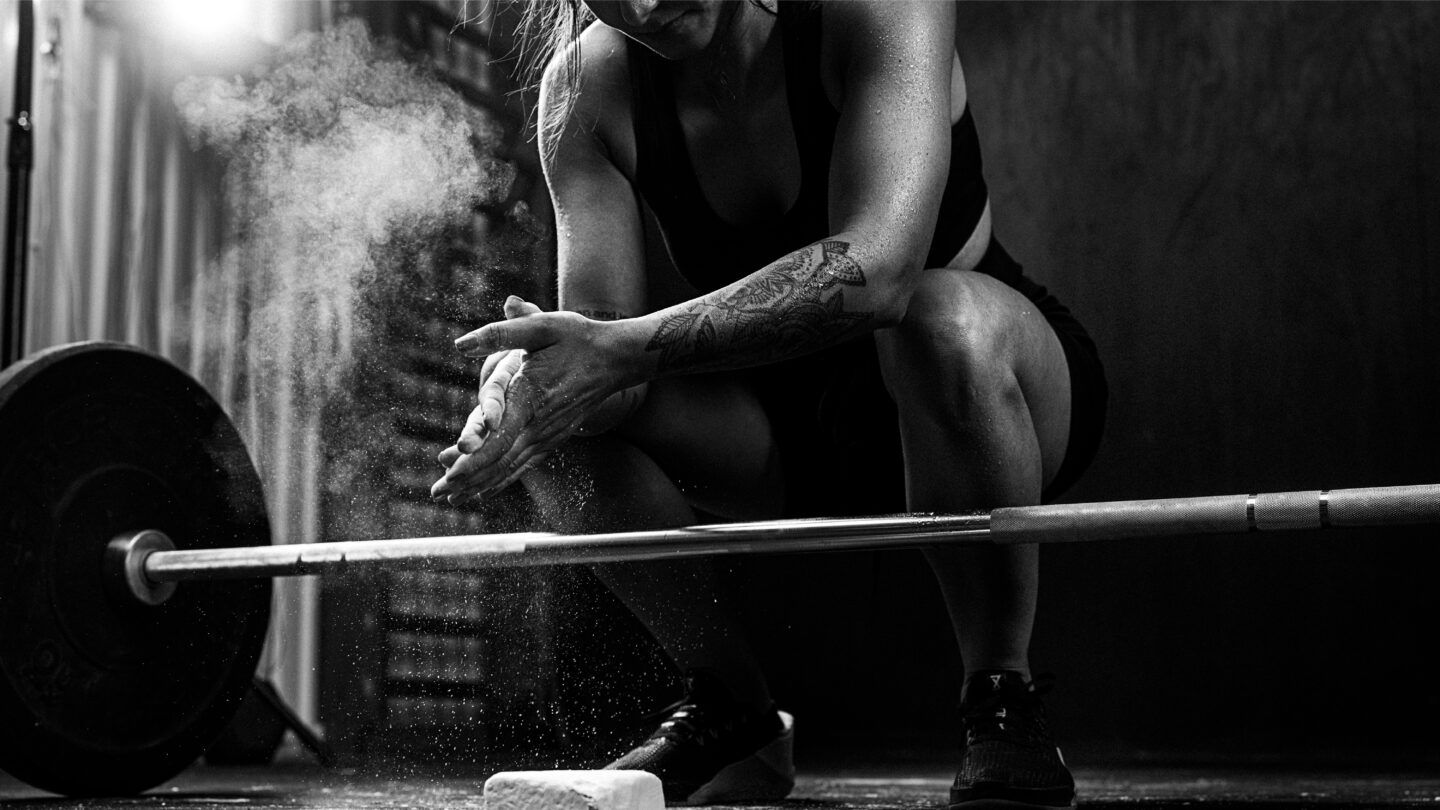
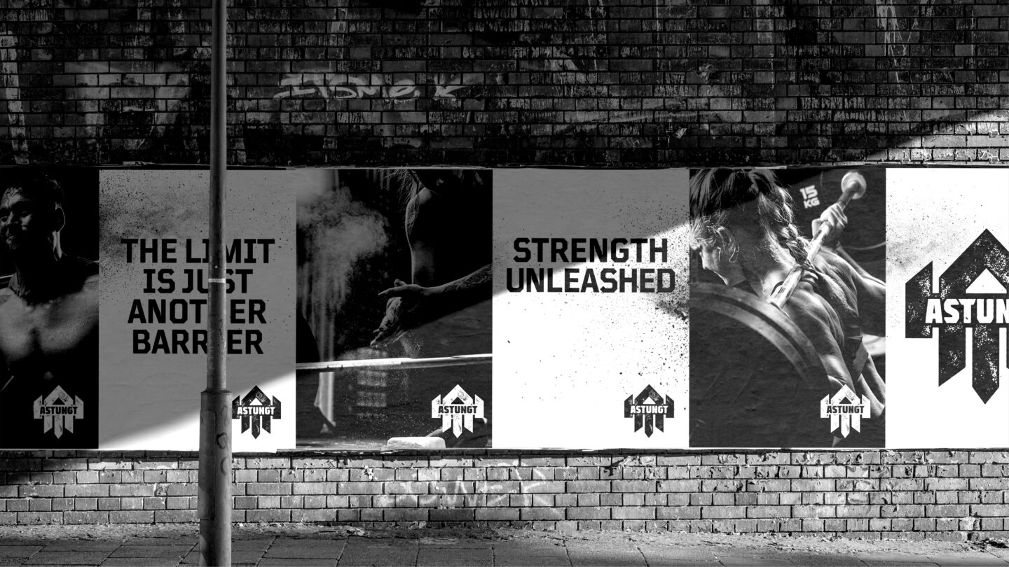
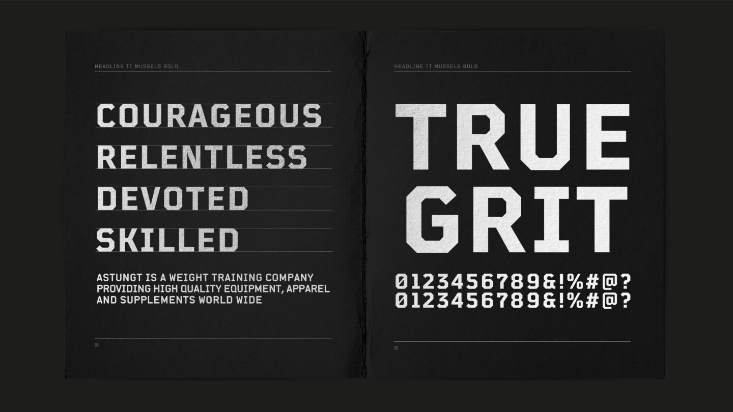
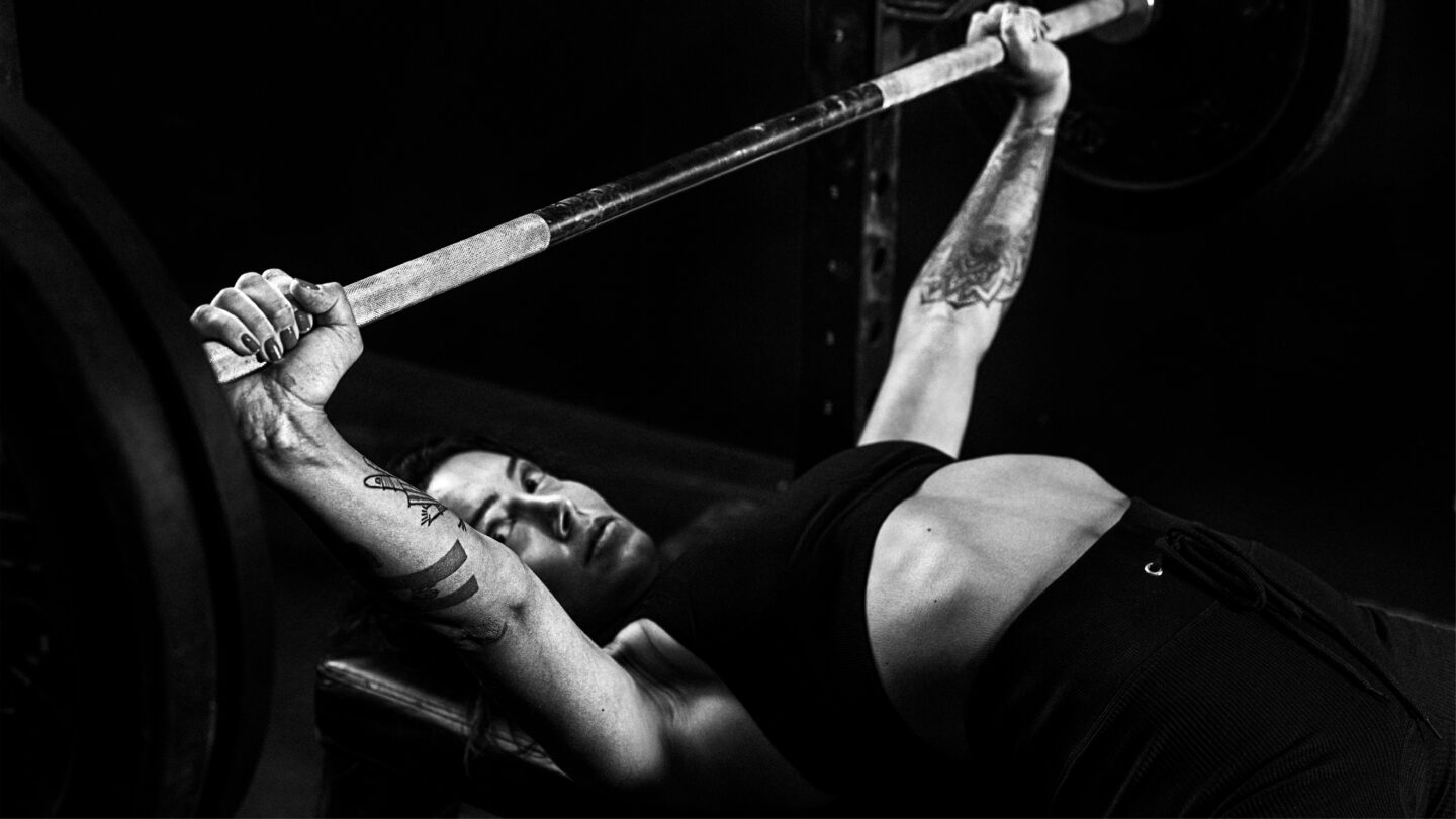
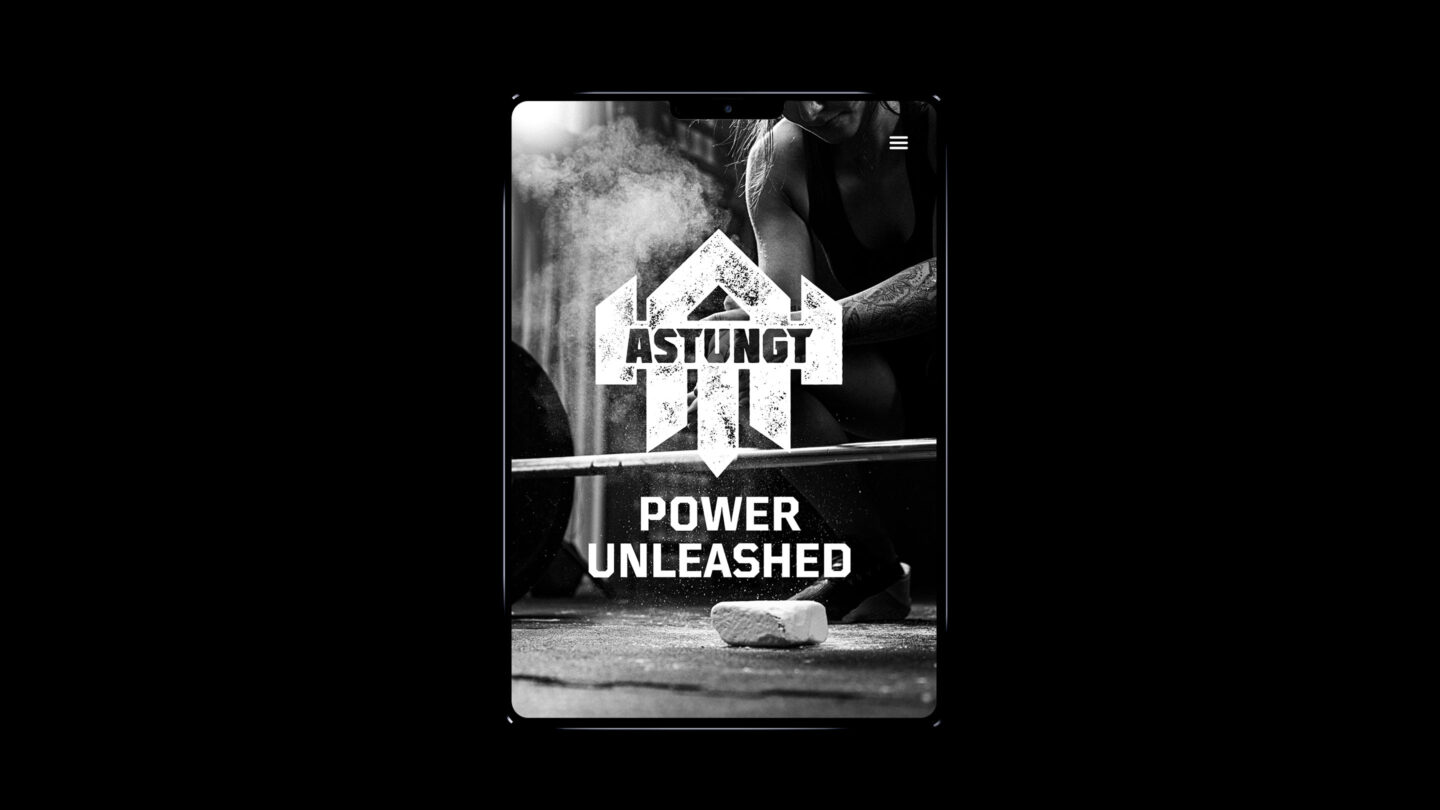
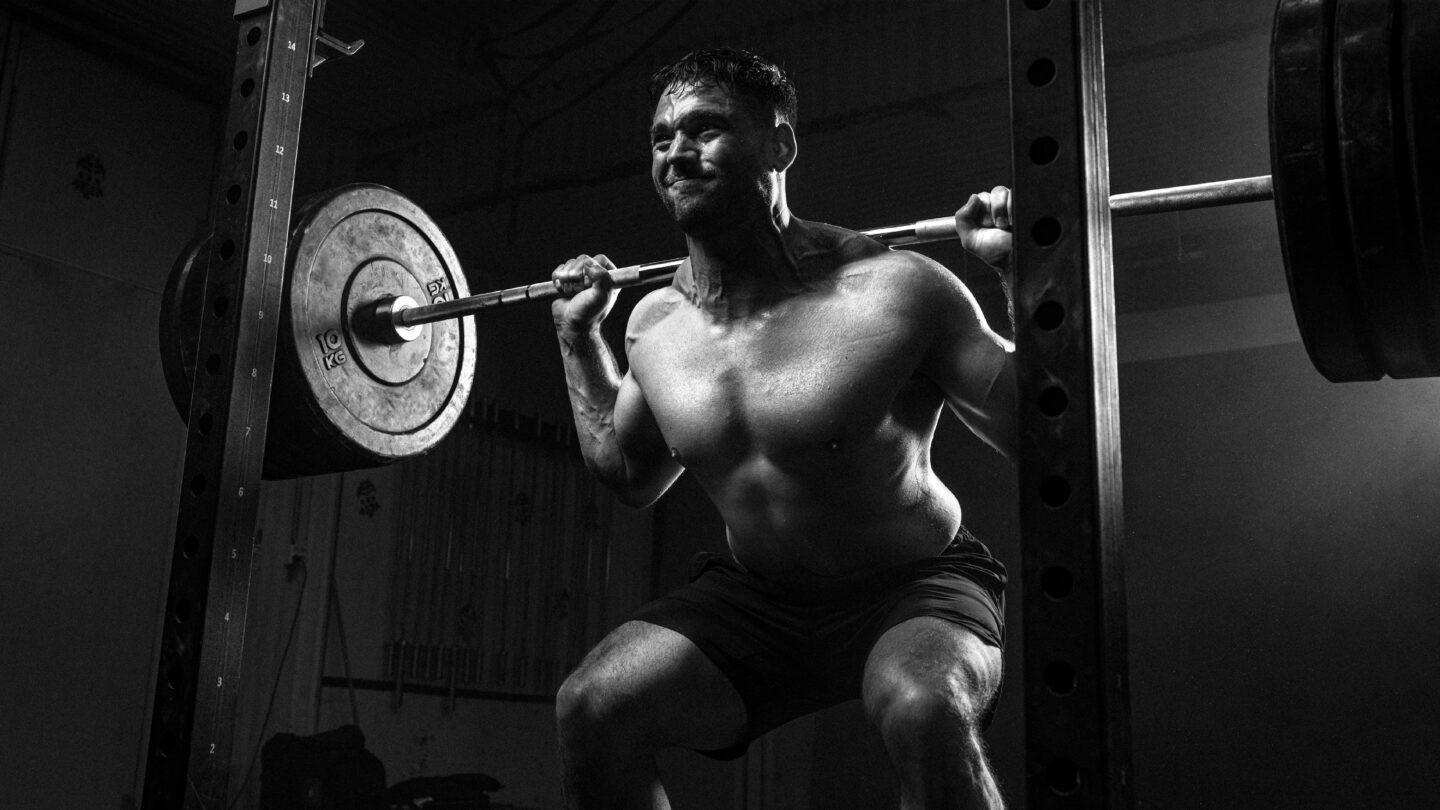
We added black and white imagery to the identity, portraying people in action, icons and patterns that are visible in the heavy lifting world and a sporty yet edgy typography.
The new brand platform and graphic identity strongly communicates the essence of the brand to attract both existing and new consumers to Astungt.