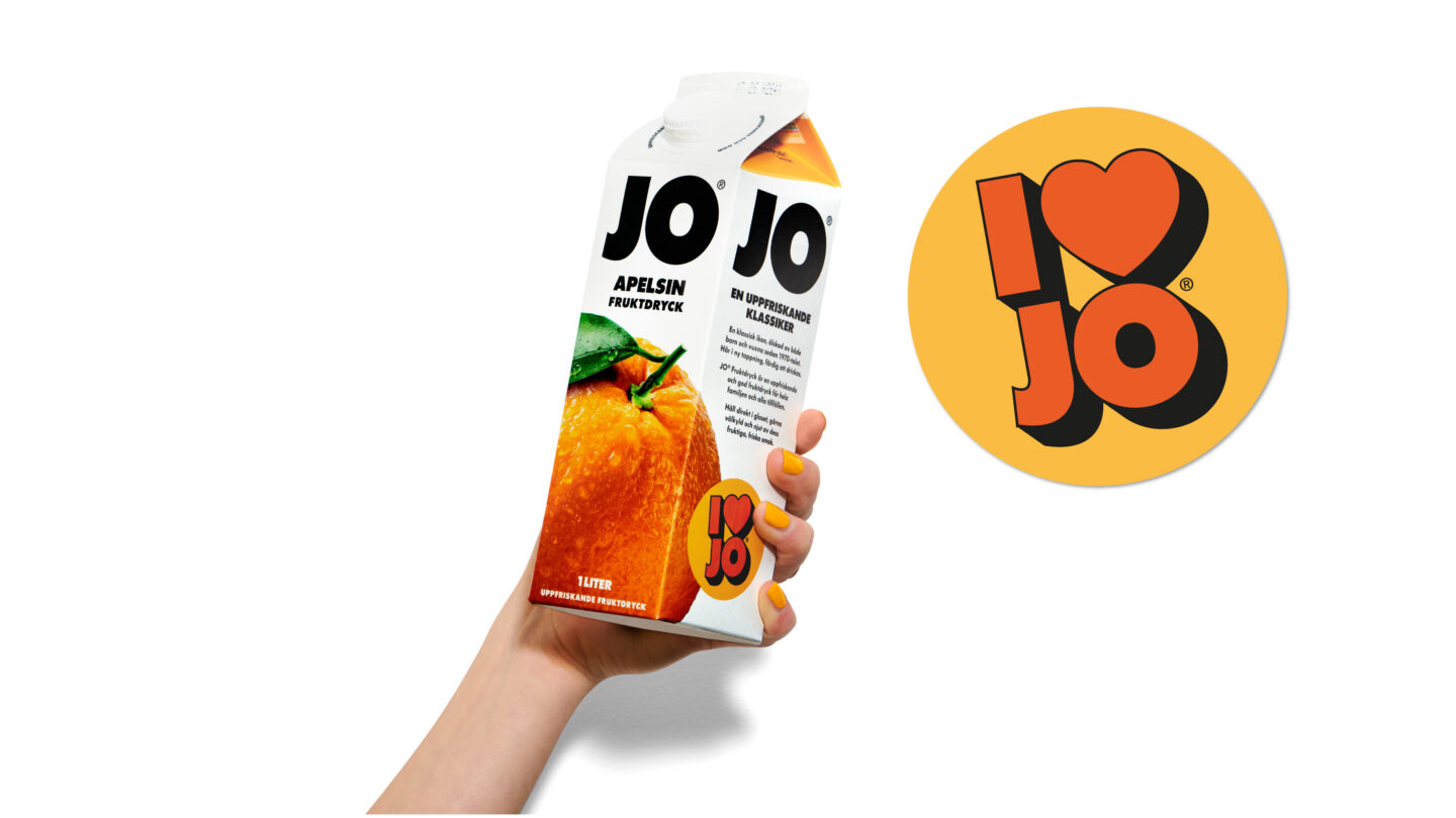
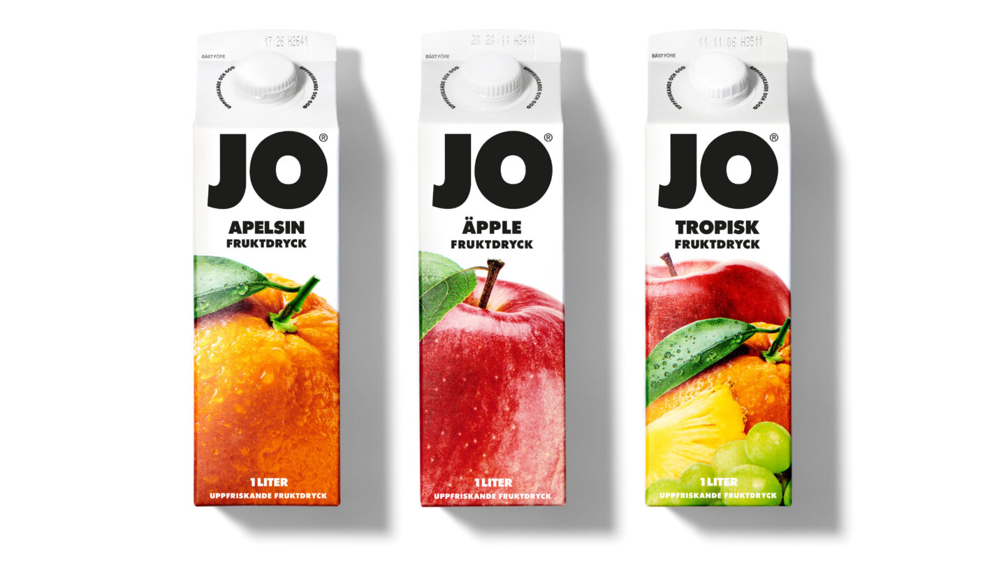
If you grew up in Sweden, you grew up with the juice JO. Born a disruptor in the 1950s, the brand introduced juice concentrate in small packages – affordable, easy to carry home, and simply mixed with water to serve fresh juice. Their mini packs have always been minimalistic with just a big fruit and a giant logo. A bit surprising, yet true to the brands heritage, JO decided to shift from its iconic format and adapt to the mainstream with 1 liter tetra pack – and take the role as a price-fighter in the chilled ready-to-drink shelf. For the new design, we wanted to retain the nostalgic charm while transitioning to a more contemporary expression.
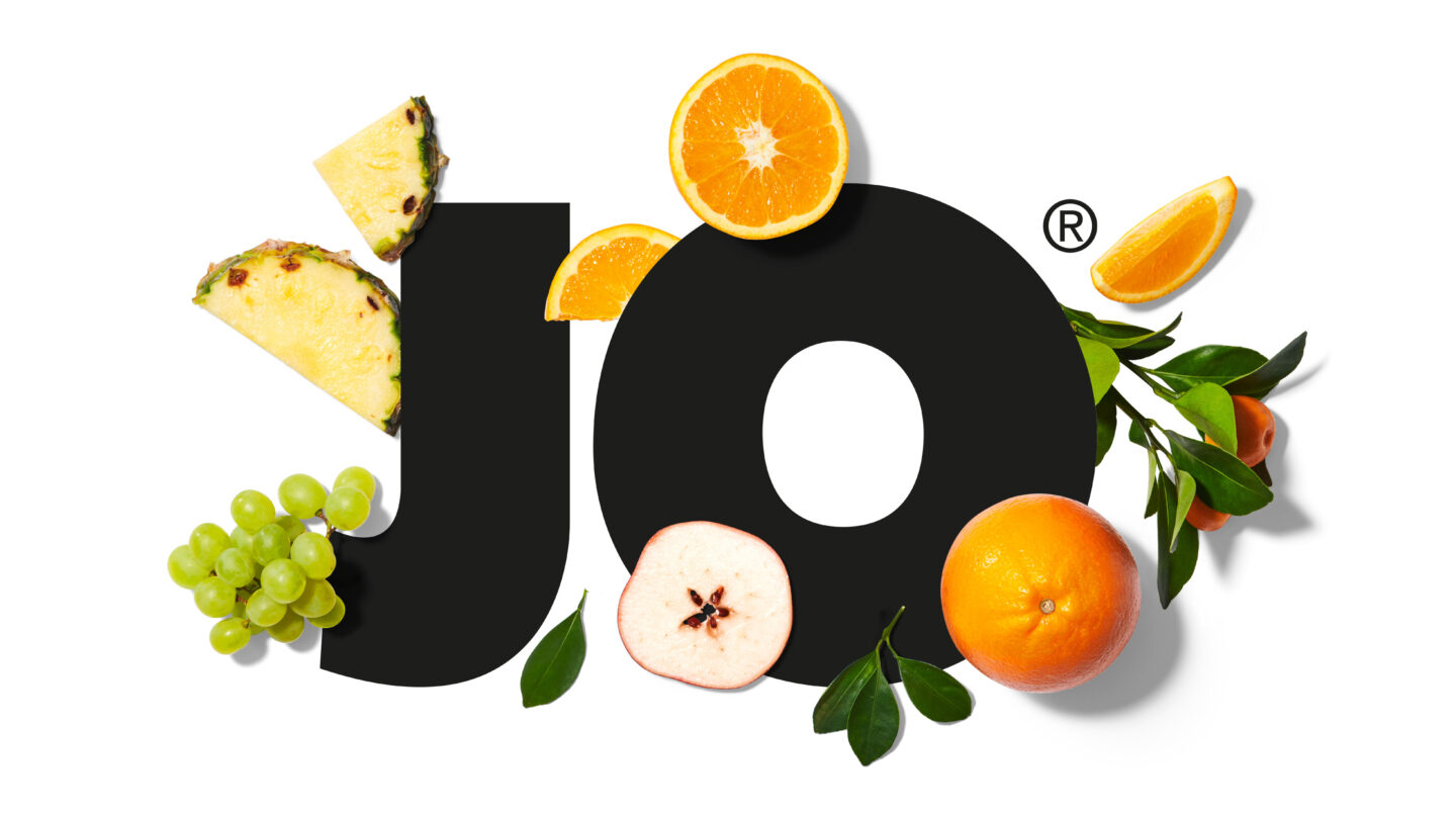
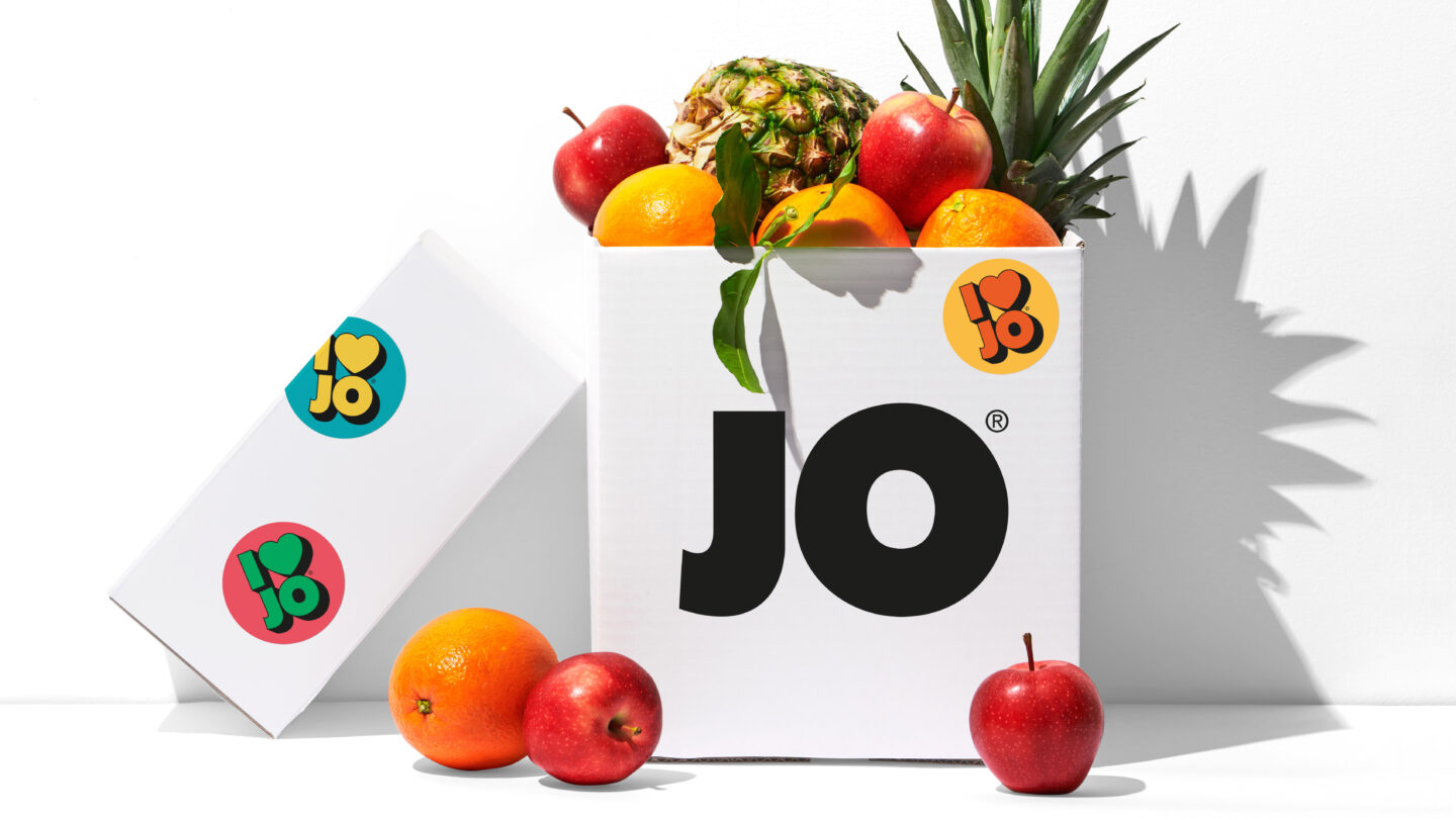
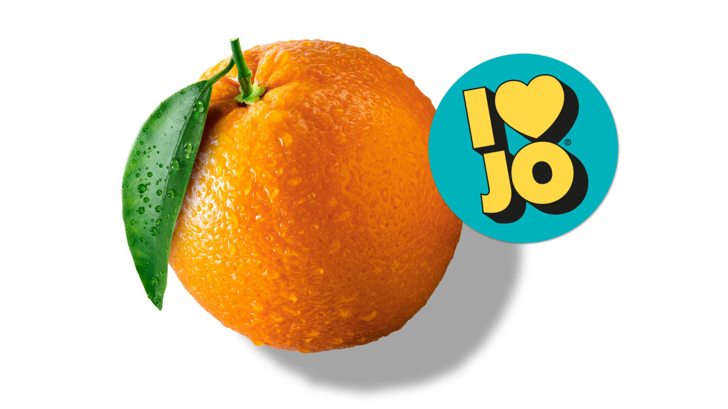
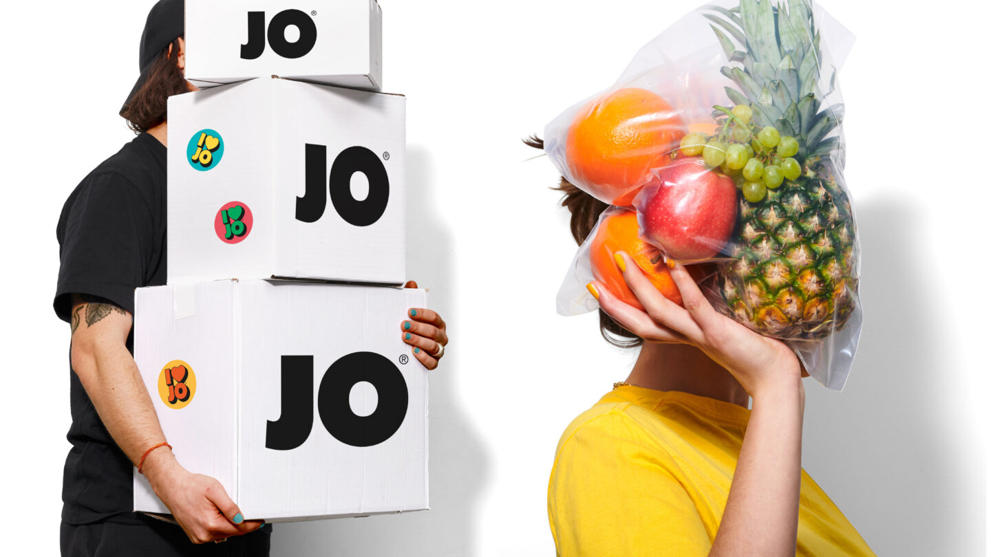
Inspired by the brand’s minimalistic design history, we hold on to the giant dimensions. Fruits are amplified – big and beautiful. Folded from the front of the pack to the sides. The nostalgic white JO backdrop is paired with a black and enlarged logo, heightening the visual impact. The addition of stickers featuring the playful message “I LOVE JO” is also a wink to the past ¬– injecting a fun personality into the brand and serves as a branding asset for in-store and other marketing materials.
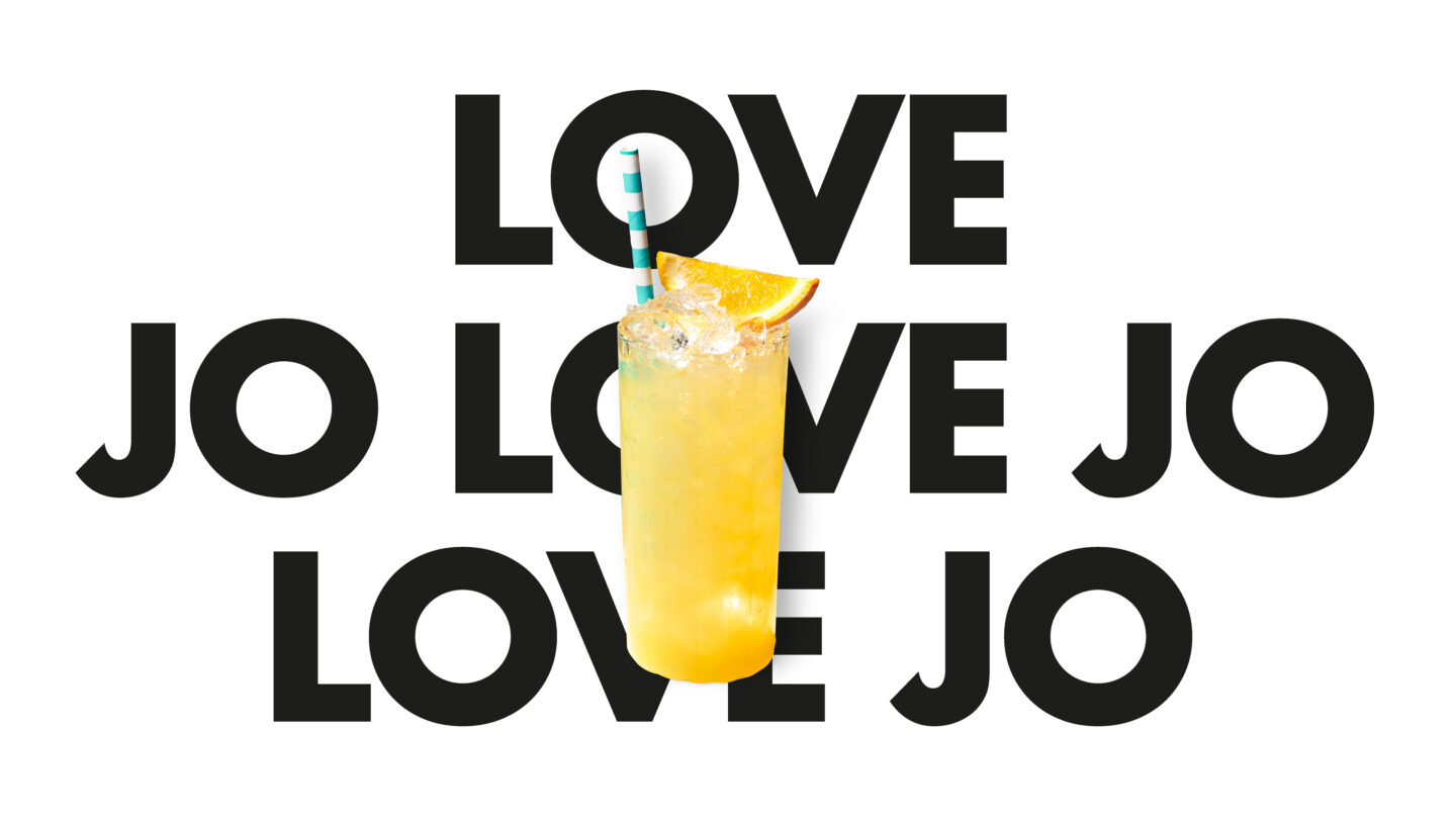
The result is a statement. The bold visuals, nostalgic charm, and playful elements, ensures JO as a staple in Swedish households for generations to come.