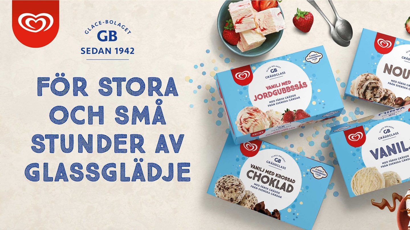
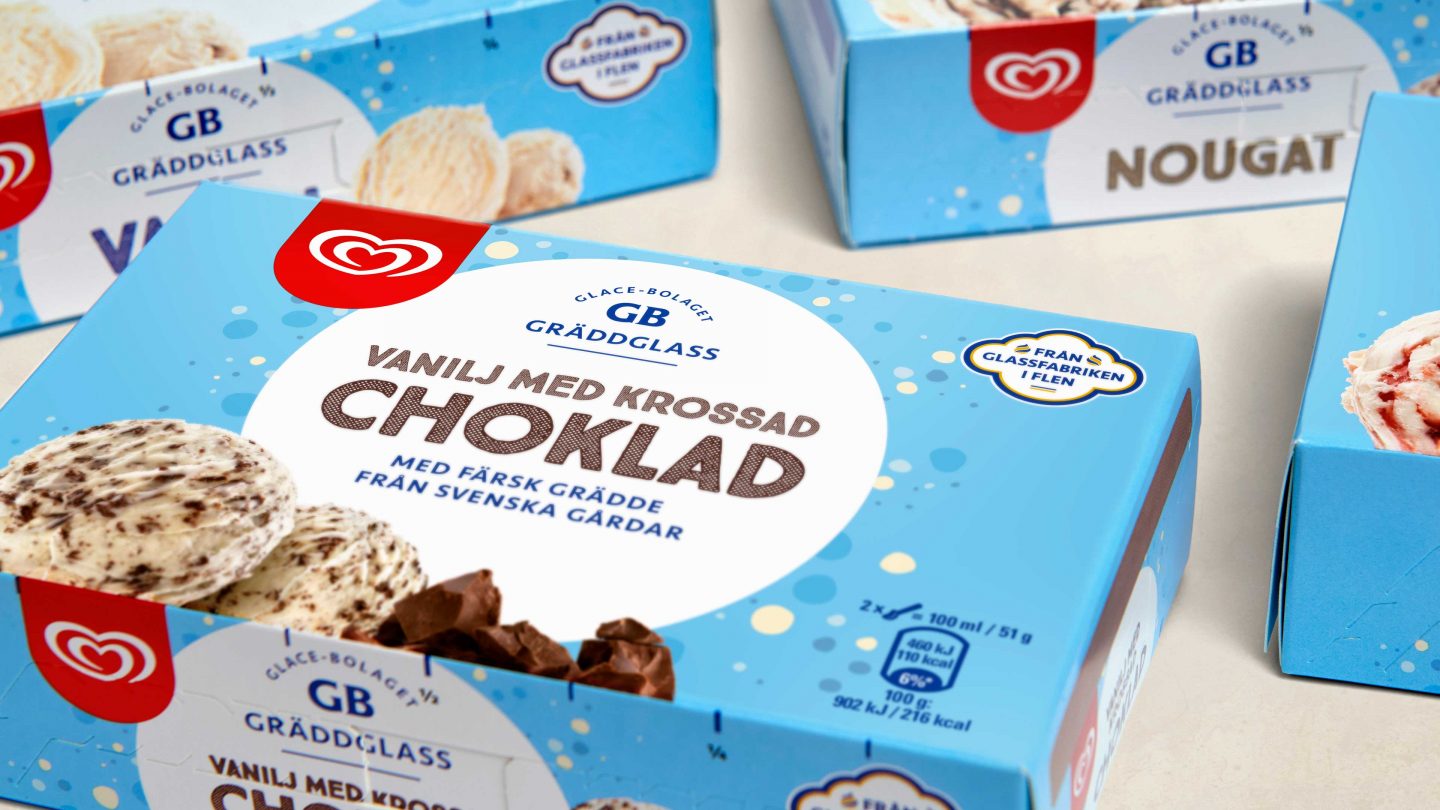
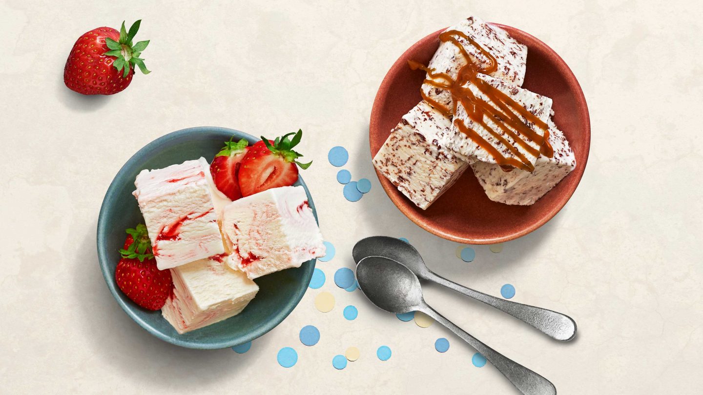
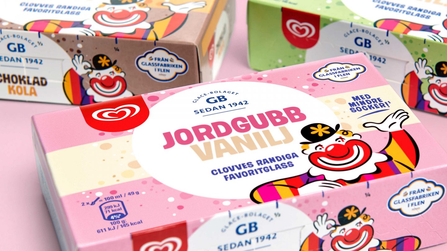
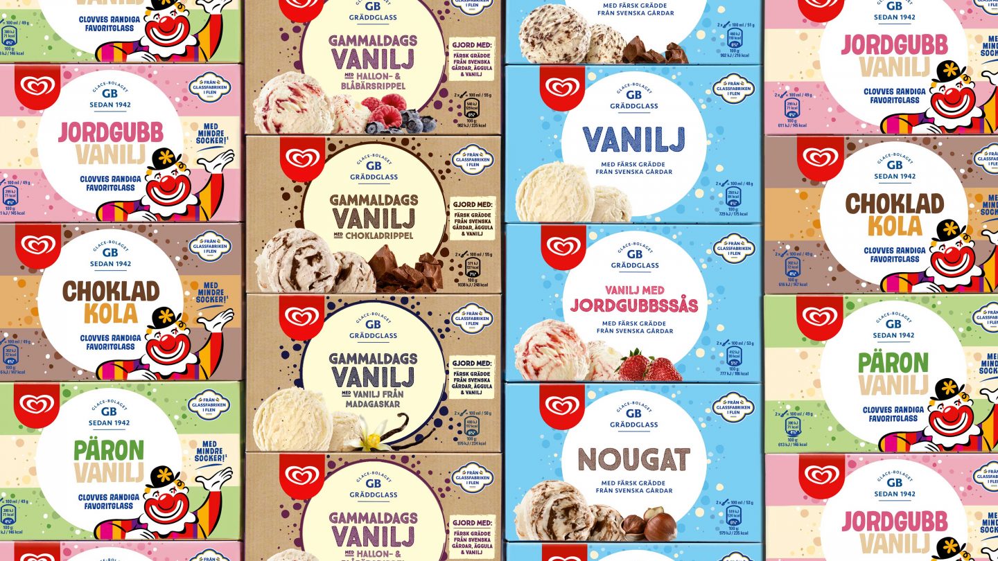
Glace Bolaget, GB, is truly part of our Swedish traditions. The ice cream made in Flen has played a key role at many fikas, birthday parties and midsummer celebrations throughout the years. This project aimed to take the longtime favorite – bricks – giving it a more contemporary look and feel. It is well deserved since the brick format is the most sustainable packaging for ice cream. And it has as a special feature – divide it into half’s and eat directly from the box!
Filled with high quality ingredients the ice cream sold in bricks deserved a refresh. Being launched in the market already in the 1950´s it has become a Swedish icon and part of our ice cream culture. Visually the range had more or less stayed the same for a number years and there was a growing need to activate the format to be relevant, attractive and noticed in this dynamic category.
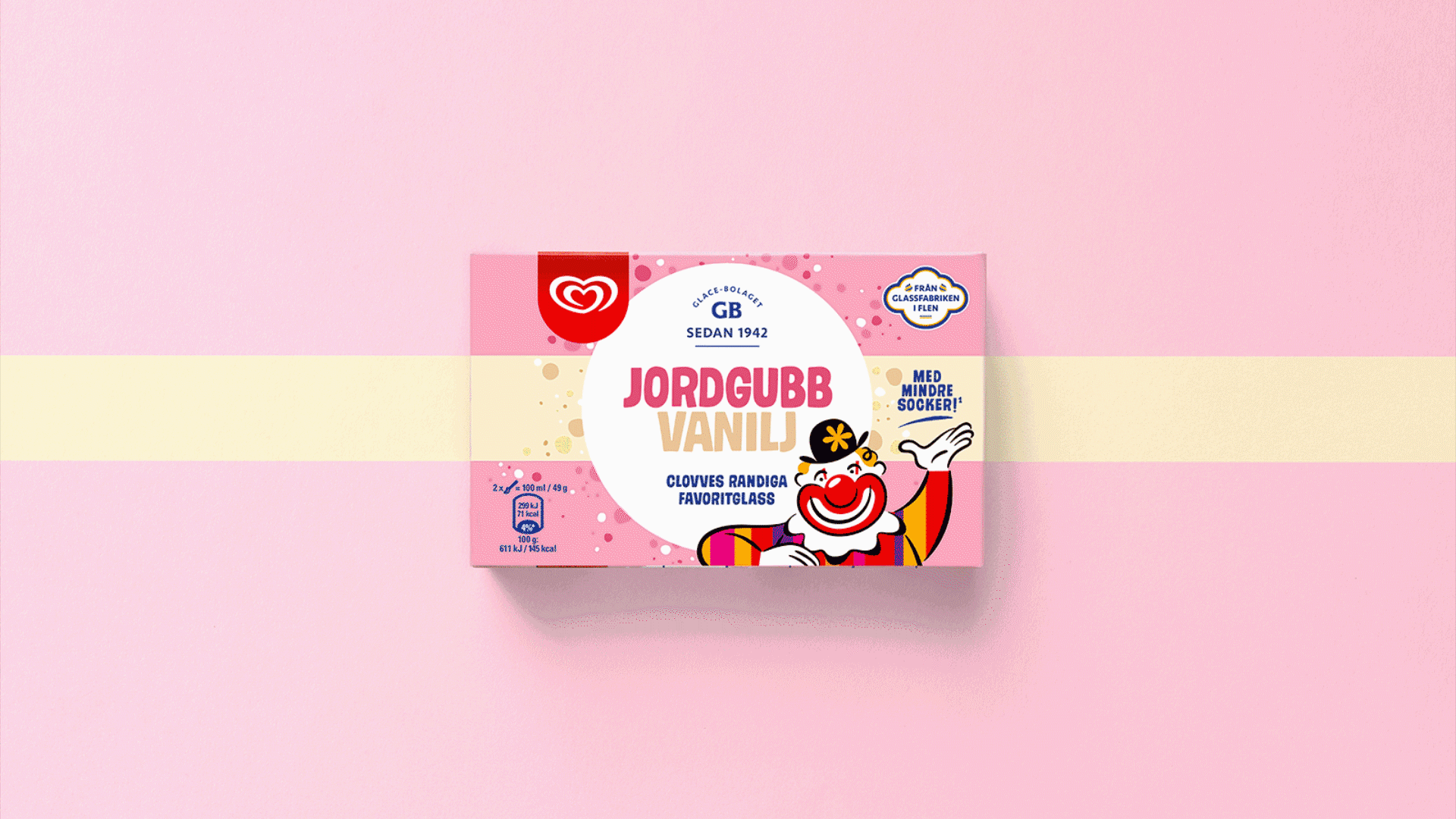
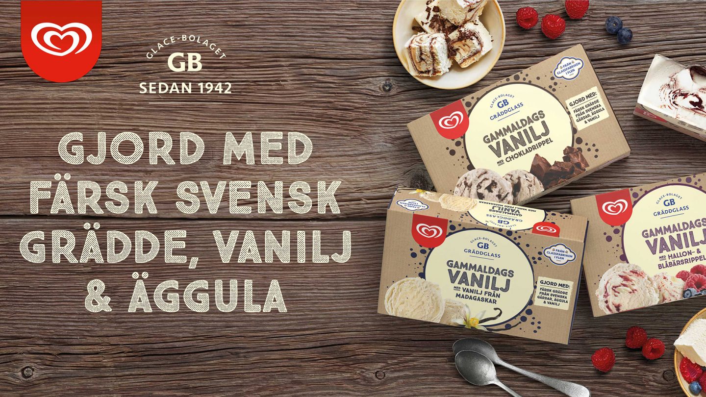
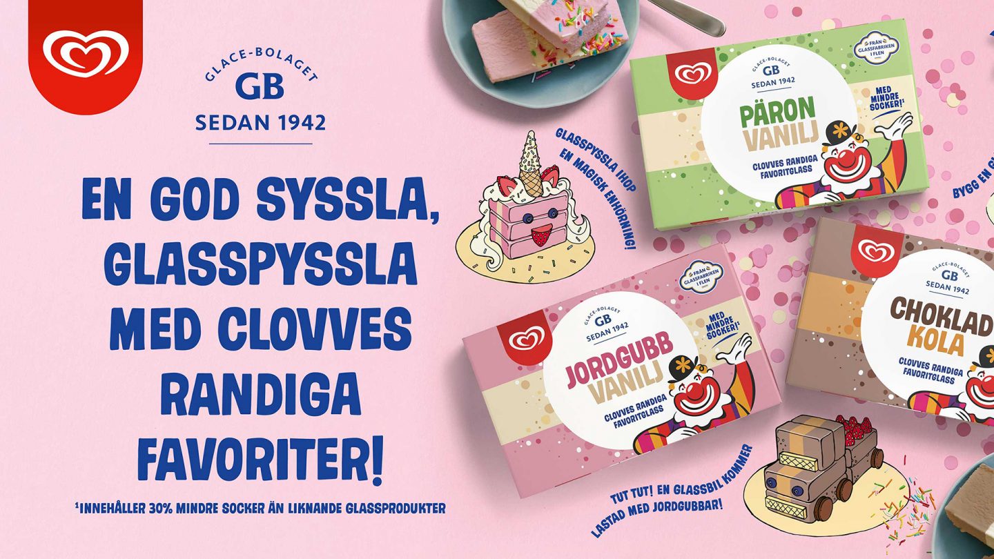
To clarify the product offerings and drive renewed interest from consumers the brick format was developed into three ranges with clear positionings. Apart from the core products, Gammaldags Vanilj was given a couple of new friends adding chocolate and berries to the iconic vanilla recipe. GB also identified an opportunity to make a children’s special inspired by the Big Pack format with it´s stripes in different colors and of course different flavors. We wanted to create a design system that allowed us to give the three ranges their own engaging personality while continue to build a strong GB brand in the market.
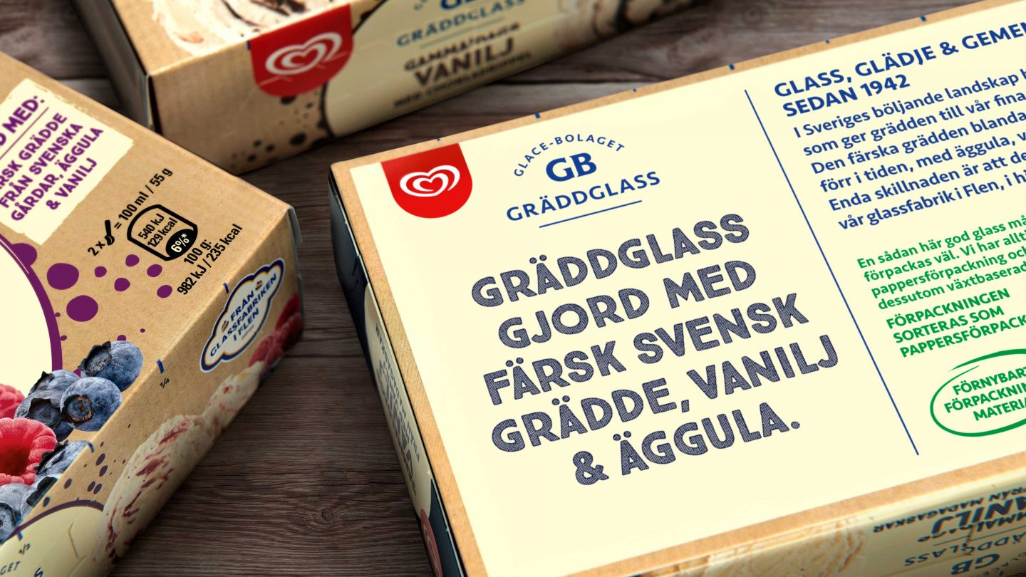
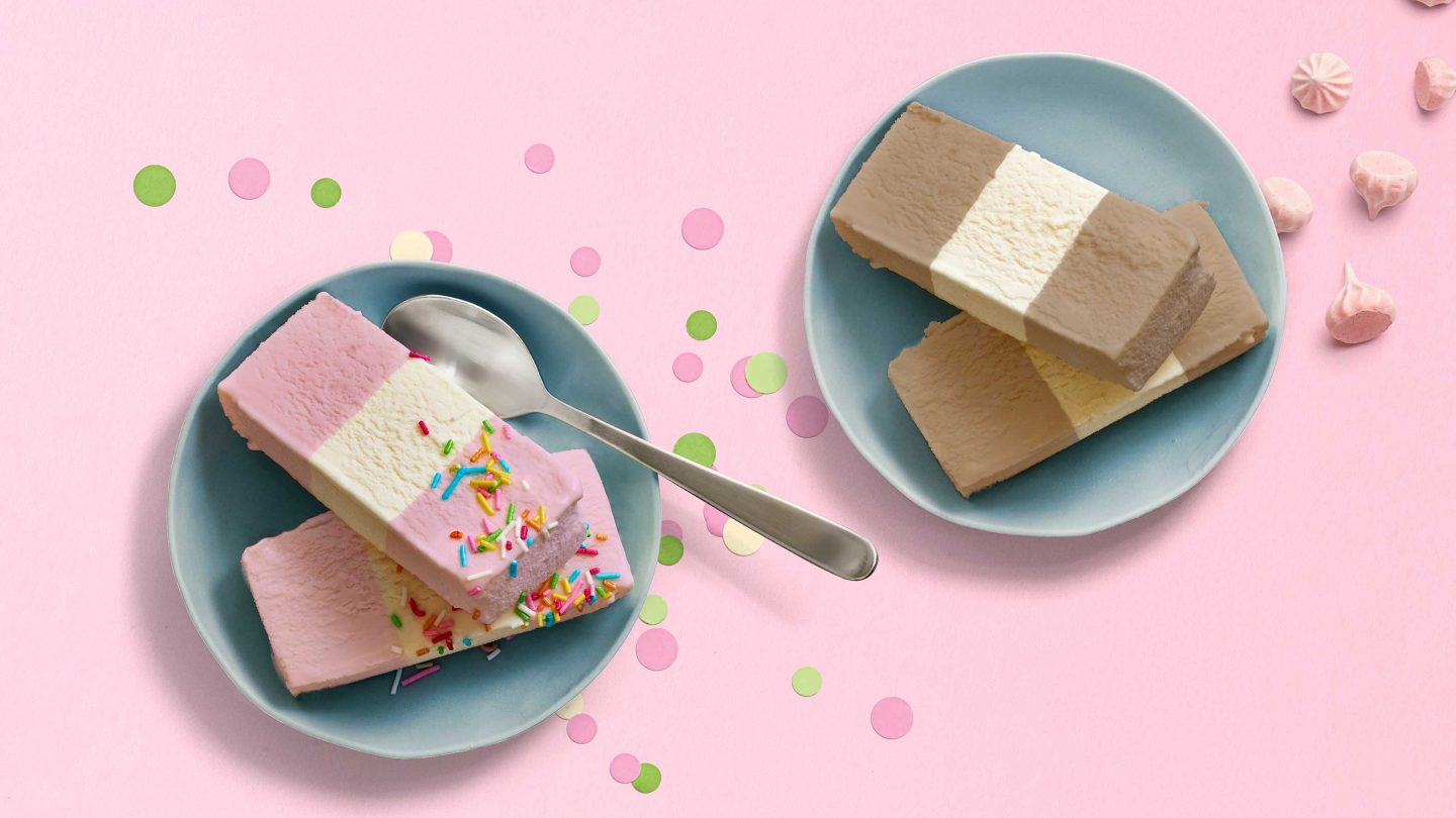
The result is an authentic look with lots of love for the ice cream. The style is putting flavor at the forefront using natural and joyful design elements. For the children’s special the clown Clovve plays a key role and the stripes from Big Pack were kept and modernized. Back of pack takes it all the way and inspires you to build your own ice cream cake. Gammaldags Vanilj is all about the pure natural and authentic recipe, that´s why it is boldly stated on both front and back of pack on a beige cardboard paper. For the core range we were inspired by the natural tasty flavors, giving the characteristic blue colour a more natural tone, adding confetti to express celebrations, festivity and happiness coming from the inside.