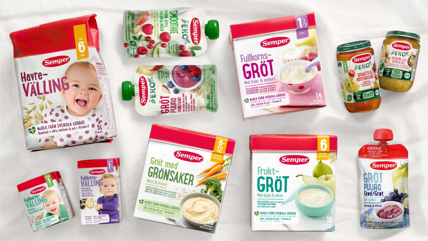
Semper, the creators of the world’s first baby formula, is loved by generations of parents and children. Semper’s history goes back to the 1930s, when a new method for drying milk was created. Today, Semper is the leading baby food brand in the Nordics.
Pond Design has been a longtime partner to Semper. As the assortment grew and the portfolio expanded, there was a need to bring the design up to date and create a natural and inviting brand experience that strengthens the brand’s Swedish roots and leads the way forward.
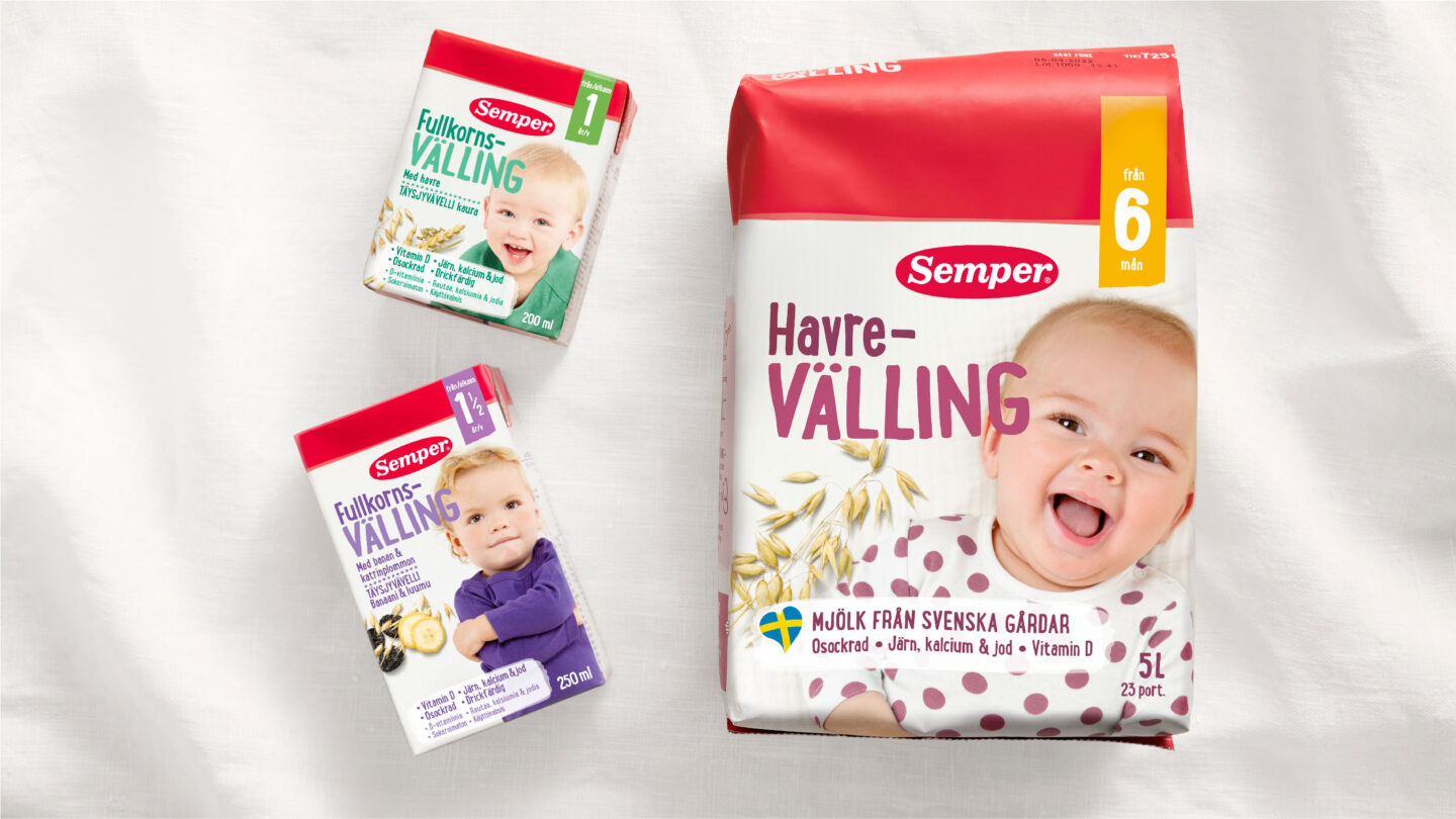
We was commissioned to identify a distinct future fit design strategy and visual identity for the iconic brand. The challenge was to create a visually impactful design system that will allow for both unity and flexibility throughout the different markets and categories. Still maintaining one brand.
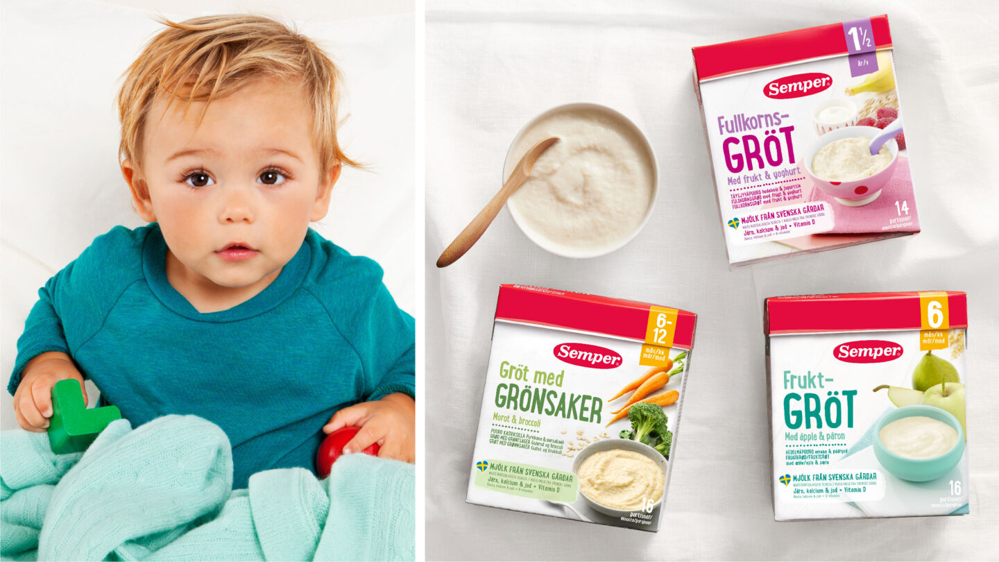
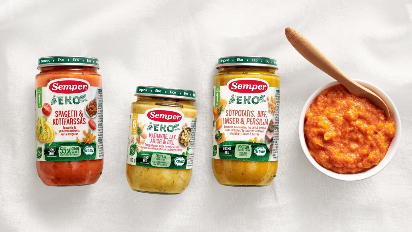
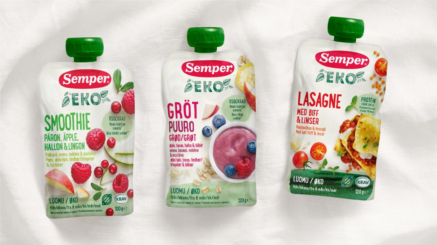
Semper’s baby food is all about integrity and respect for nutrition, allergens, and taste. It’s natural food, in every aspect. The design had to deliver a sense of trust, transparency, and familiarity. Furthermore, Semper should feel like the best and most natural choice for parents, regardless of language.
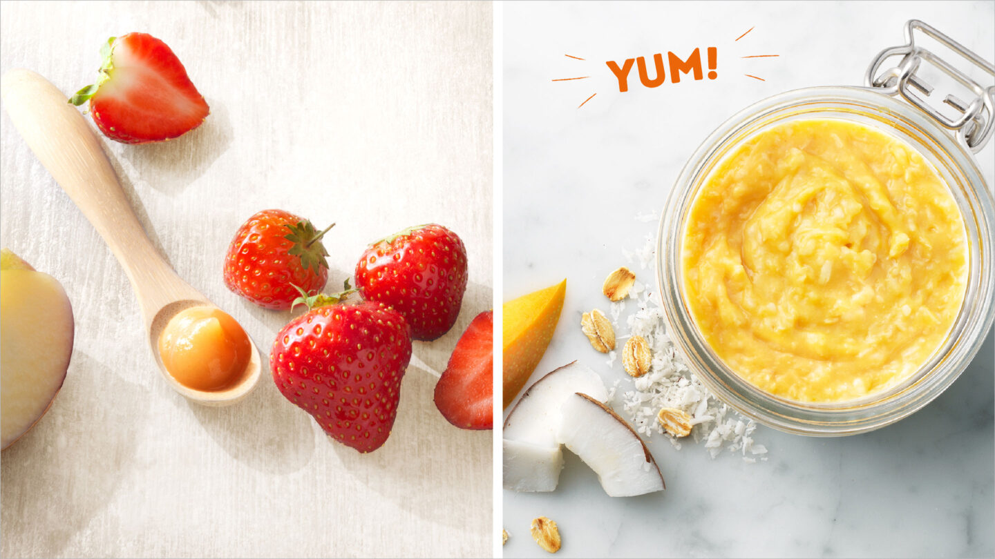
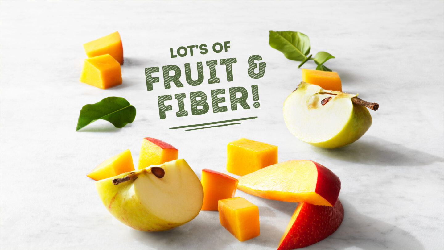
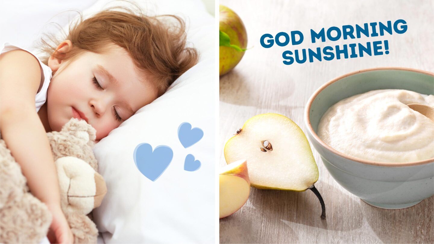
We shaped the new design expression from a platform of honesty and attention to details – and last but not least – taste and deliciousness. The large number of brand-assets previously in use made the brand look cluttered. Assets had to be reviewed, selected, refined and redefined. Working with reputable food photographers and stylists was also an essential part in creating the eye-catching Nordic feel.
During the years, the design has evolved, but without ever losing its warmth, credibility, and contemporary touch. And, who said baby food can’t look delicious?
