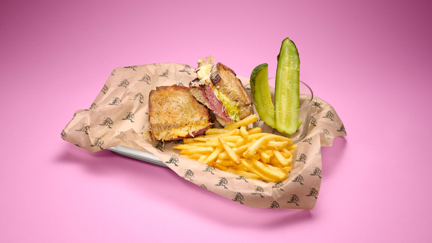
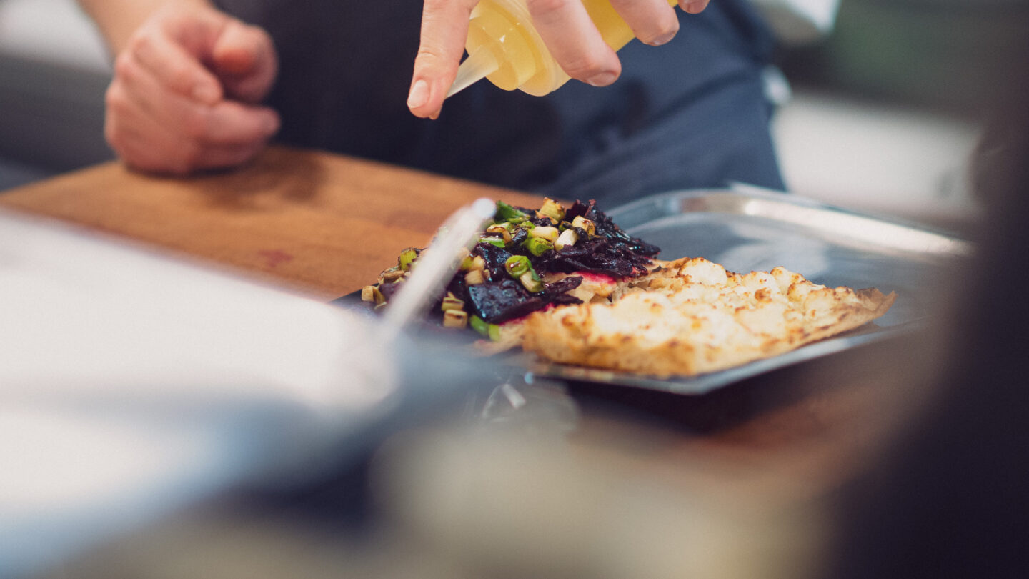
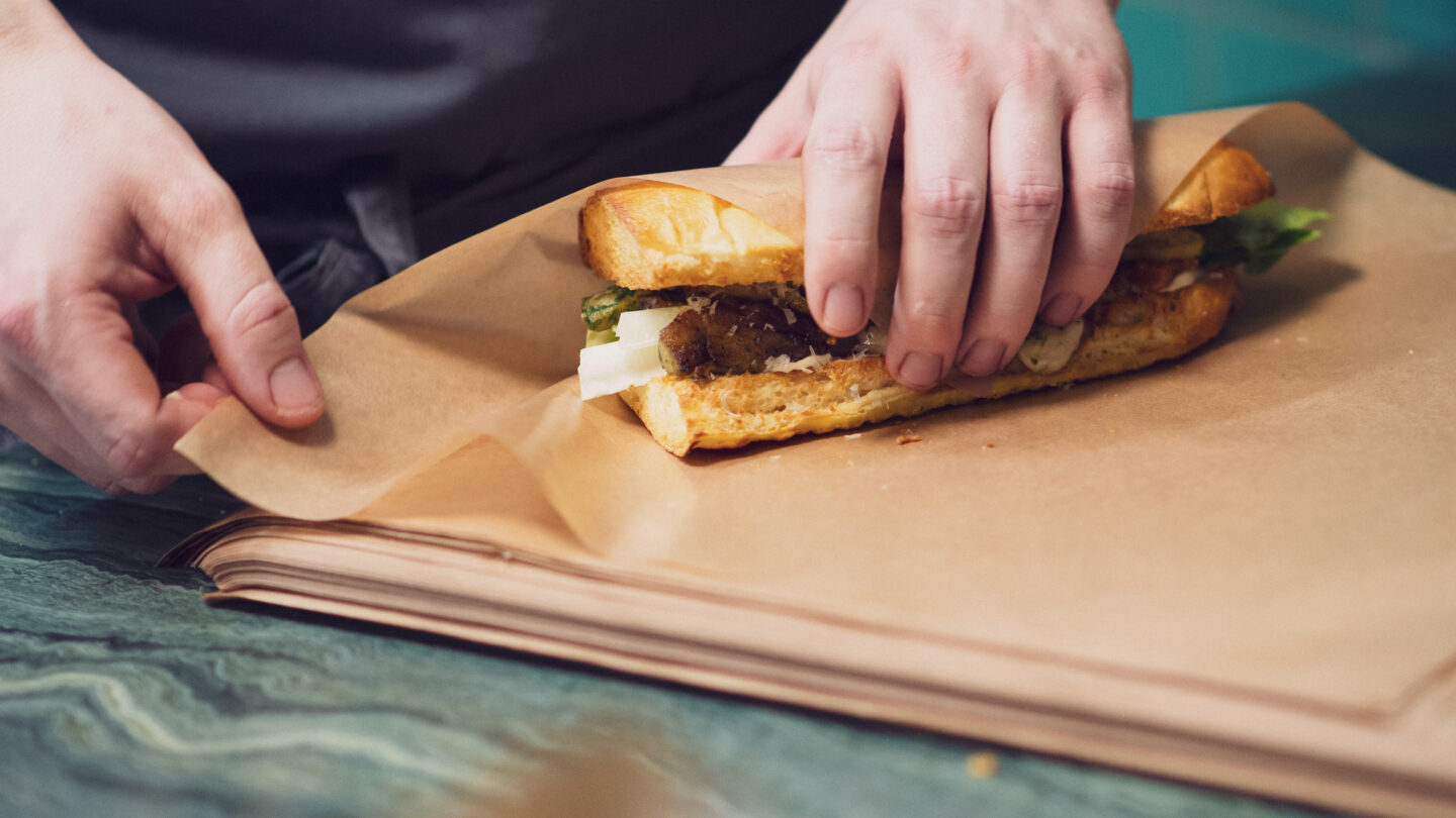
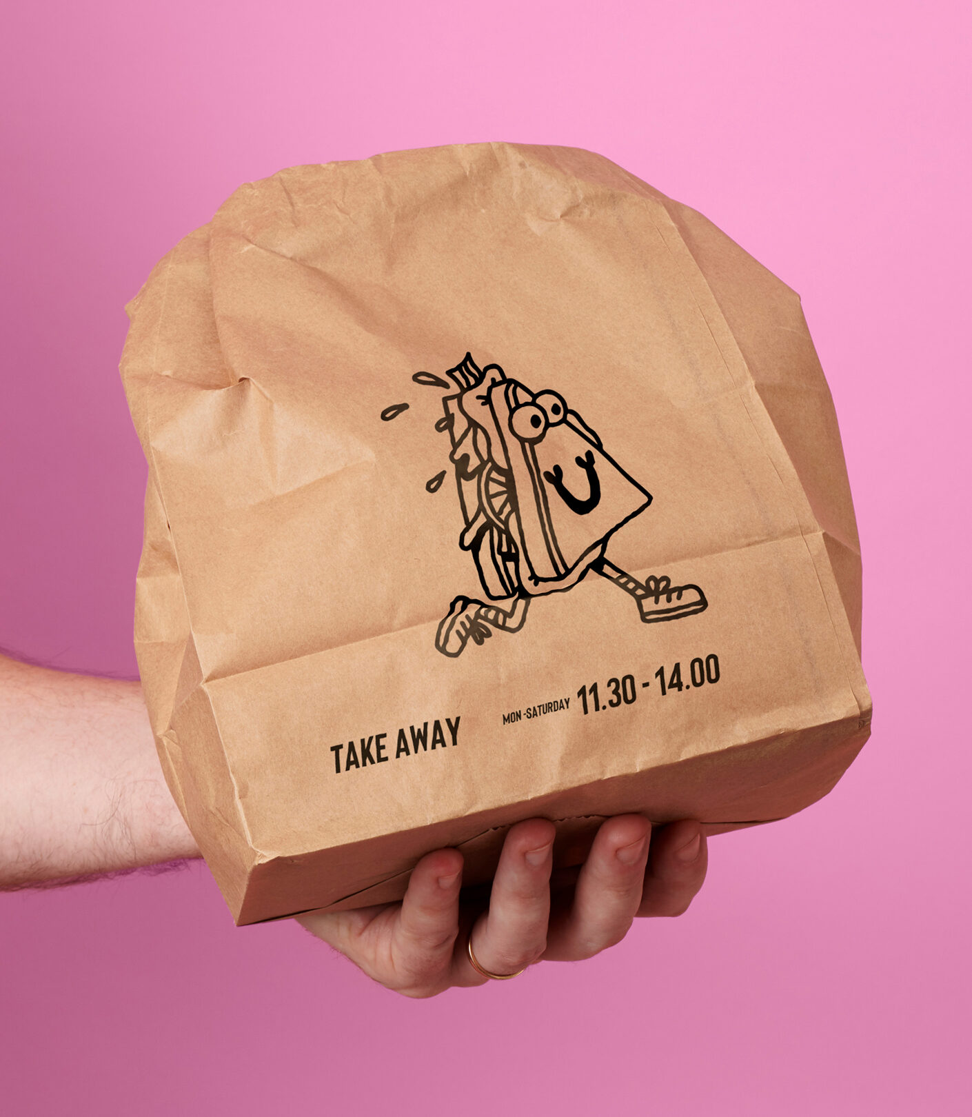
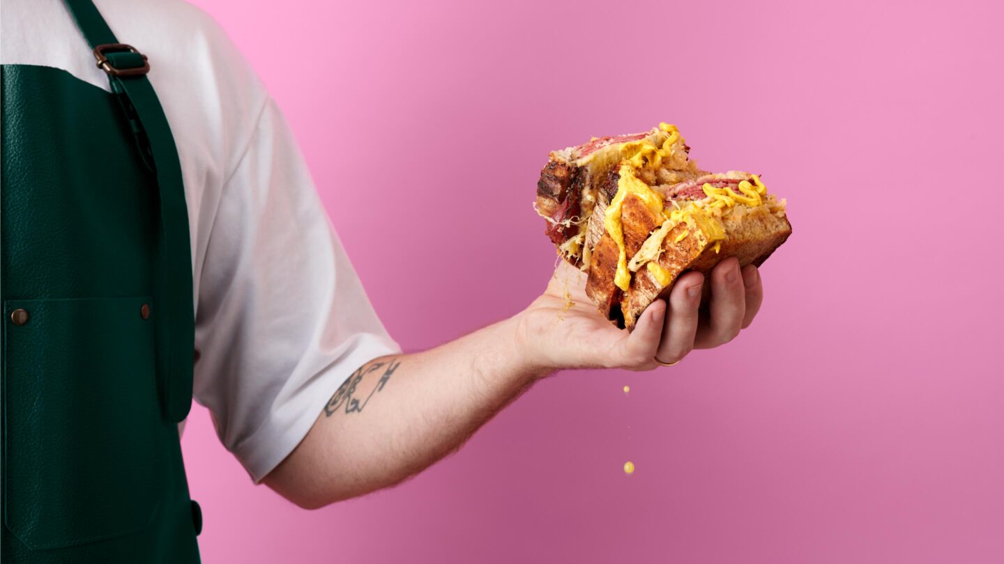
A few years ago, we created the identity for Restaurant Nabo, a premium dinner and bar concept in central Stockholm. But Covid hit hard. To meet the needs of a city held back by a pandemic – they decided to open a fast-food place next door, catered for comfort food pick-ups with premium melts and pastrami sandwiches. We got the opportunity to create the identity – and Nabowich took shape.
For this new and younger concept, we continued to build on our Nabo design. Our objective was to capture a takeaway concept on par with the Nabo taste and quality. To both have a kinship and differentiate the two establishments, we treated them as brothers with recognizable assets, just adding more attitude.
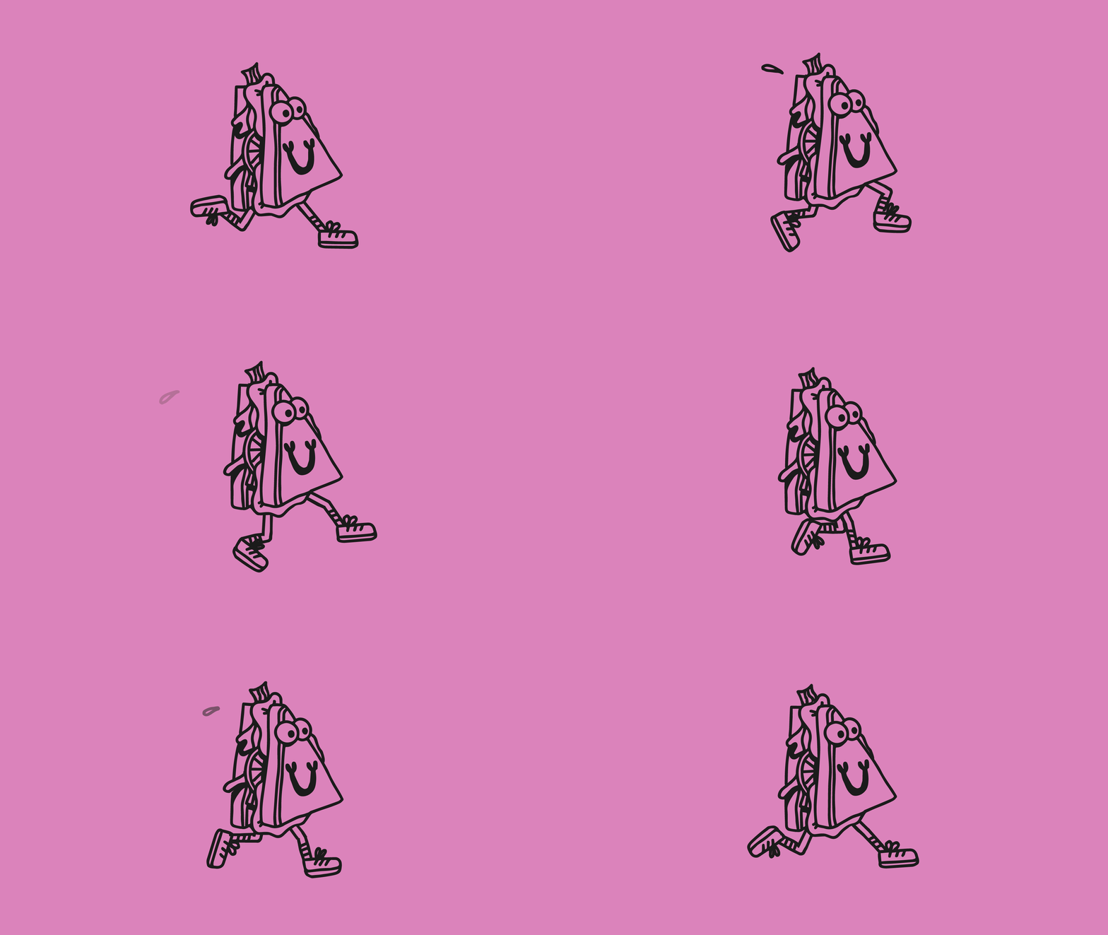
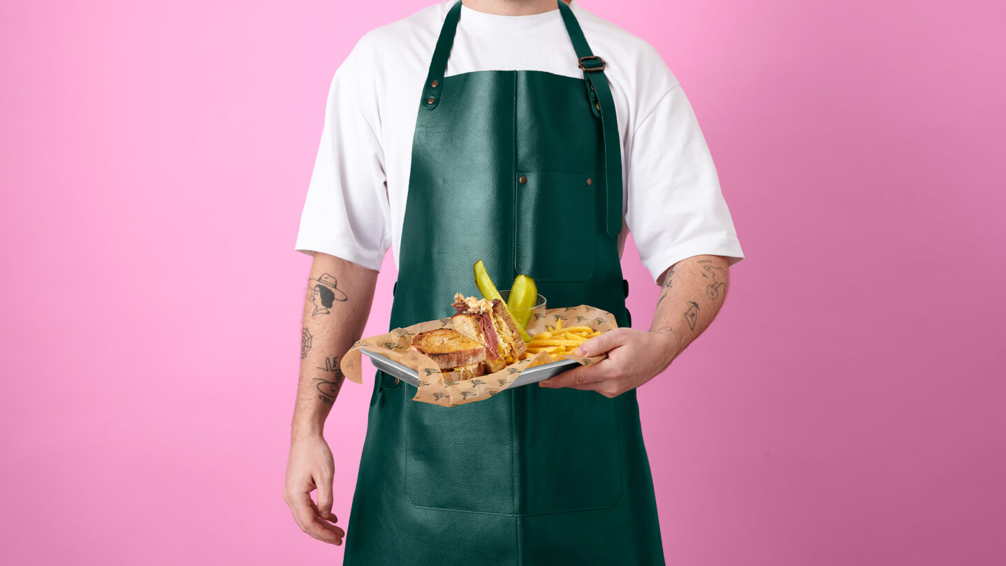
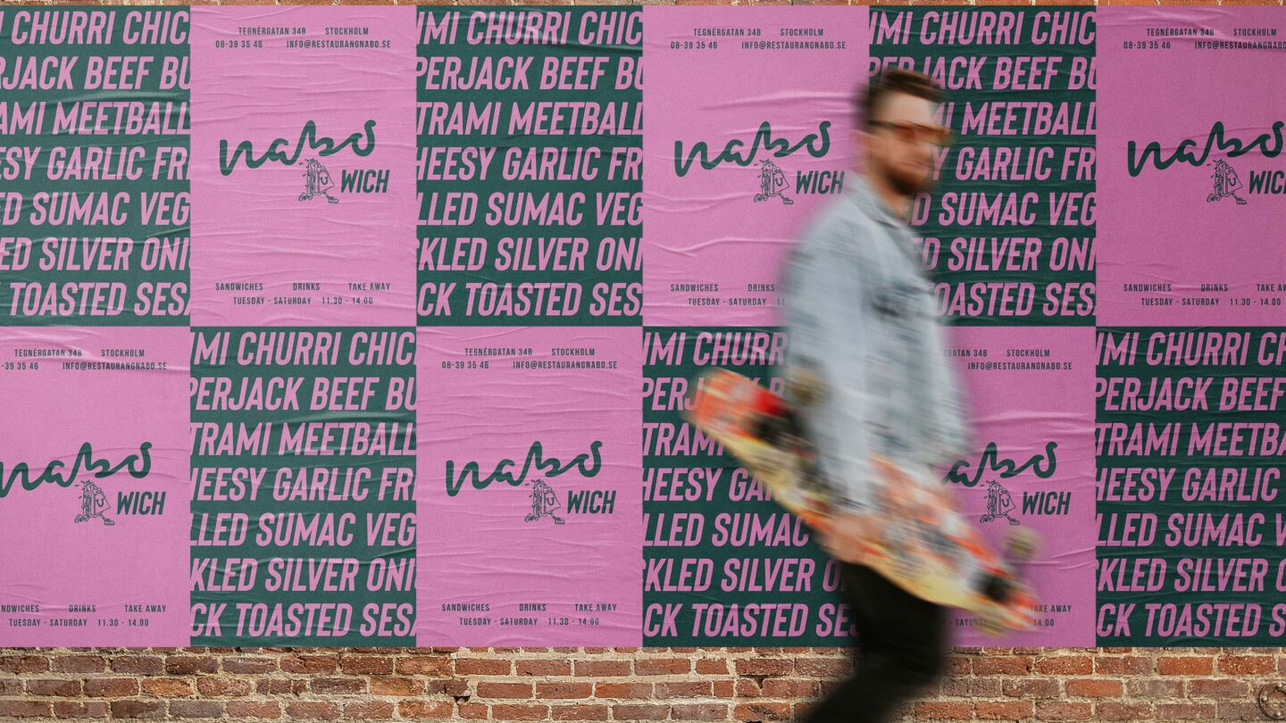
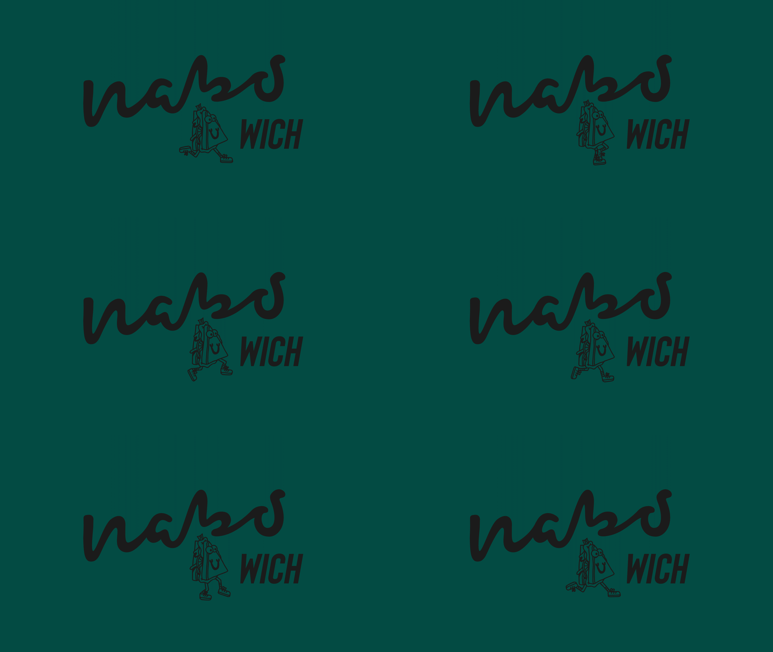
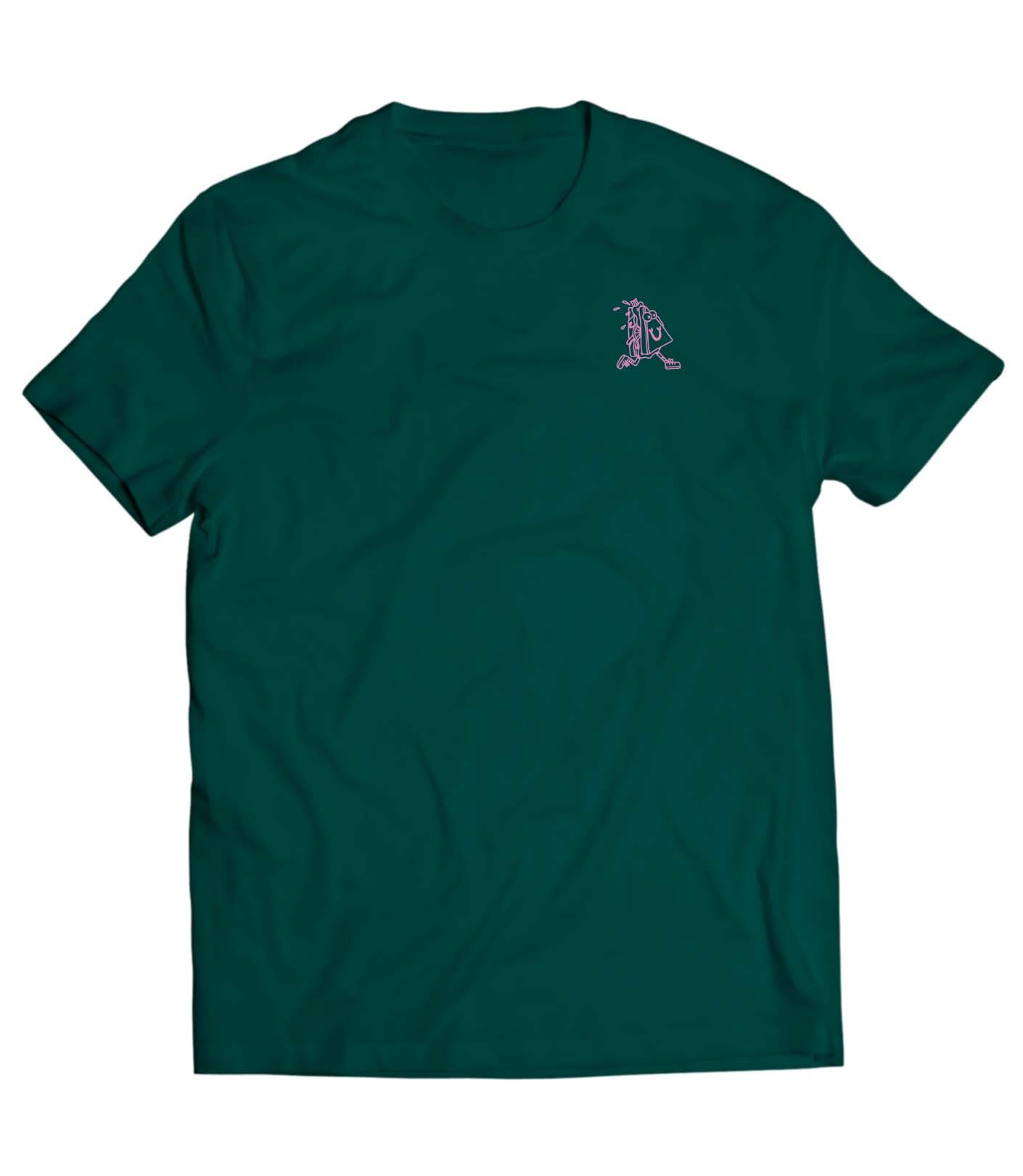
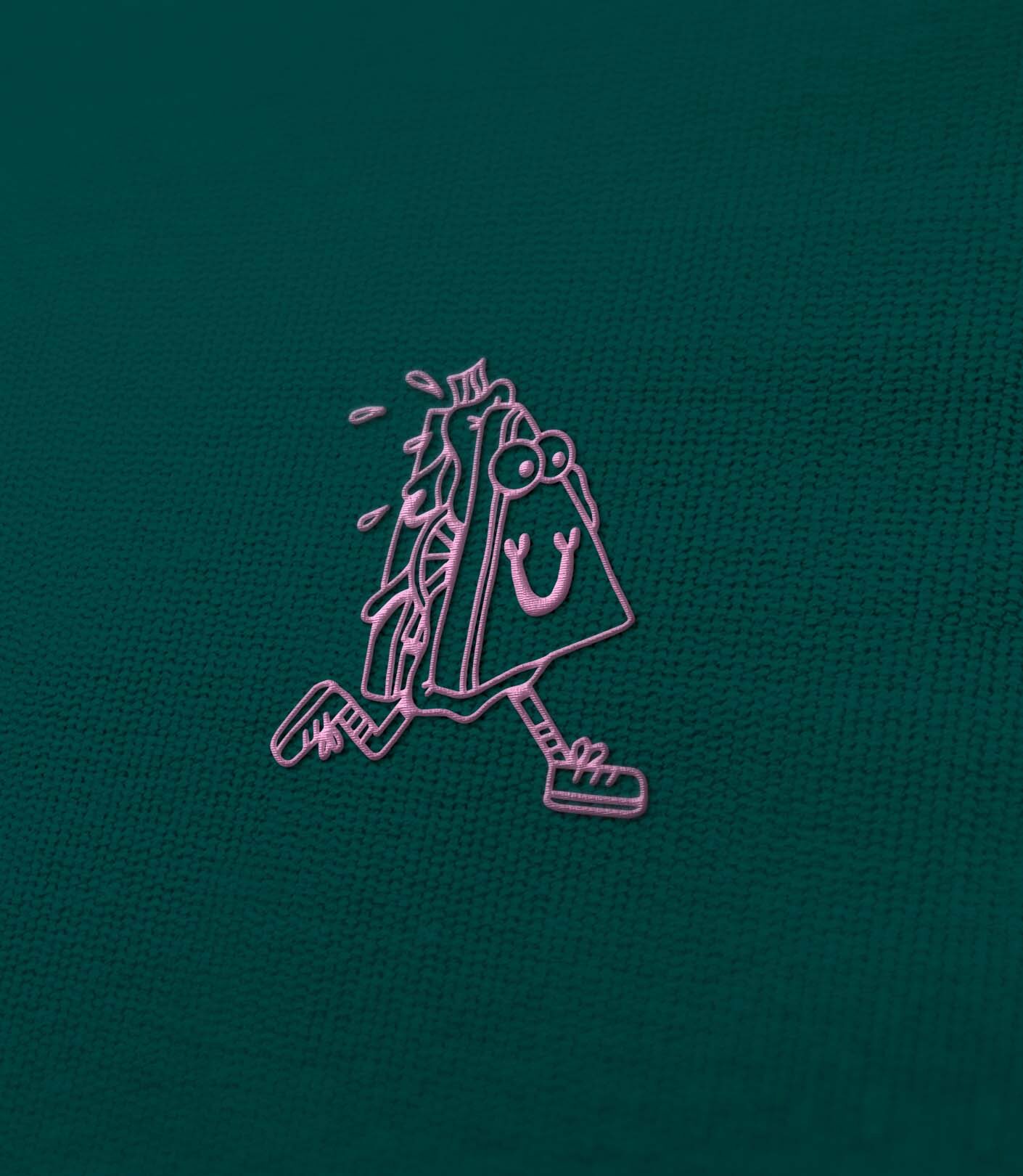
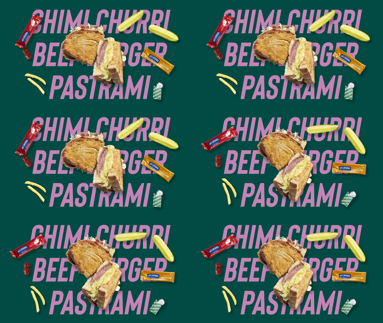
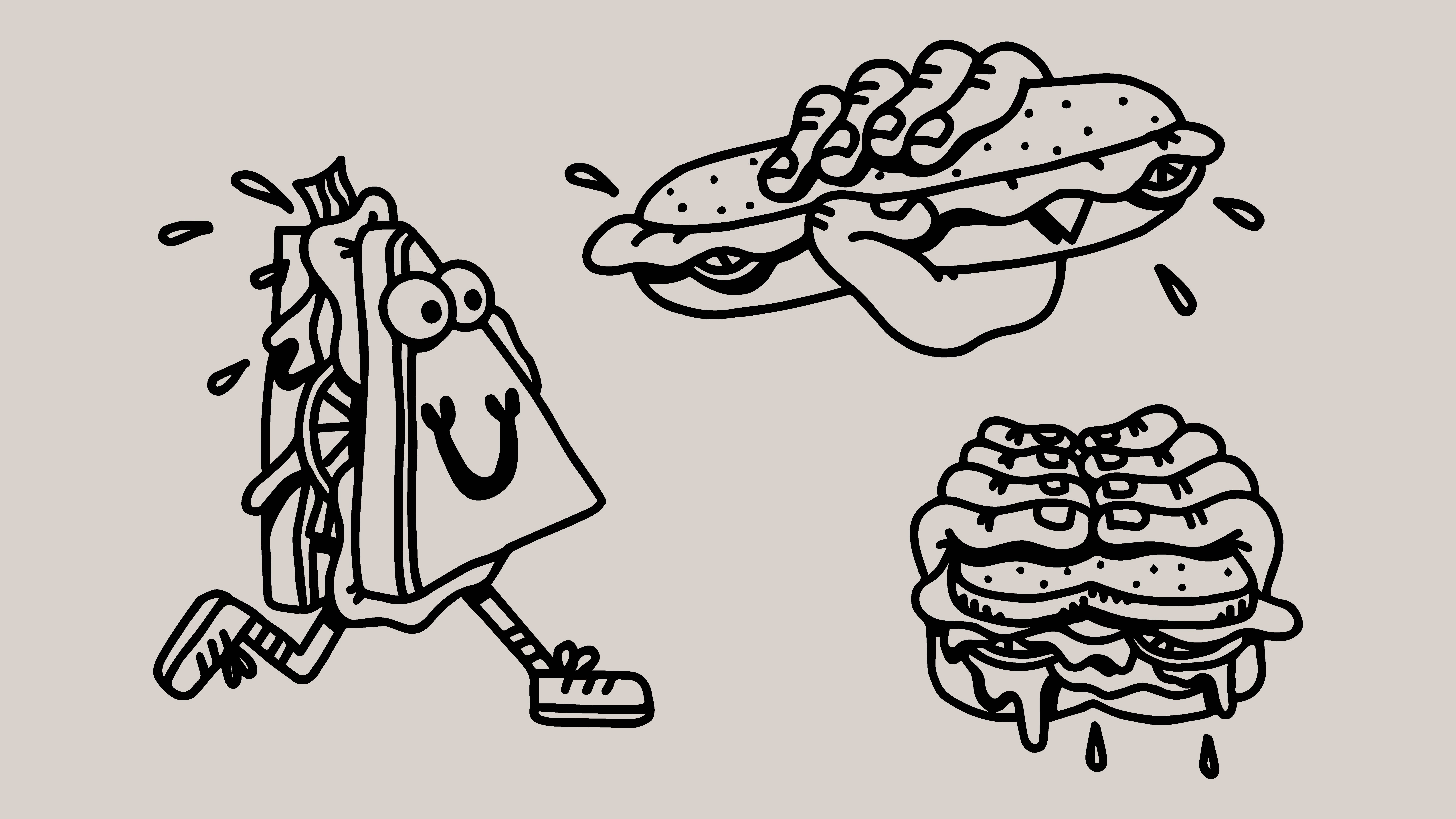
The Nabo logo was kept uniting them. By adding “wich” in a different font, we made a subtle reference to the word “sandwich”. With the Nabo Dark Green at the center, we swooped up the accent colour scheme with a punky pink. To keep adding unexpected elements in a fine-dining context, the imagery style is influenced by the aesthetics of classic fast-food stands. With an illustrated fast-running sandwich melt, we’re visualising the on-the-go-theme and adding a touch of humour to this premium identity.
