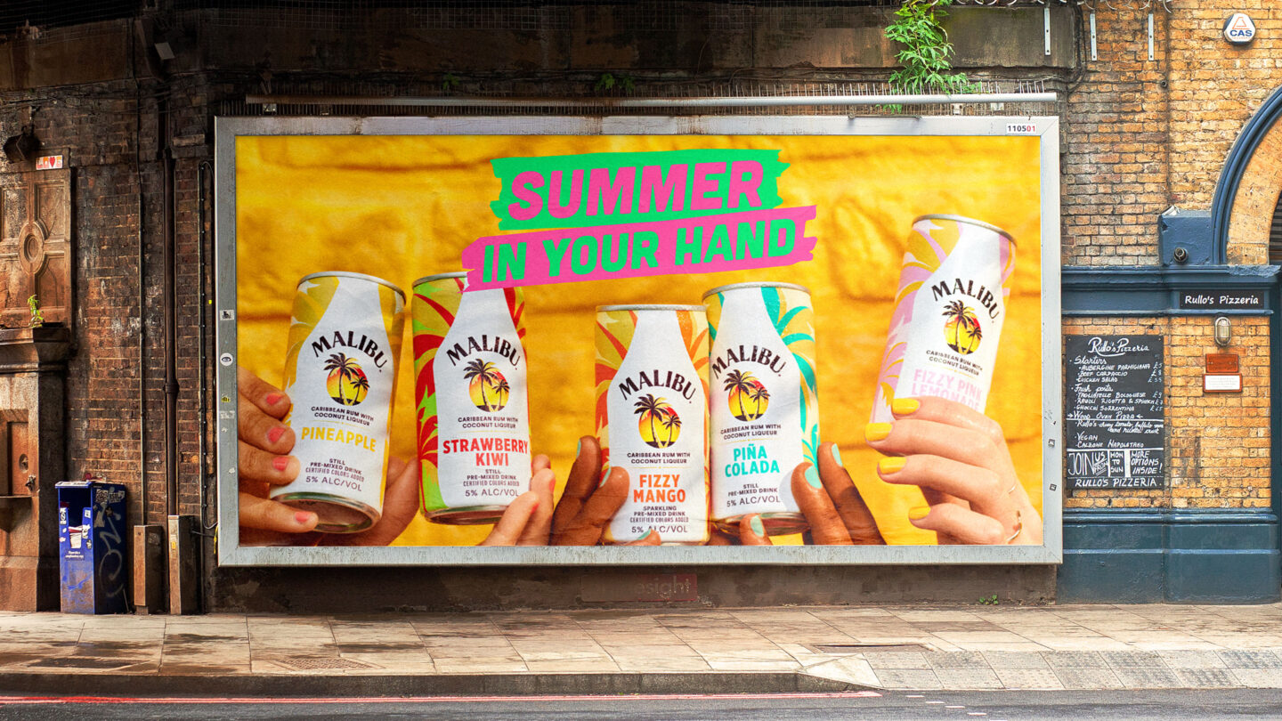
With this refreshed master brand identity for Malibu, we’re enabling the brand’s iconic summer vibes to be enjoyed anywhere, any day. We’ve shaped a fun, friendly and vibrant brand – sharing the colors of Malibu and their fun-loving spirit like a summer breeze across continents.
With a rich past and strong brand, Malibu saw a need to refresh their identity to play a greater role in the lives of a new generation. Our challenge was to find the balance between retaining the strengths from the existing identity, and still make a fresh and dynamic impression.
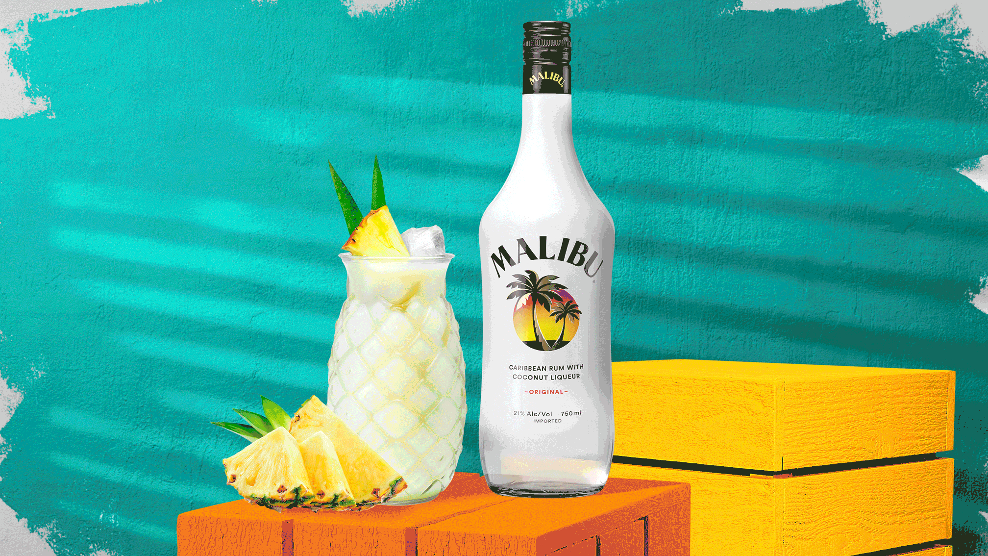
This brand had been ‘stuck on the island’ for too long – we wanted to shift focus and change the perception of Malibu to being ‘from the island’ instead. It led us to define a concept for the new master brand identity – ’The Colors of Malibu’.
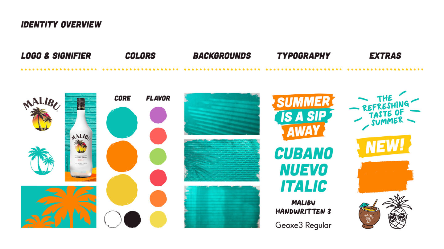
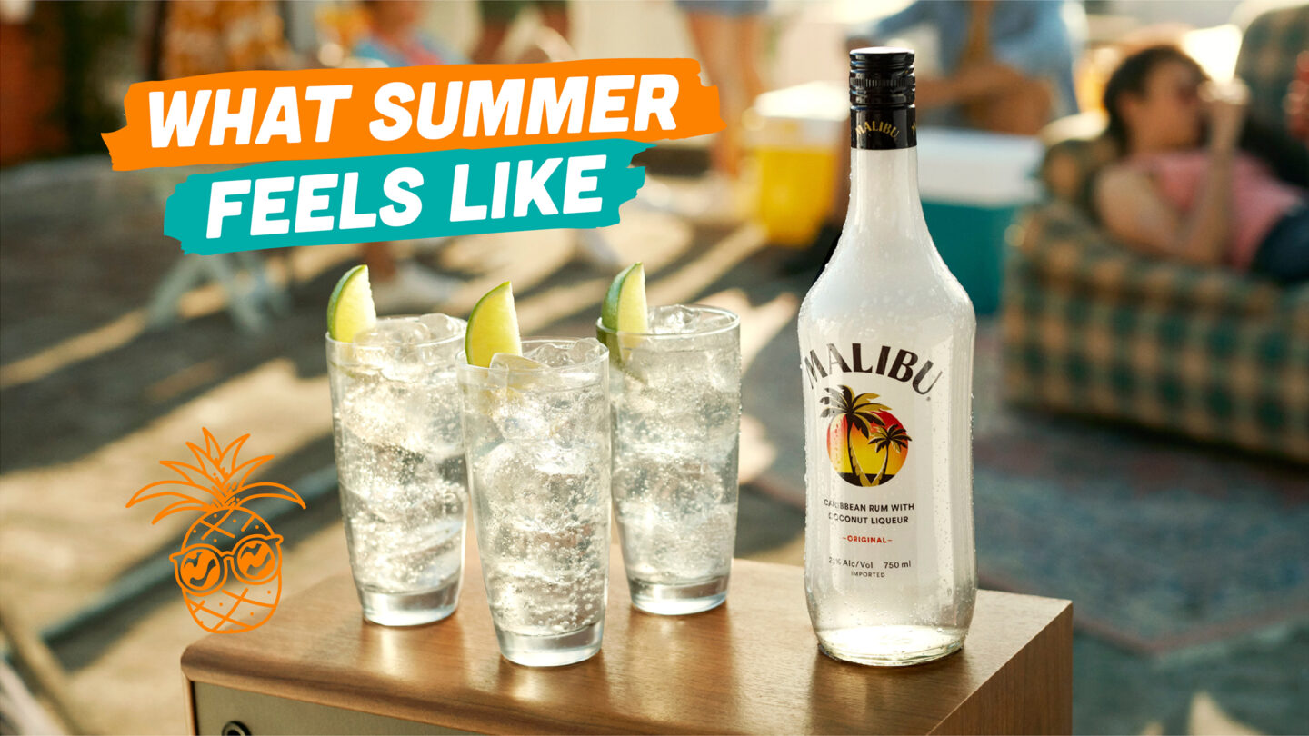
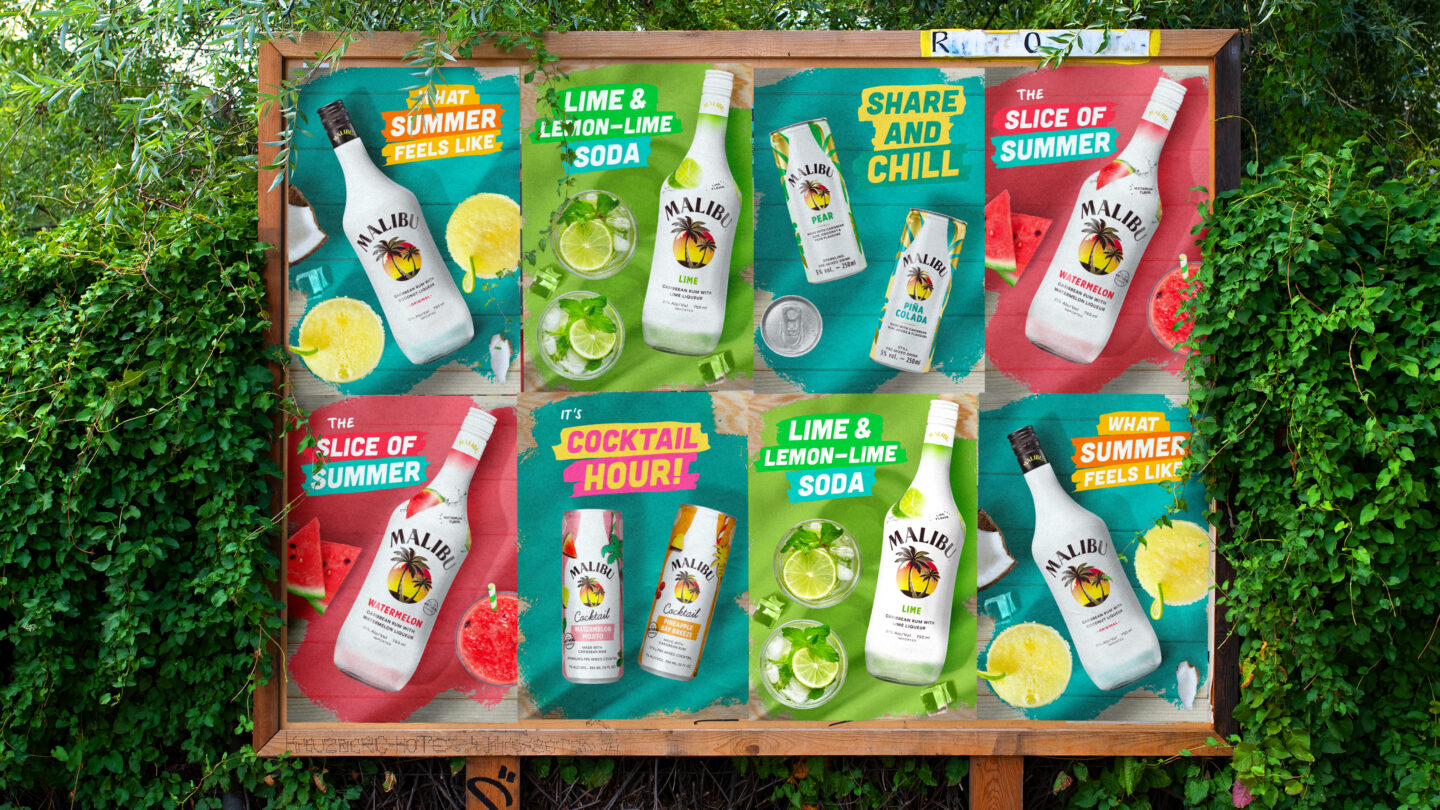
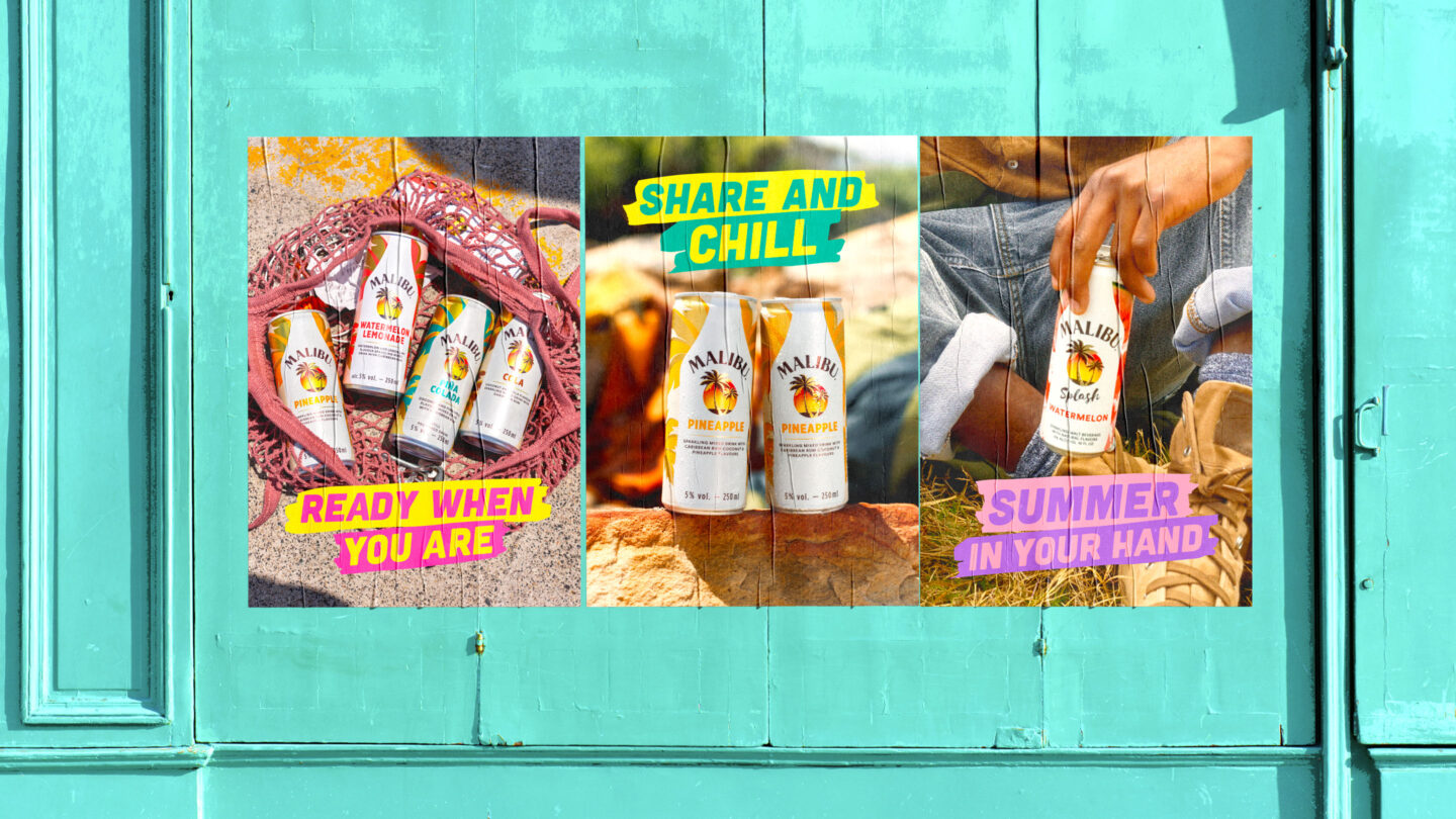
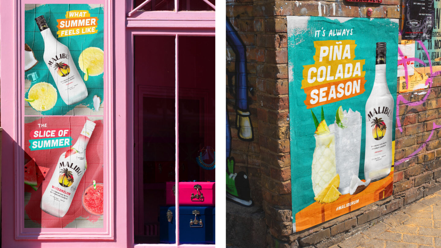
We added new colors and made them the core. They visualize Malibu as a playful, optimistic, and energetic brand – being vibrant, injecting energy, conveying taste and refreshment. By keeping turquoise as the main communication color, the new shades both build identity and work together with existing product colors.
By adding a new set of backgrounds with dramatized environments and places, we created a summer feeling with textures and shadows. And to give the brand a more modern, energetic, and cohesive appearance – we added a new customized version of the main brand font (Cubano) and a handwritten font previously only seen on packaging.
Finally, to bring the personal and playful side of the brand to life, we developed a new set of graphic elements and icons to convey Malibu’s light-hearted personality and to make the brand feel more personal, human, casual and less staged. Some icons, like our fruits and drinks, are timeless while others can be created to fit current trends.
All in all, Malibu’s identity is now bringing colors and summer vibes from the Caribbean Island to the rest of the world. Enjoy!