Can an iconic juice brand, rooted in the purity of the orchard, find its soul in the clinical world of functional water? Since the 1960s, BRÄMHULTS’ juice has been synonymous with 100% natural fruit. Entering the functional aisle – a space defined by synthetic ingredients and sterile, pharmaceutical aesthetics – demanded an emotional design that balances BRÄMHULTS’ premium natural roots with a high-performance sports edge.
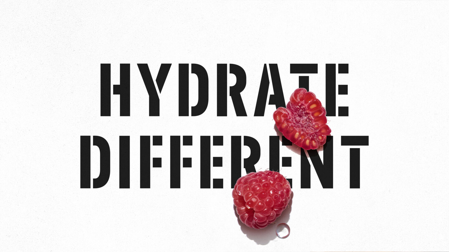
While established brands rely on lab-grown formulas, a new generation of health-conscious consumers seek transparency. We distilled to amplify, stepping away from medicinal data toward the vibrant energy of nature itself. The strategy was to emphasize what others leave out and build on the concept of “Hydrate Different”.
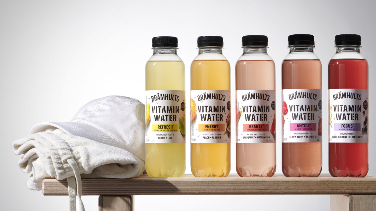
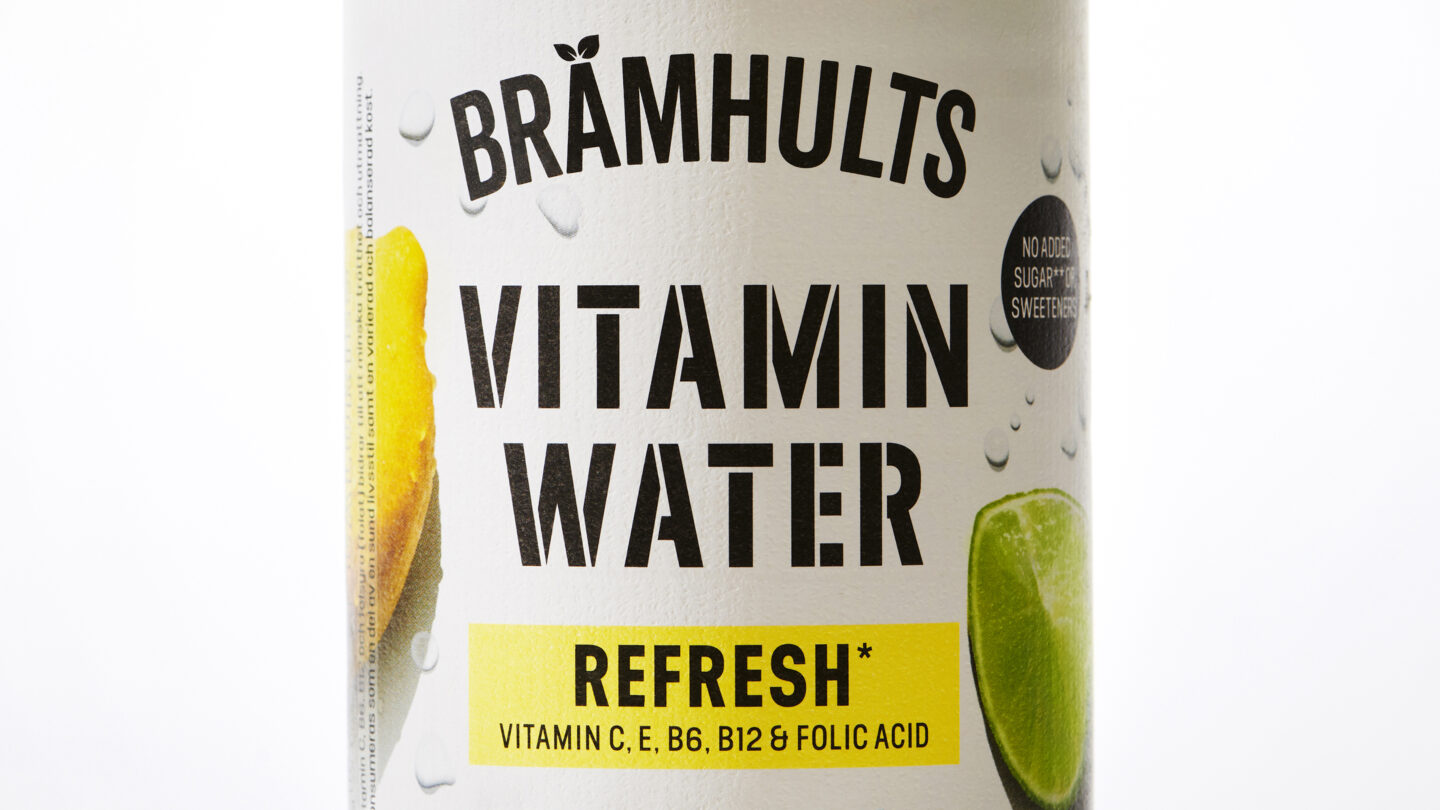
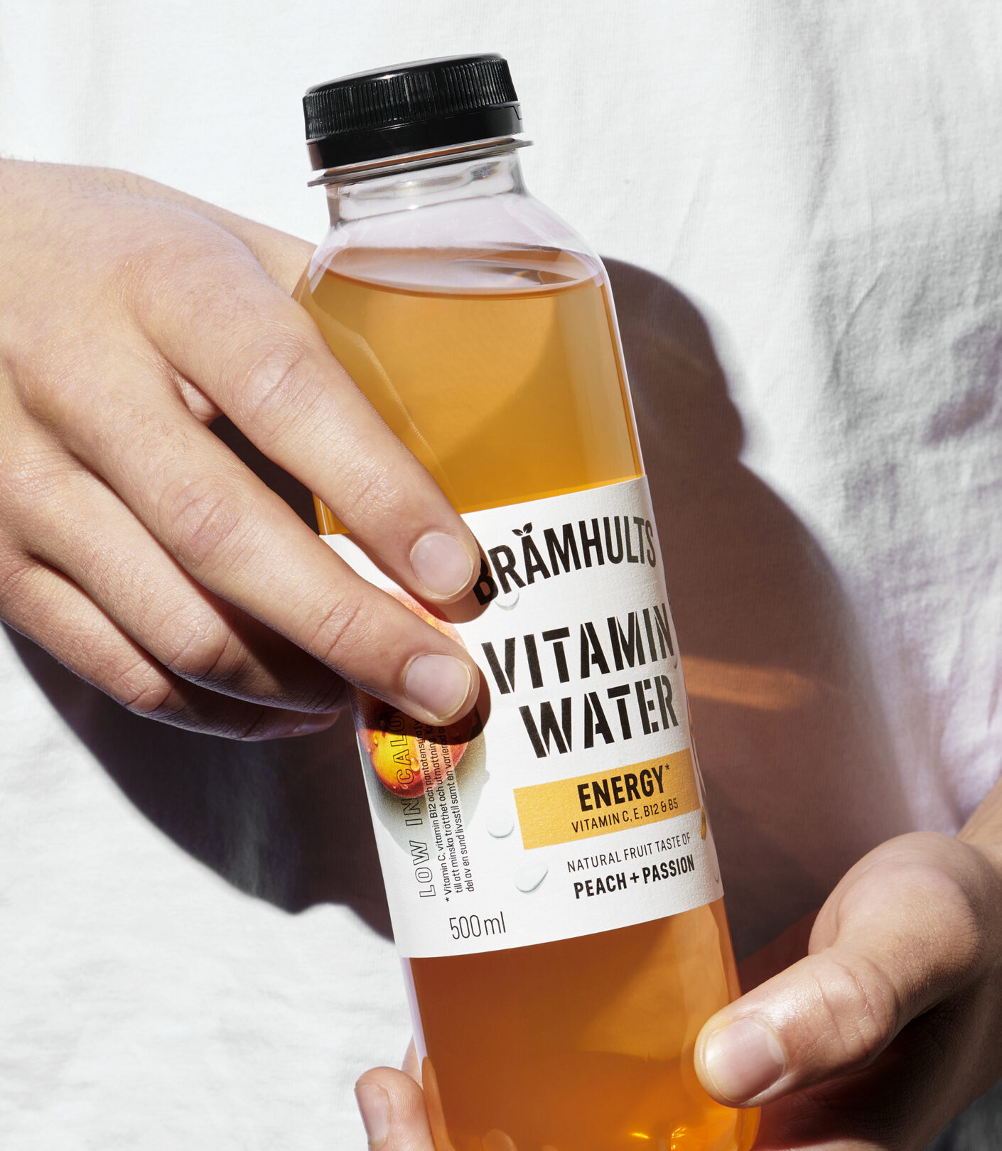
The label is created on a high-contrast aesthetic, opting for a tactile, textured paper to ground the product in the physical world. A heavy stencil typeface lends an athletic grit to the brand, while the white backdrop allows real fruit and berries to take centre stage. Unlike the abstract graphics found on traditional vitamin waters, we utilise raw, real and “imperfect” imagery. Hard lighting showcases the true texture of a raspberry and a chubby lime slice. Instead of generic bubbles, we work with life-sized water drops throughout the label, also over the iconic BRÄMHULTS’ logo. This realistic imagery provides a sharp, refreshing contrast to the clean layout.
The raw-looking design concept creates a cohesive, high-impact identity for comms at the gym and street alike. By merging juice craftsmanship with a modern, fearless edge, we’ve created a functional drink that feels as vital as it looks. This is Hydrate Different; a lucid alternative to a category stuck in synthetic truths. BRÄMHULTS show that true function doesn’t come from a lab – it grows in the sun.