Kungsörnen was founded in 1929 by Lantmännen in Skåne and is a popular, well-known brand with significant experience within pasta, flour, frozen products and various types of food and bread mixes.
Mission
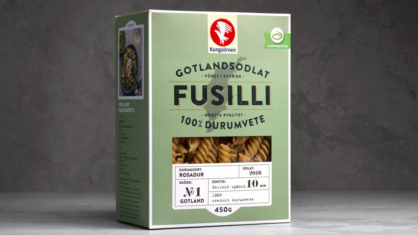
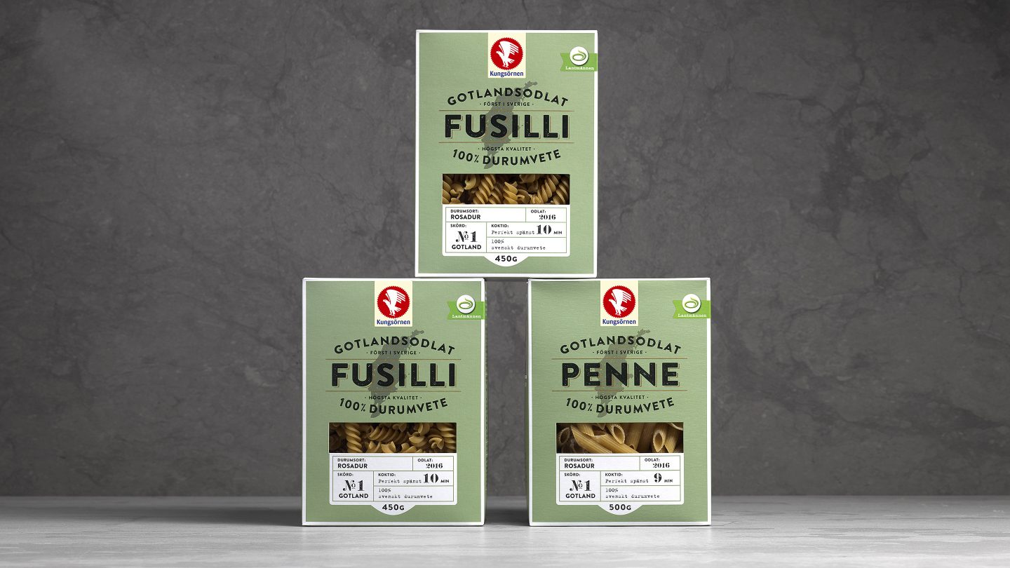
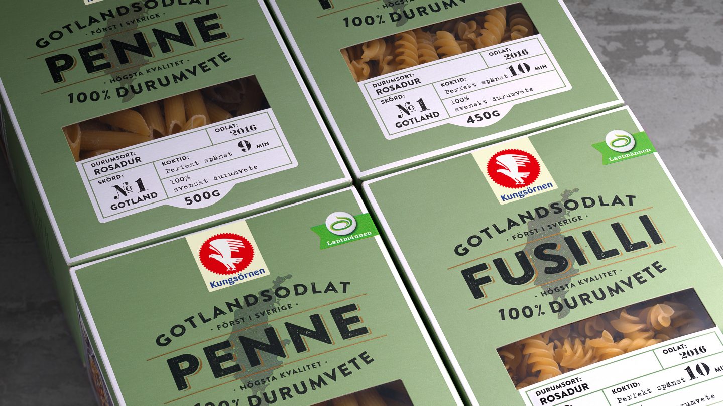
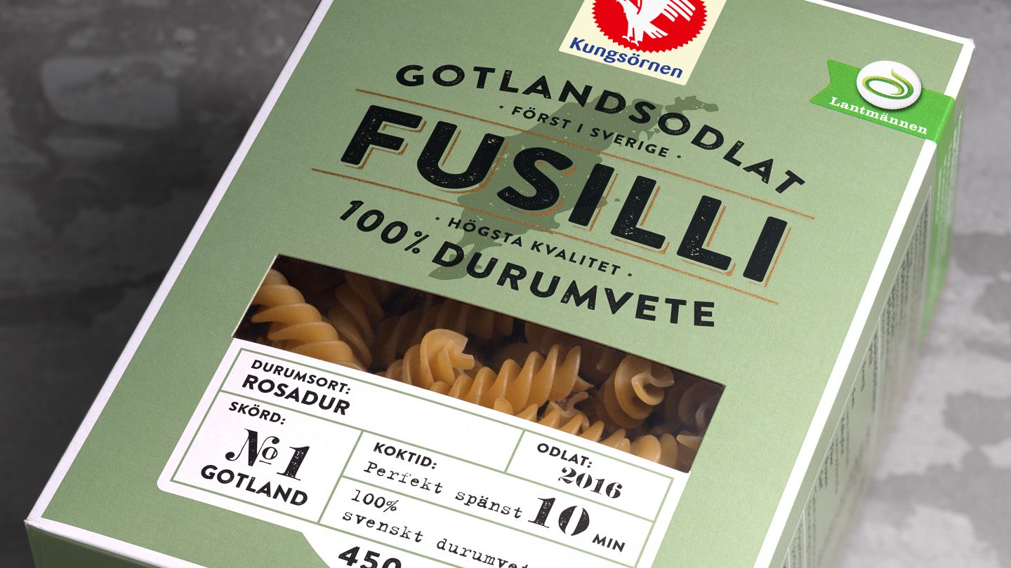
Kungsörnen wanted to create a new, premium pasta range by introducing a new pasta, made exclusively with Swedish grown durum wheat from the island of Gotland. Pond Design was commissioned to develop storytelling, branding and design concept that could be applied on different sorts of pastas.
Insight
Although Kungsörnen is one of the most popular brands in Sweden, the pasta is not perceived as a premium. To address that issue we looked for points of differentiation that would make consumers understand that the new pasta is of the highest quality. We know that consumers are interested in origins and that Swedish-grown is highly perceived. With that in mind, we developed a concept for knowledgeable home chefs. To capture a mass-premium position relevant to a more mature and interested target group, we created a design that communicates craftsmanship, proximity to the raw material, durum, and with a focus of Gotland’s nature.
The idea
The fresh breeze of the island of Gotland is perfect for the delicate durum wheat. We therefore created a visual world that communicates knowledge, taste and origin with Gotland as the starting point, executed with modern, sophisticated design cues. Brand assets from Kungsörnen were elevated for a premium look. To differentiate from the other pasta ranges and get an impact on the shelf, we used a green earthy colour, a framework that works well for both communication and storytelling.