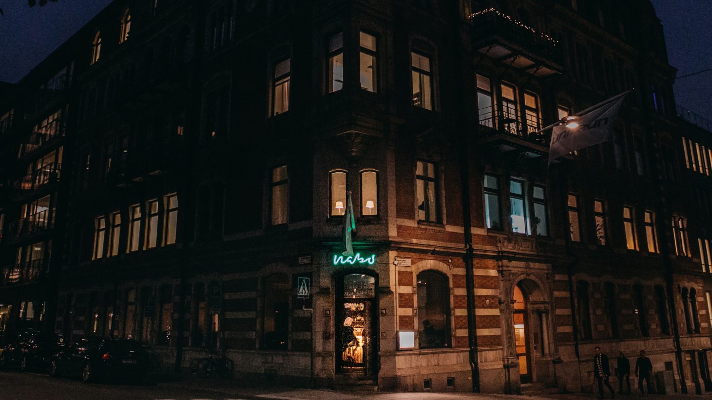
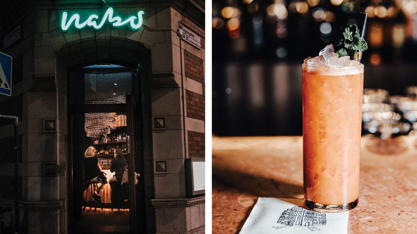
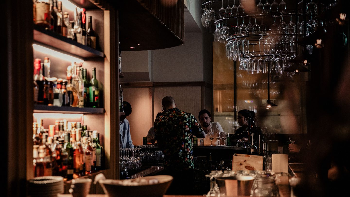
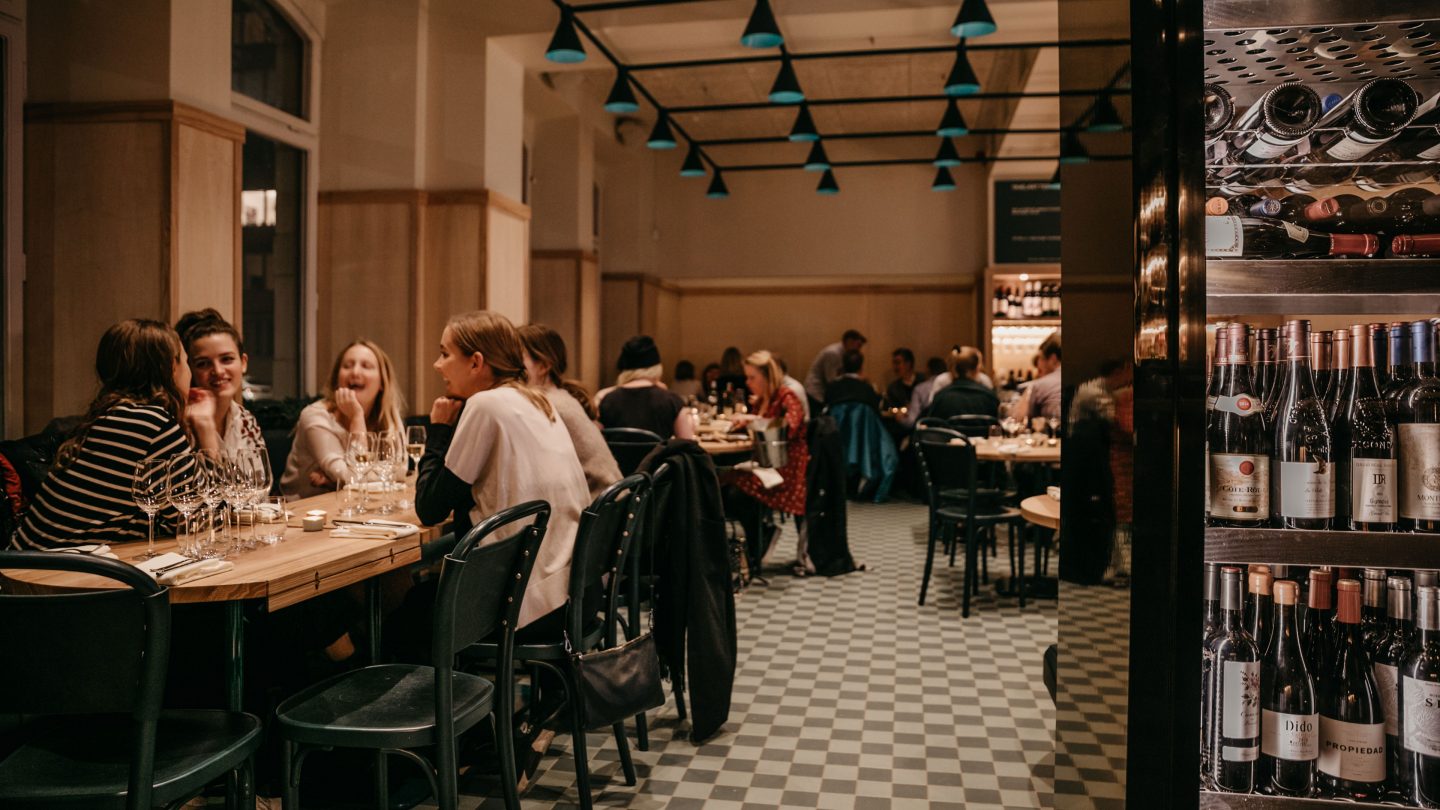
Nabo is an exciting new restaurant in Stockholm. The restaurant opened its doors to the public in 2018 with the ambition to become a modern, timeless classic with a warm and welcoming personality and urban vibe. The restaurant’s location, the building and nearby park, are all closely connected to the history of Stockholm. The building and park are where the famous Astrid Lindgren’s story, Mio my Mio, took place. The word Nabo is an old Swedish word, roughly meaning neighbour.
Mission
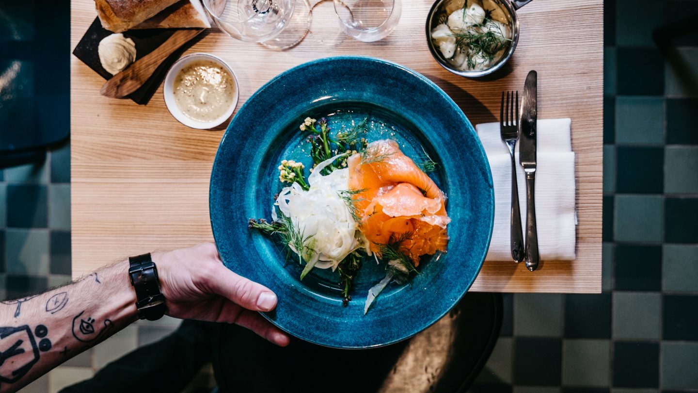
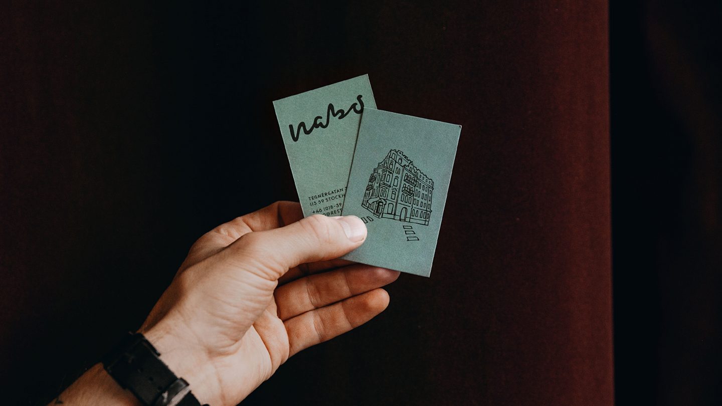
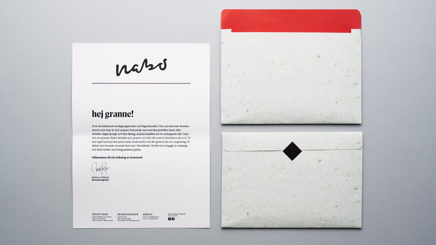
The enthusiastic entrepreneurs behind Nabo wanted a versatile graphic identity, one that could be applied on items as diverse as menus, coasters, staff uniforms and social media.
Insight
People look for a sense of belonging and to find a home away from home. In addition, there is a growing interest in the history of, and stories about buildings and neighborhoods around Stockholm.
Idea
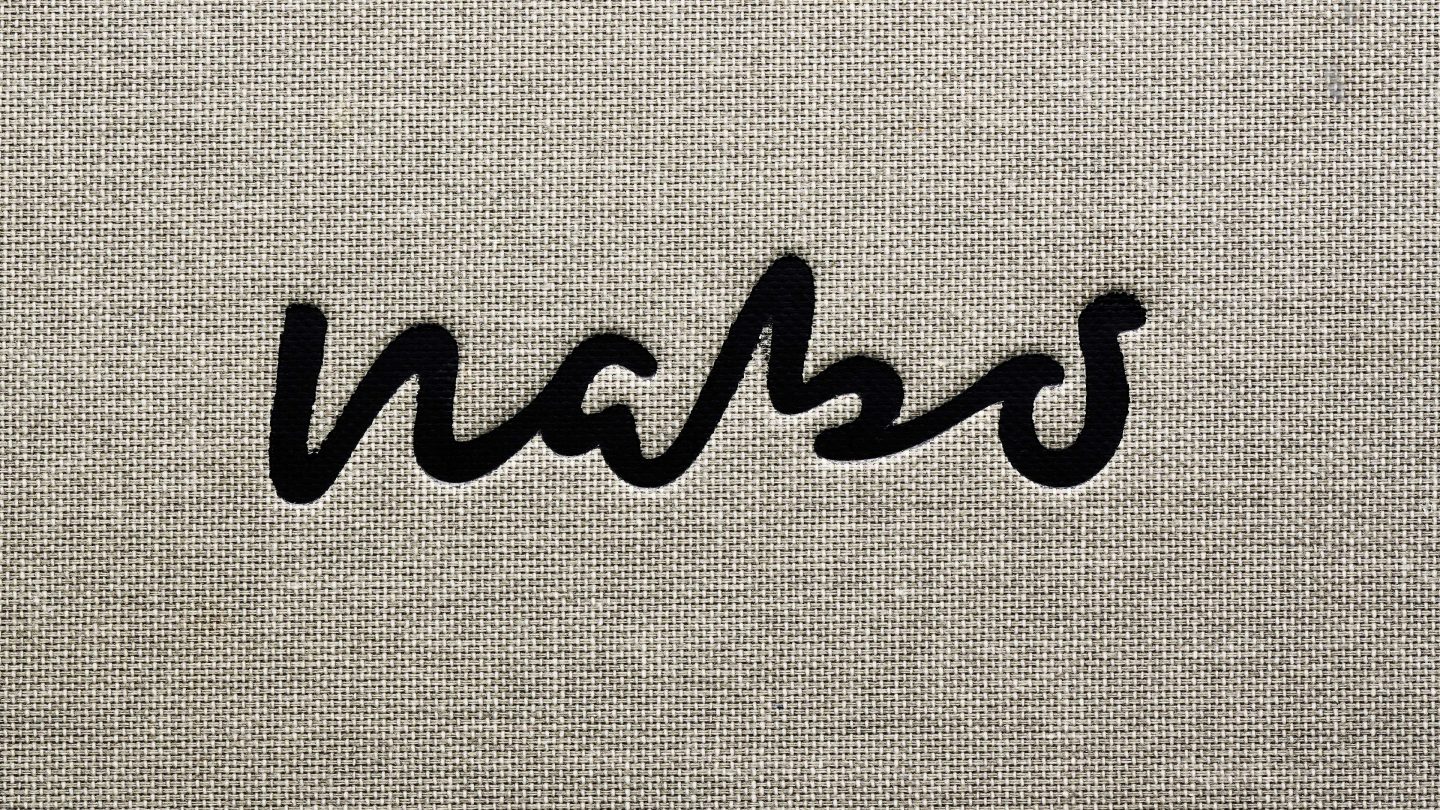
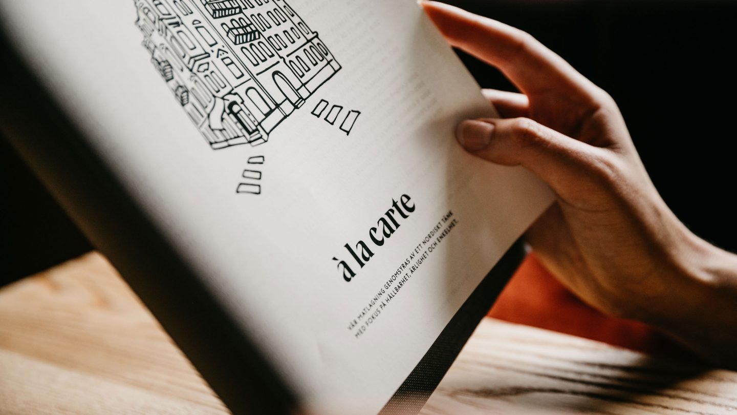
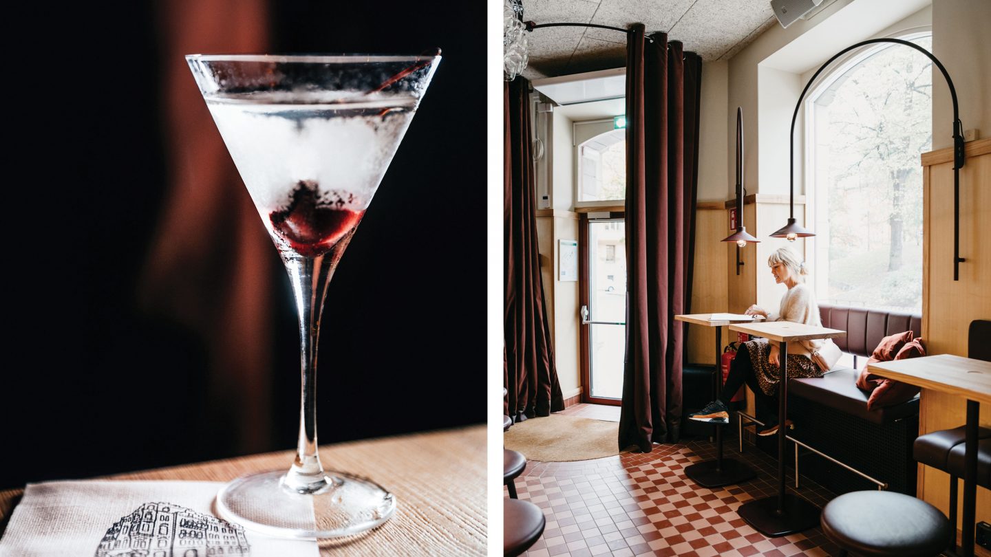
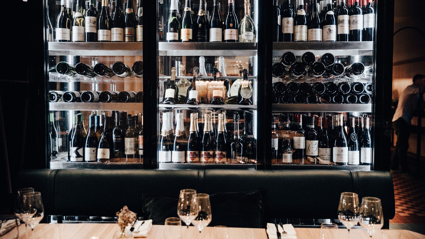
The idea was to capture the vibe of the neighbourhood, people and the park around the restaurant and build the identity with roots from the heart of Stockholm. Nabo’s ambition is to become a gastronomic headquarter with great food and a warm, welcoming attitude. This attitude was captured in a hand-written logotype and modern classic typefaces designed by the famous Swedish designer, Olle Eksell. The interior was inspired by the surrounding area and neighbourhood park, famous for its alder trees, which was mirrored in wood details. The alder tree was also captured in the stationary and an illustration of the restaurant’s building was used in different details in the restaurant itself.