Eldorado has been a pioneer within the low-price sector in Sweden, providing affordable good quality food and household essentials since 1969. Eldorado is owned by Axfood AB and is found in supermarkets all over Sweden.
Mission
Eldorado needed to strengthen their position on the market and update the brand’s overall packaging design. The ambition was to position the brand as a trustworthy budget choice for the wise consumer and create a sense of pride in the brand through an attractive and appealing look.
Insight
Consumers are somewhat sceptical towards low-priced products and don’t really trust the category’s quality and taste. When they do buy low-price products they don’t always feel good about their choices.
The idea
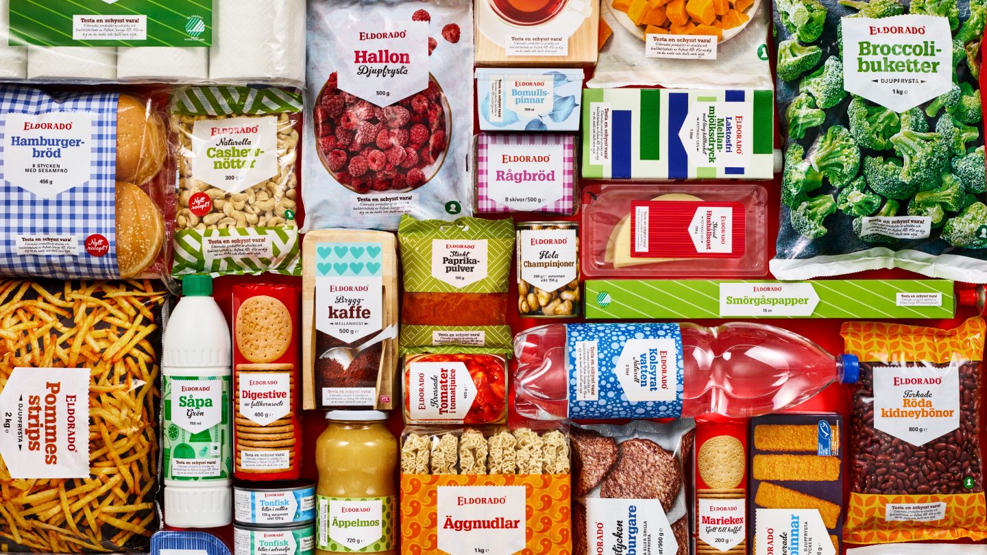
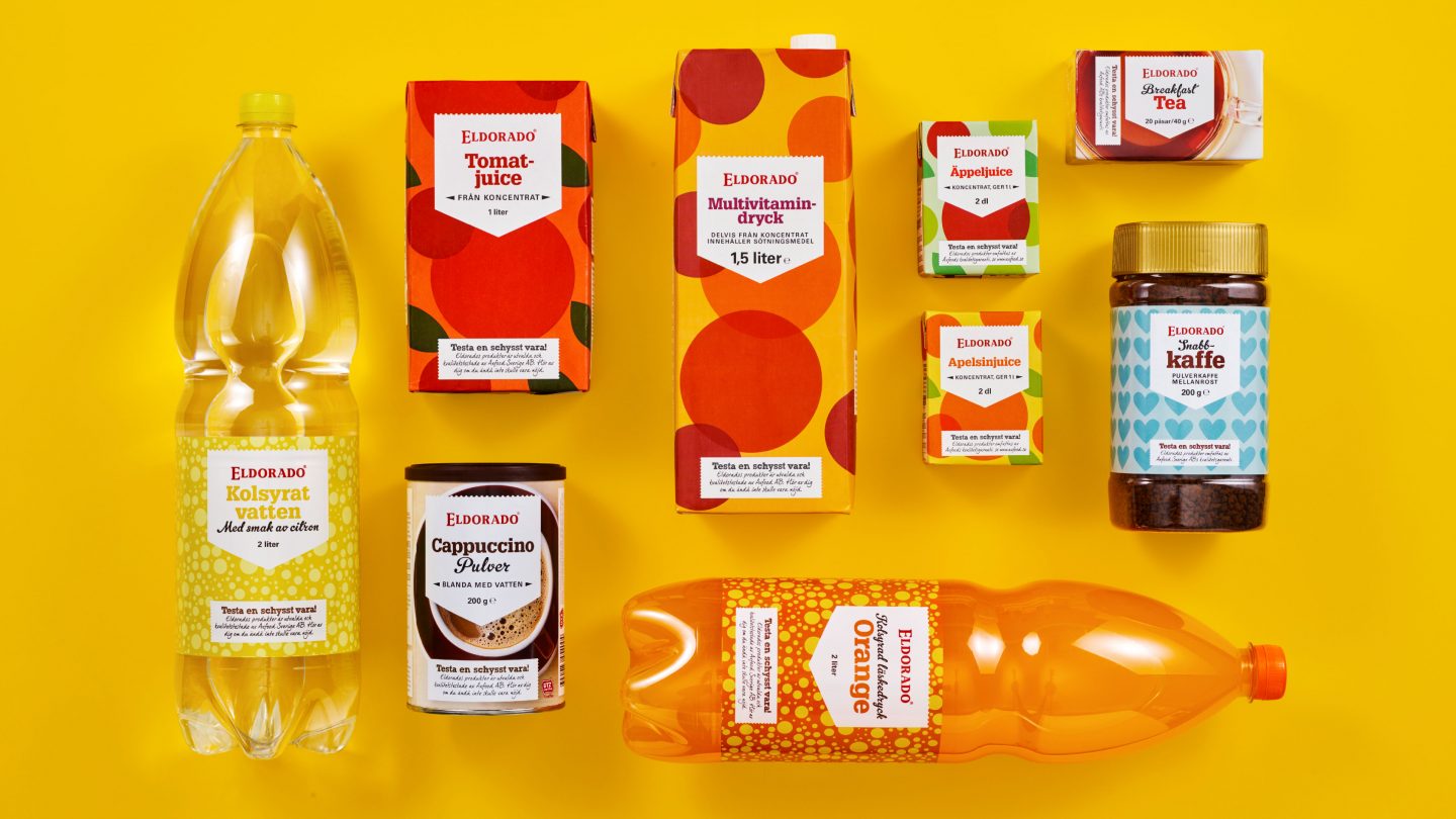
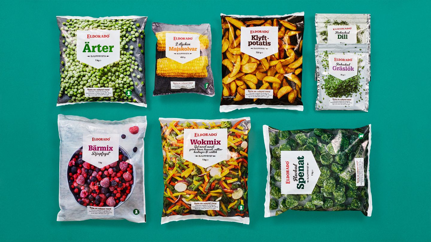
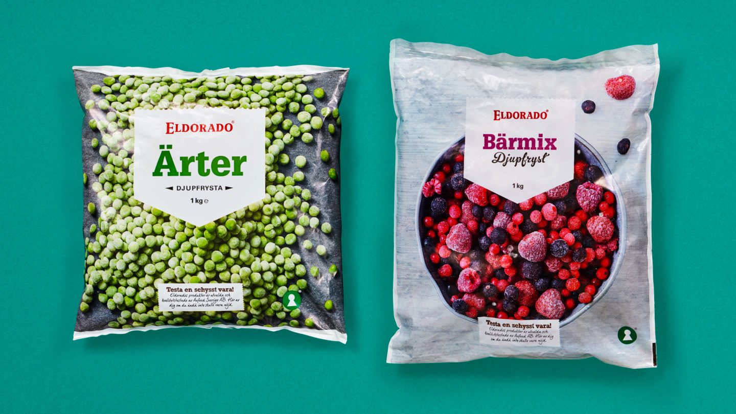
The idea was to move the brand from being “a cheap brand” to becoming “smart brand”, ultimately empowering consumers to make wise budget choices.
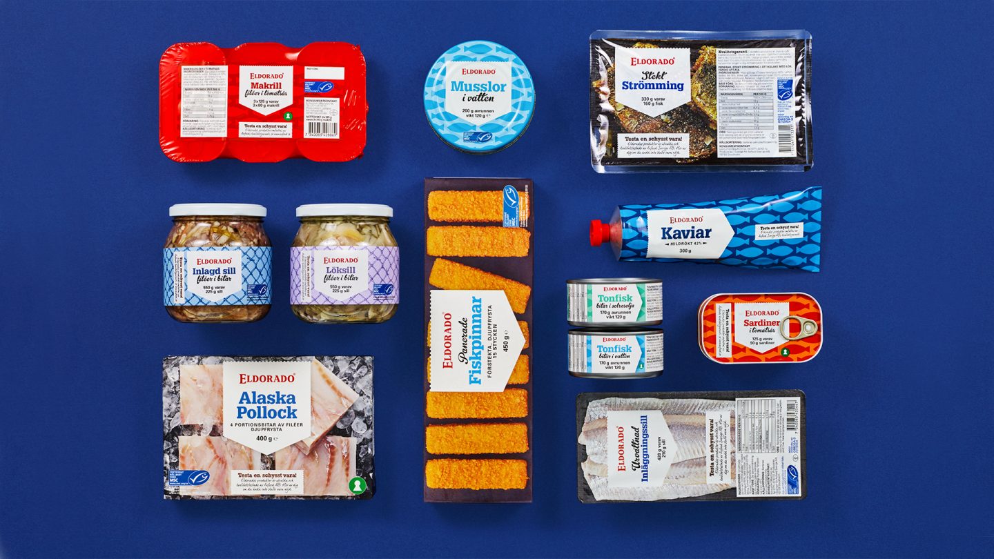
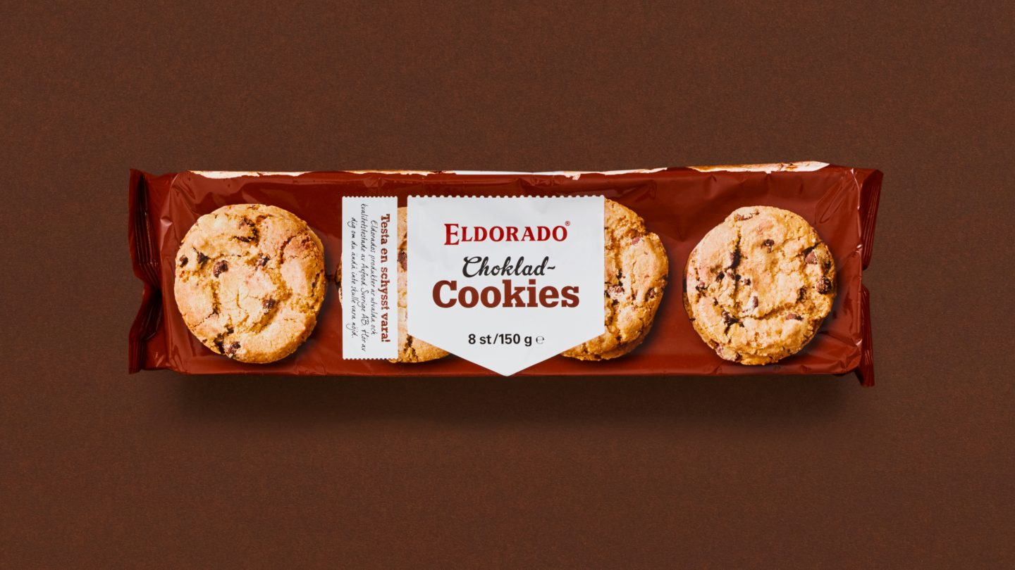
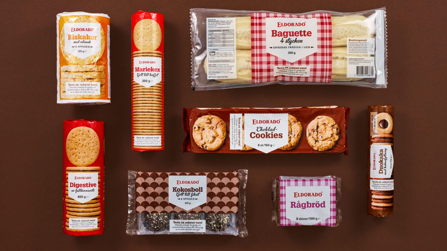
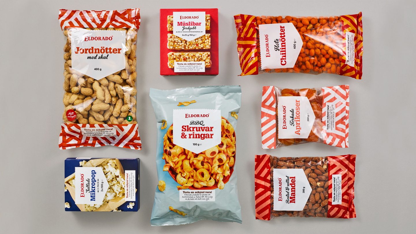
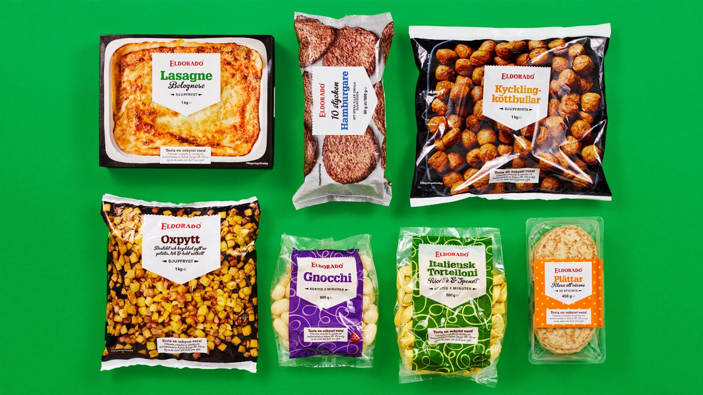
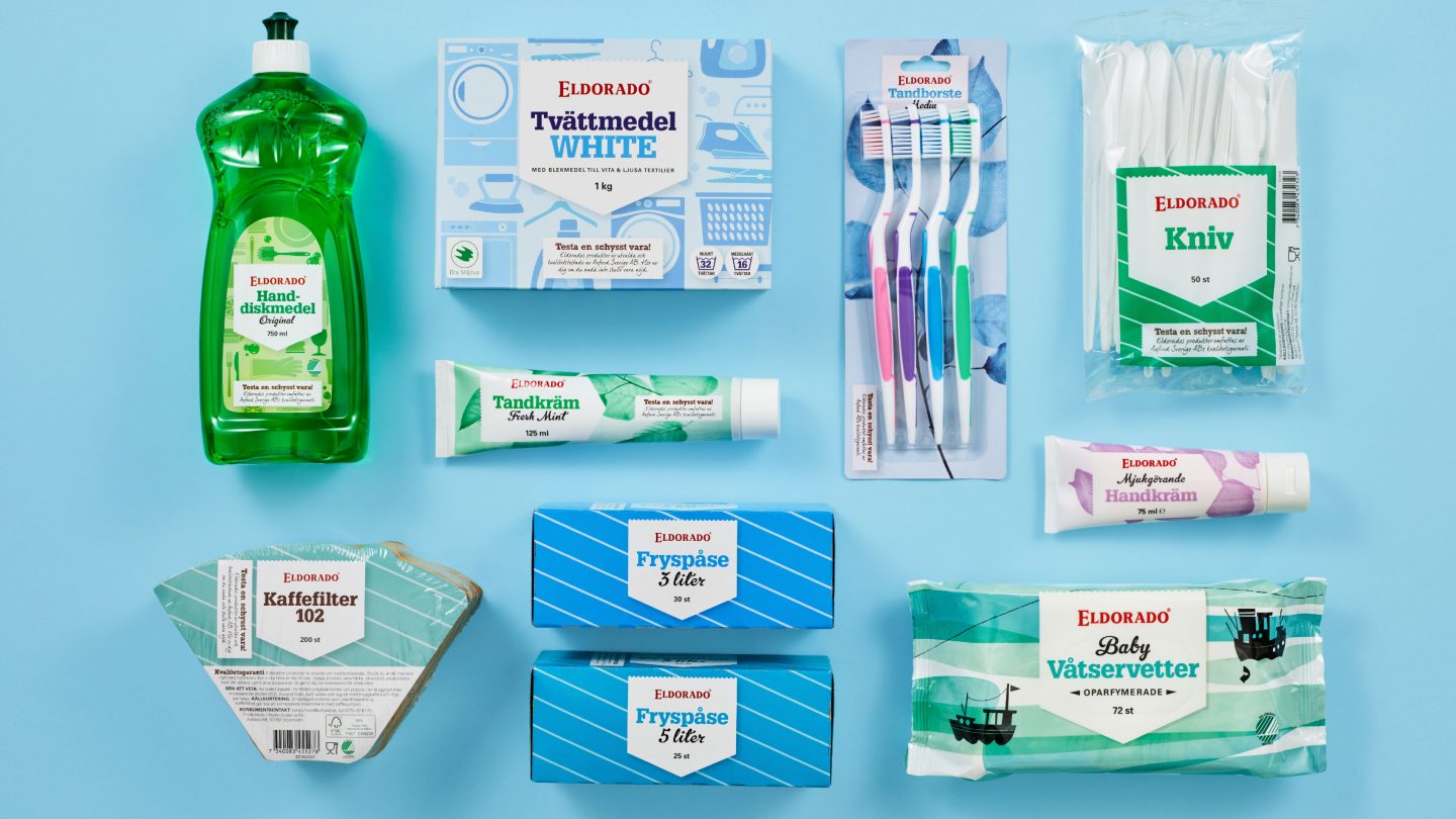
As Eldorado is a classic brand, keeping high brand recognition was important. In addition, the design system had to be both efficient and practical to apply to a large amount of different products and categories. There was also a need to strike the right balance between “well designed” and “not fancy”. Finally, the design had to relate to the visual cues most commonly found within the different food and non-food categories where Eldorado products can be found. The solution was to create a downwards pointing arrow-formed label that symbolizes prices going down and acts as a holding device. Products are shown in a straightforward photographic manner, a what-you-see-is-what-you-get approach. The holding device is flexible and allows for clear brand recognition on the one hand, and clear communication of respective product and categories cues on the other hand.